A refreshing first
WATO
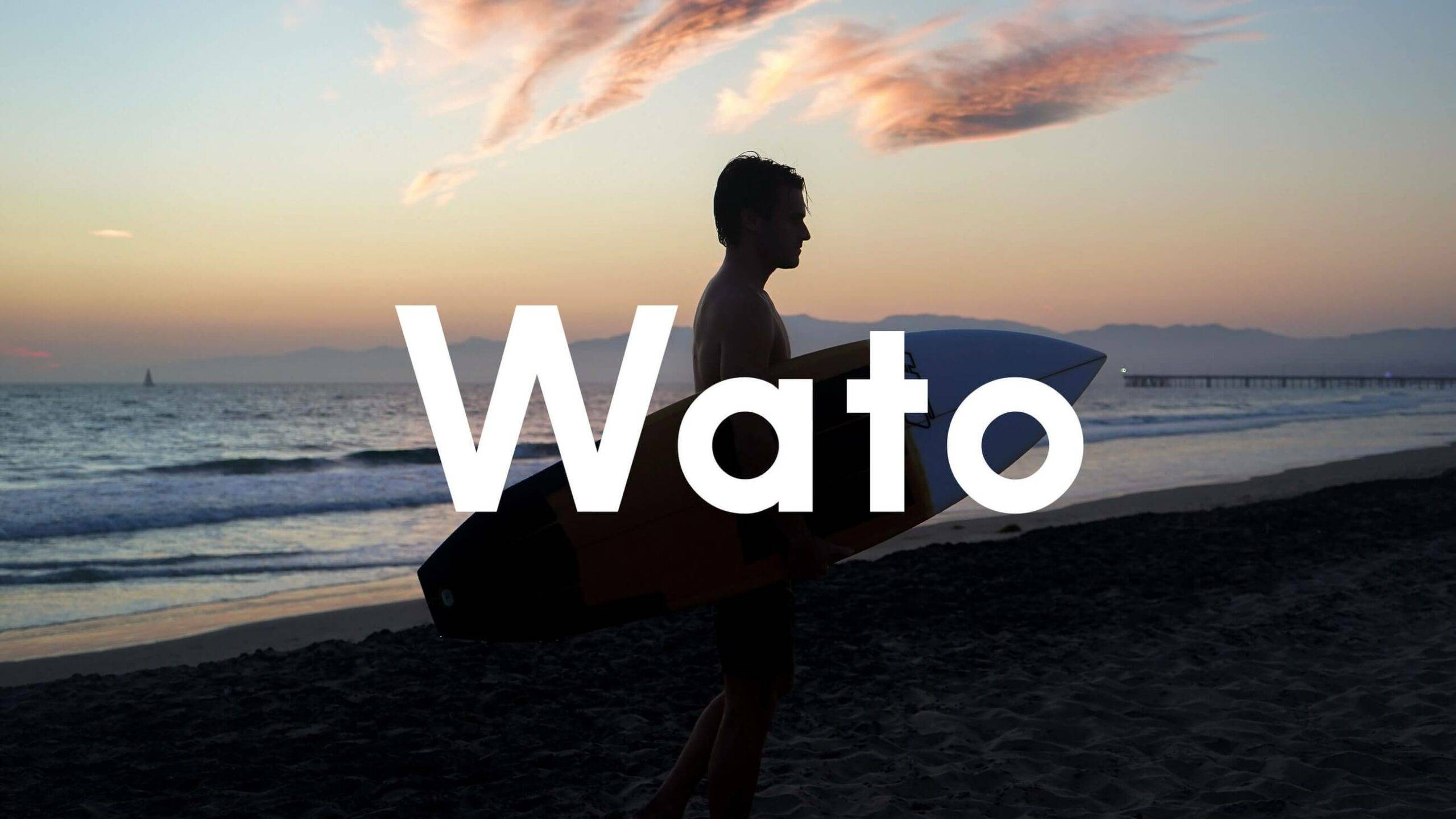
Wato is a new hybrid product with the refreshing qualities that come with rehydration and the invigorating qualities of an energy drink. In other words, a new category of health drinks. Now it needed to fight for its space in this overpopulated segment.
What we did:
Design
Visual identity Packaging Illustration UX/UI design
Technology
Prototyping Front-end development Back-end development
Press:
“Wato Undo the Bridge”, Brand New “Ny dryck med blöt identitet”, Cap&Design “Stay Hydrated With Wato This Summer”, Dieline
Fighting for space
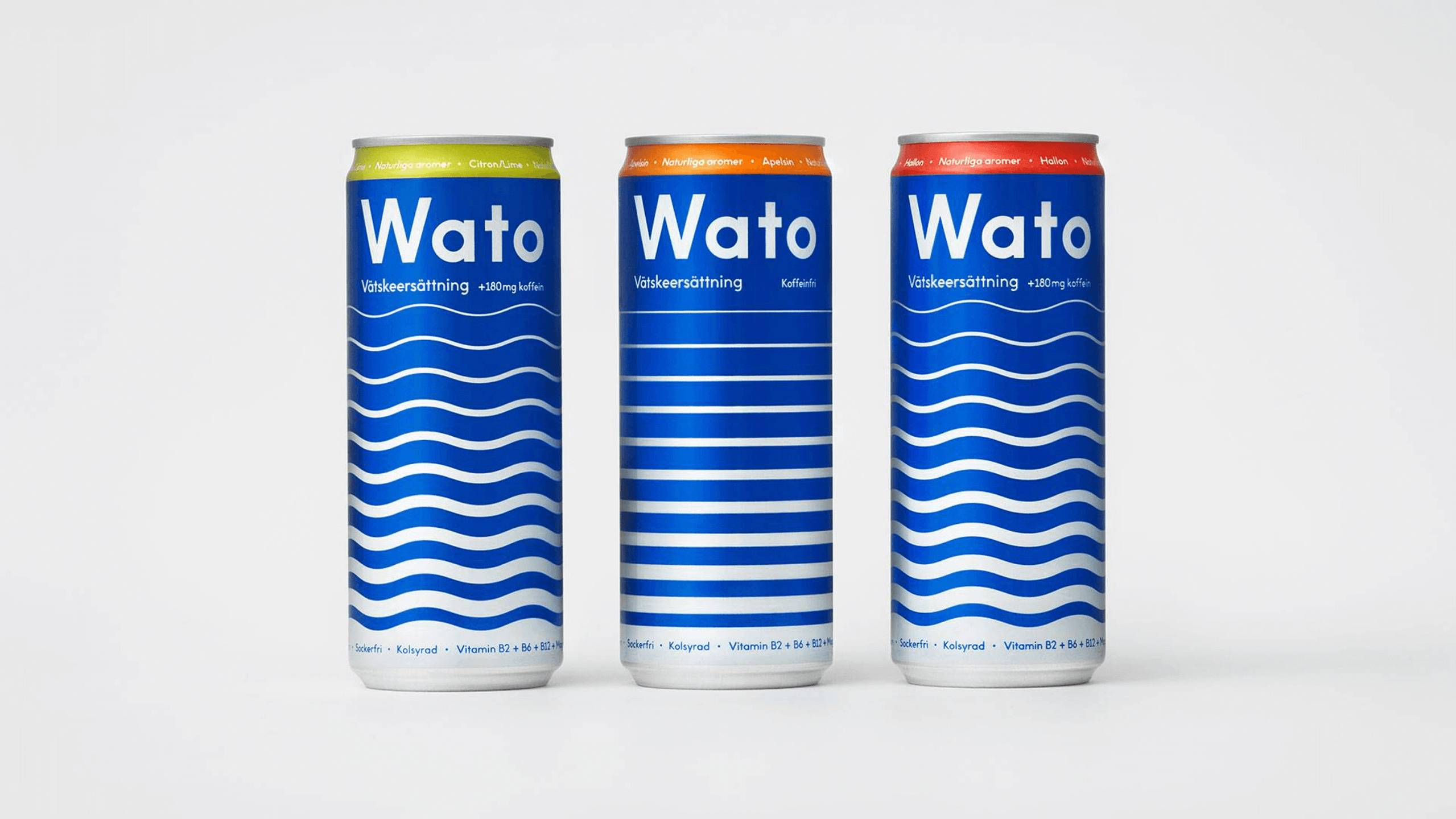
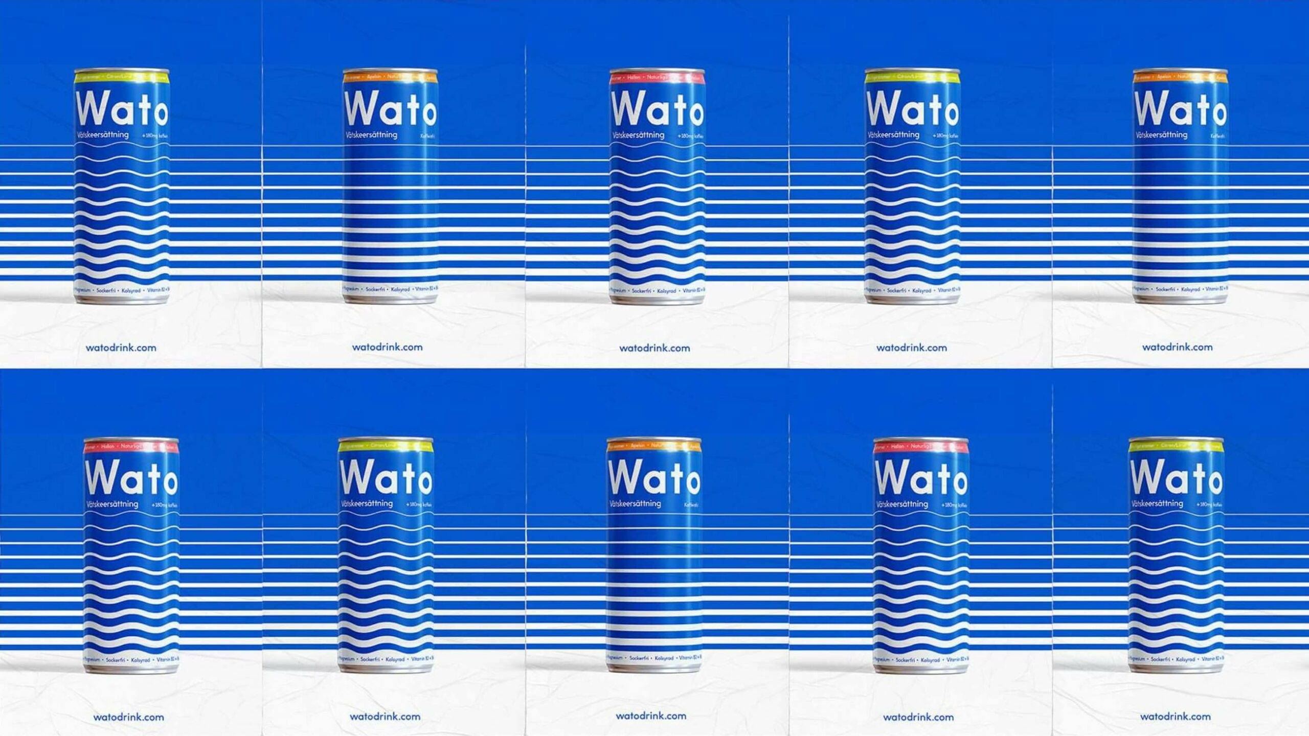
We were brought in to create Wato’s visual identity and packaging. With FMCG brands, and a new one in particular, the battle is won on the shelf. Differentiation and impact are everything. In a segment abundant in loud visual expression, we therefore chose a cleaner solution, with a visual identity sprung from the product’s key differentiator. Rehydration.
Making a splash
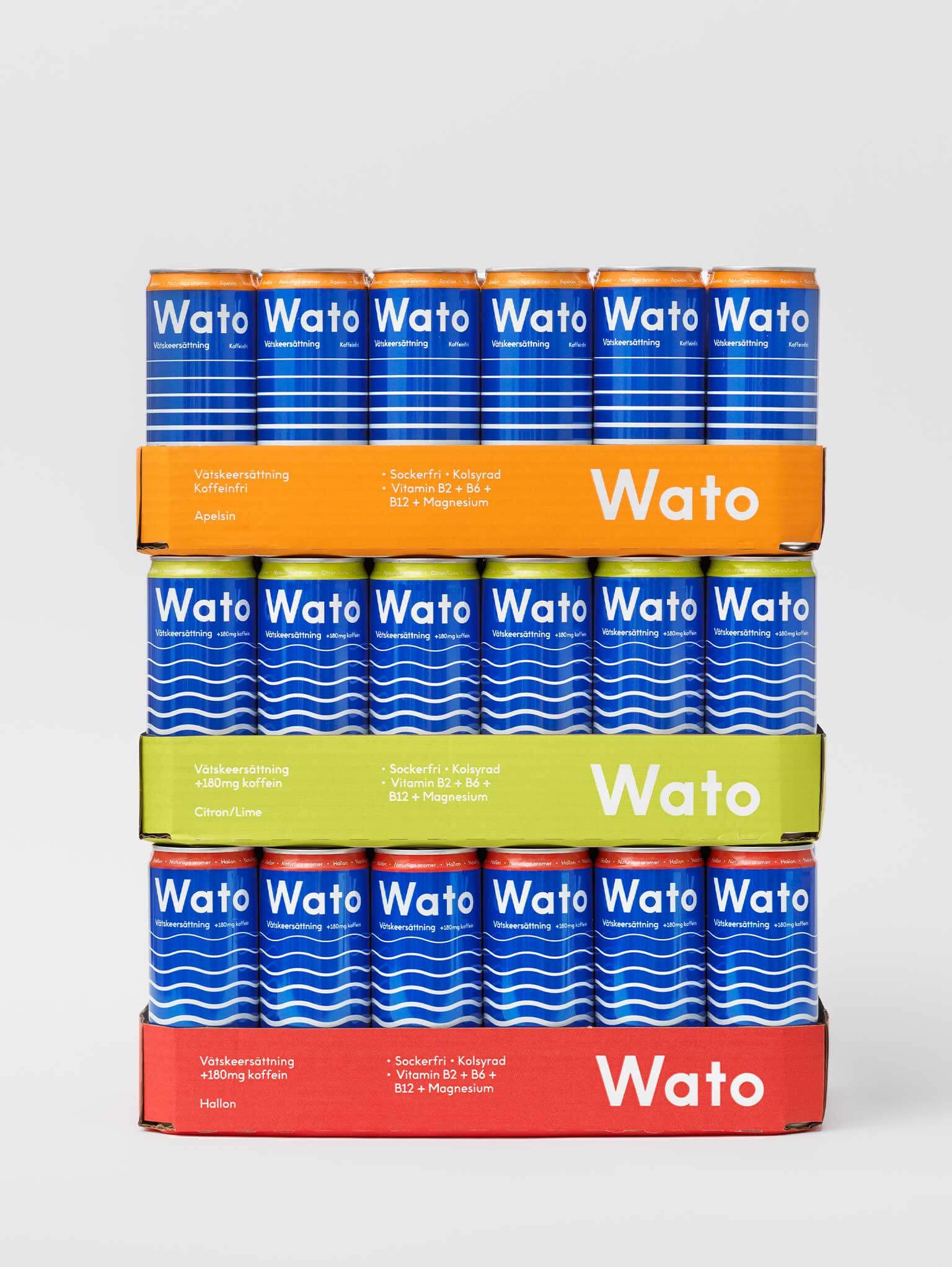
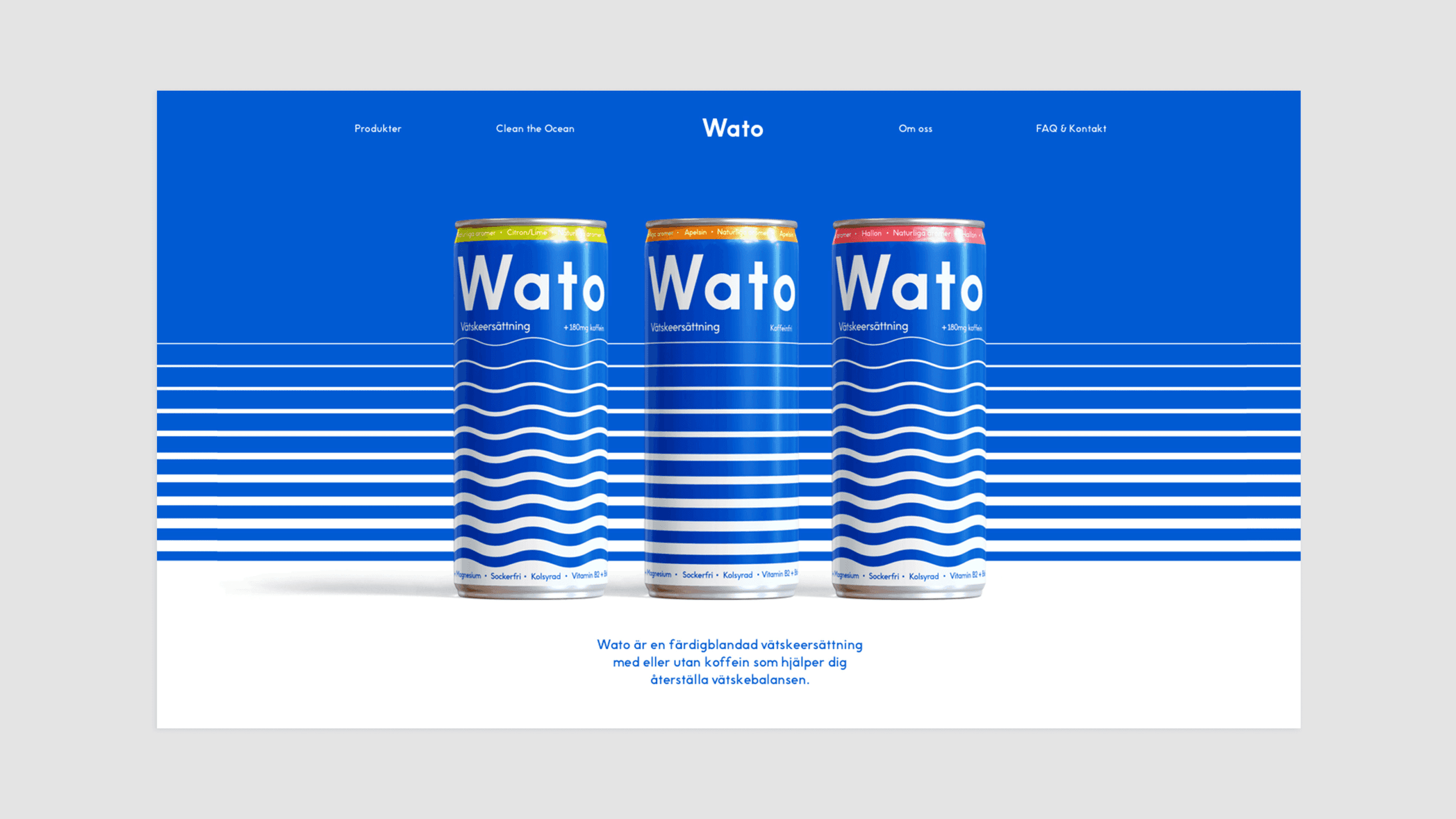
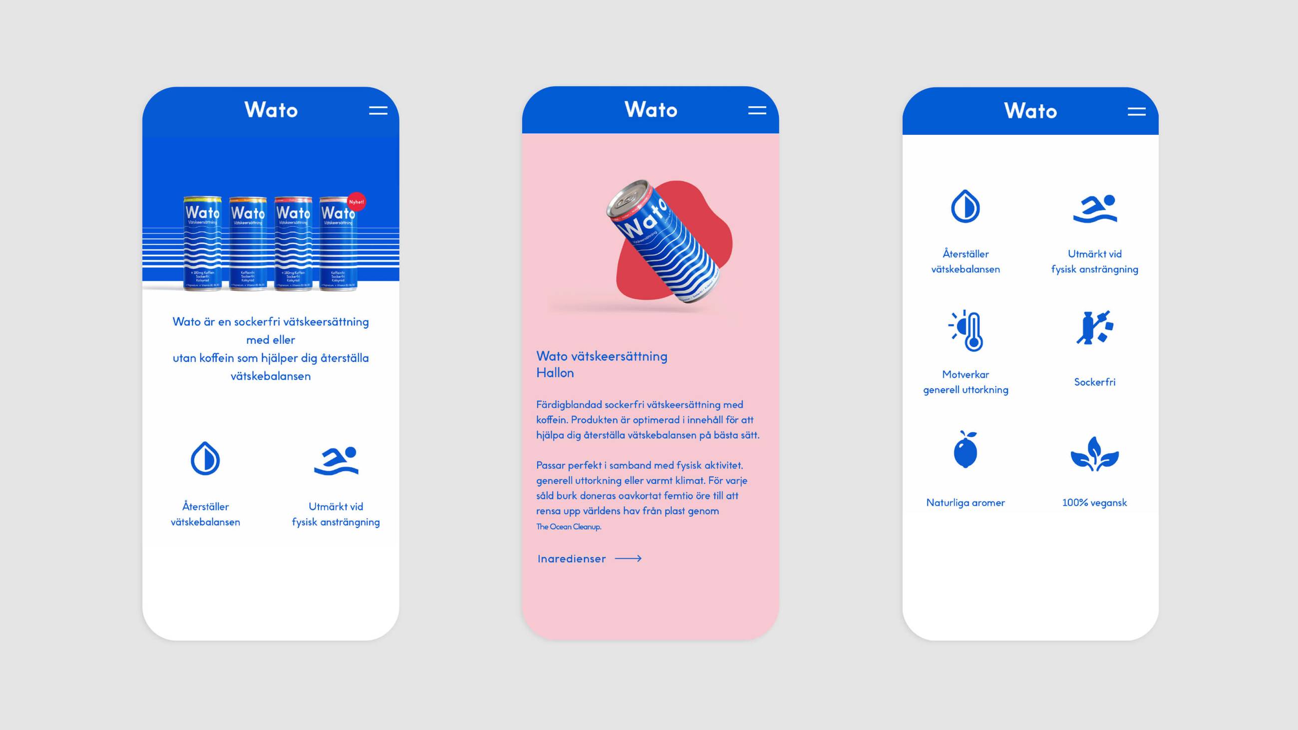
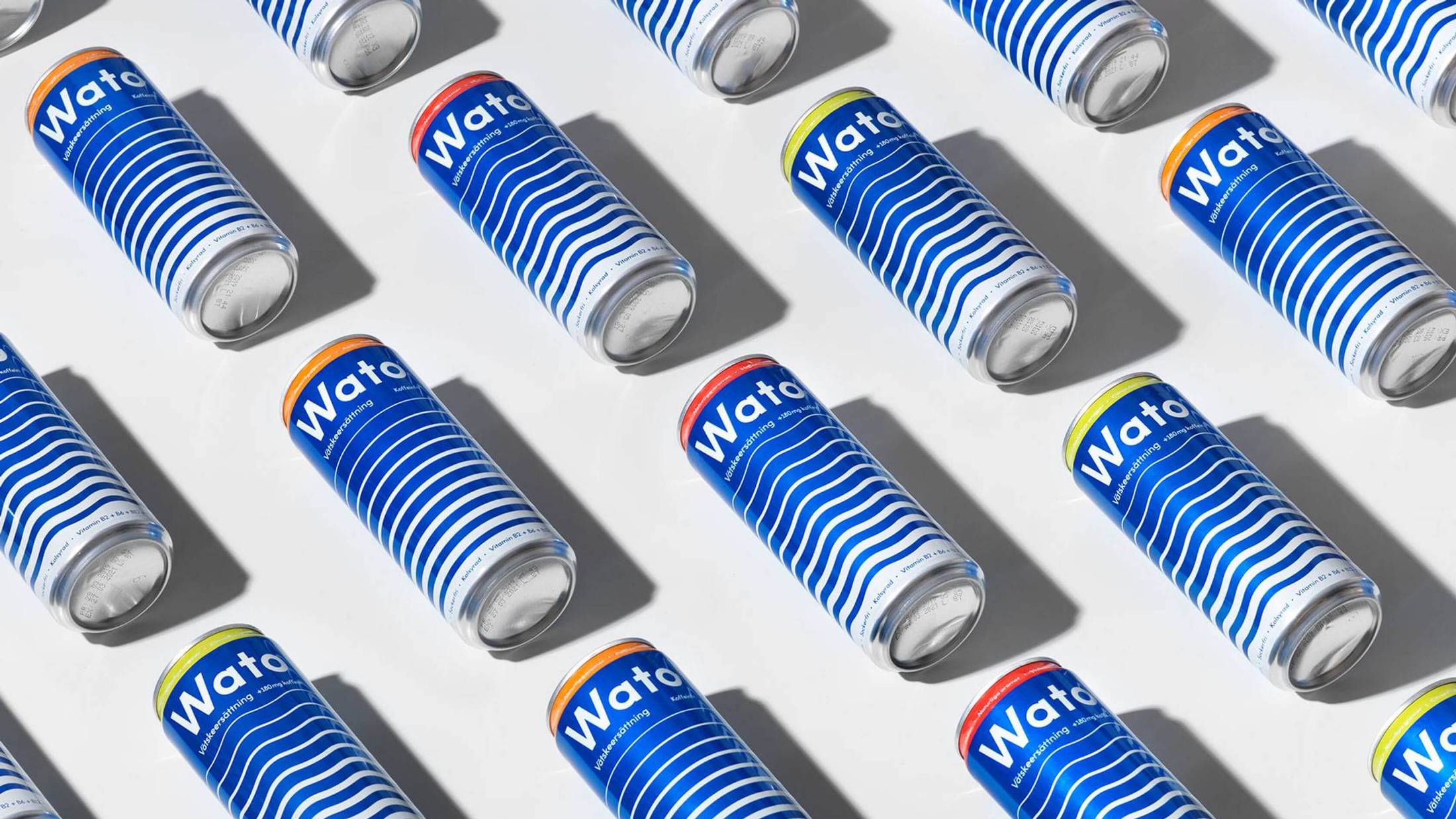
The keystone of the visual identity was a graphic pattern depicting the movement of water. On the packaging, wavy and straight lines represented products with or without caffeine. Different flavors have their own colors, without losing sight of the big blue. Ever since its launch, Wato has been making waves on the store shelves.
“We are extremely happy to have chosen Essen International as our partner. Their work has taken our product to a whole new level – a lifestyle brand.”
Oscar ThomsCEO, Wato drink

