A big player with a
big heart
SKANDIA
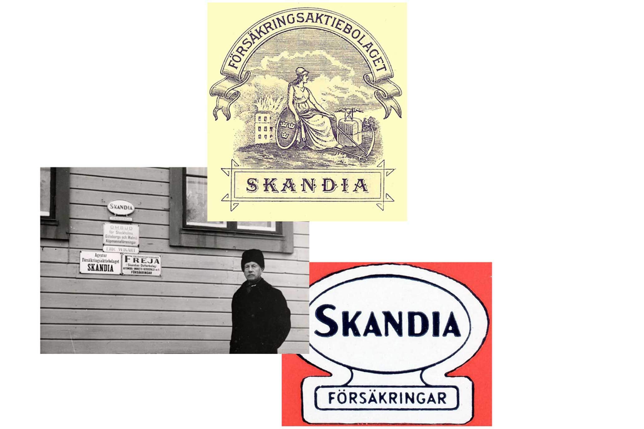
Skandia has a long and rich history. In fact, the company provided the very first life insurance ever available in Sweden. When the Stockholm Stock Exchange opened in 1863, Skandia stocks were amongst the first to be sold. Today, the company keeps pushing forward, making it easier than ever for everyday people to enjoy the present and worry less about tomorrow.
What we did:
Strategy
Brand architecture Brand platform Brand positioning Naming Communication strategy Content strategy Social media strategy Technical strategy Qualitative and quantitative research studies
Design
Visual identity Verbal identity Bespoke typeface Iconography Illustrations Motion design UX/UI design Packaging Websites and apps Retail/ Environmental Guidelines/ Brand portals
Press
Skandia increased its customer satisfaction in 2019 accordingly to YouGov’s BrandIndex, and was place second on the list of brands that increased their brand advocacy the most.
Content
Copywriting Scriptwriting Photography direction and production Motion video direction and production Campaign Implementation plan Design templates Office templates
Technology
Front-end development Back-end development Prototyping Integration support
Clarifying the position
There used to be some confusion regarding who Skandia are and what they do. Most people thought of them as just another retail bank. So, in 2016, a strategic decision was made – Skandia is a life insurance company. A big player that cares about and invests in our world. Also, a long and proven track record doesn’t mean you’re old. It means you know how to move fast forward.

Defining the brand to be
At the end of 2016, Essen was brought in to help Skandia reposition themselves. At first, we worked hard to figure out what these words actually mean and how they should be put into practice. Who are the customers? What keeps them up at night? How can we help them? What are their requirements on a digital product today? Insights were formulated. Design principles were developed.

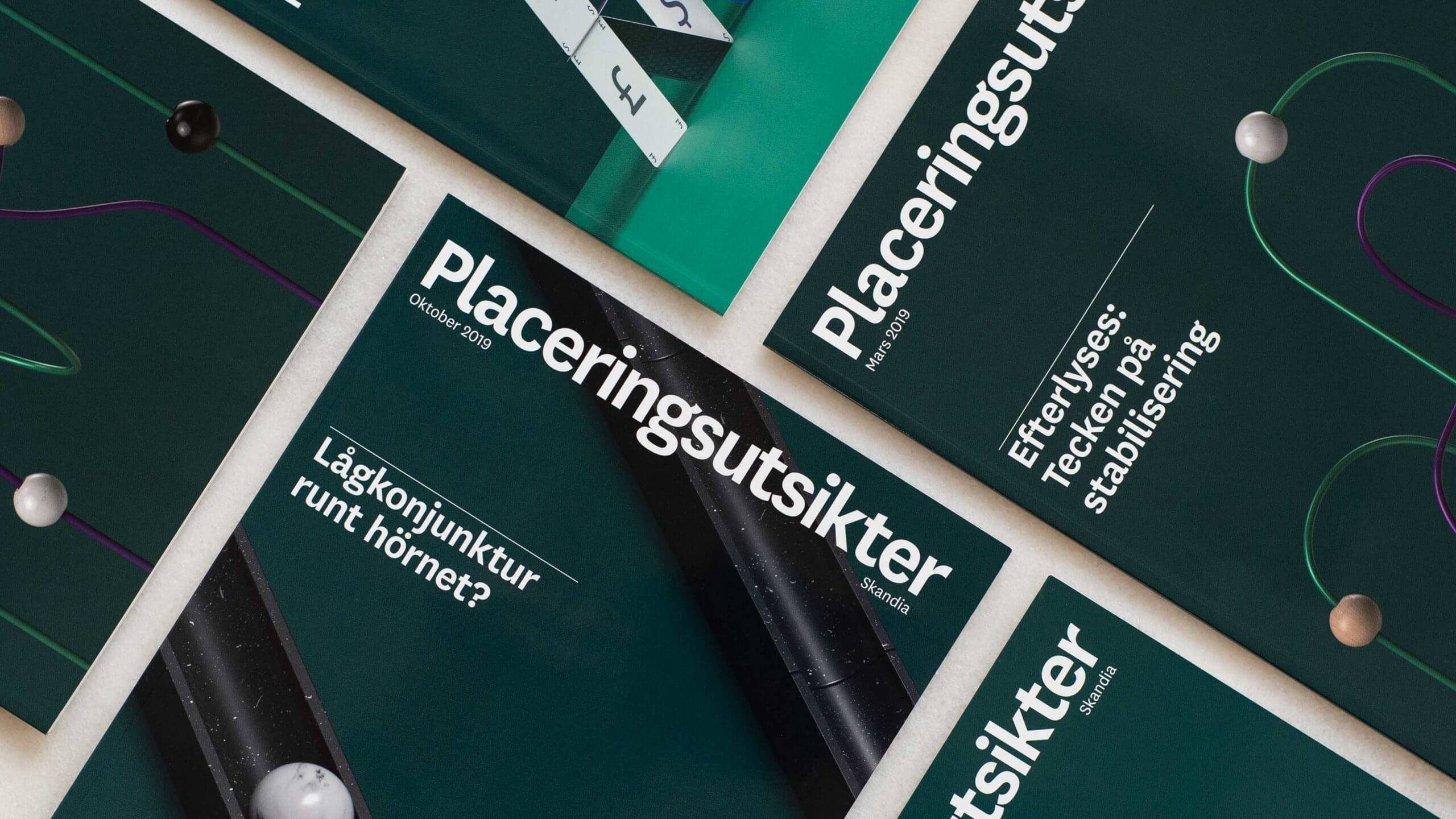
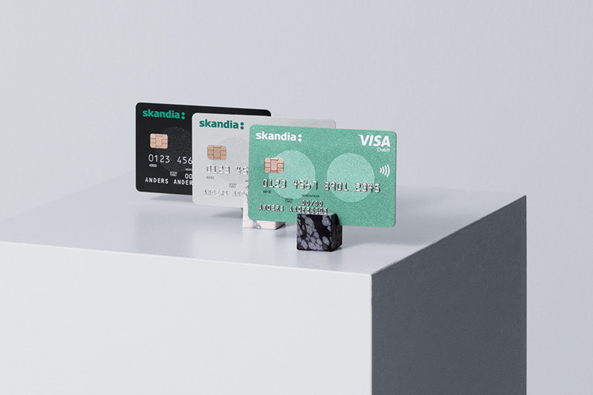
Packaging products you can‘t touch
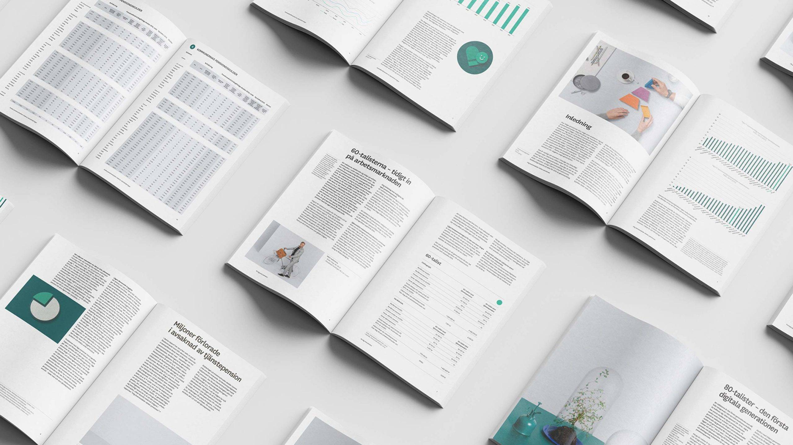
Figuring out how to explain and sell products you can’t see is a big part of the job when working with Skandia. Take pension, for instance. It’s abstract. It’s complex. We wanted to make it tangible. As a result, we literally packaged Skandia’s prioritized products and developed new names and benefits. Now, it’s hopefully a whole lot easier to make informed decisions about your future.
“Essen has worked continuously and across disciplines to solve one of our biggest challenges – to make the difficult easy and the challenging engaging. They've really helped us stand out, and I believe we're now perceived as more accessible as well as more attractive.”
Per LundhBrand Strategist, Skandia
New imagery for the new image
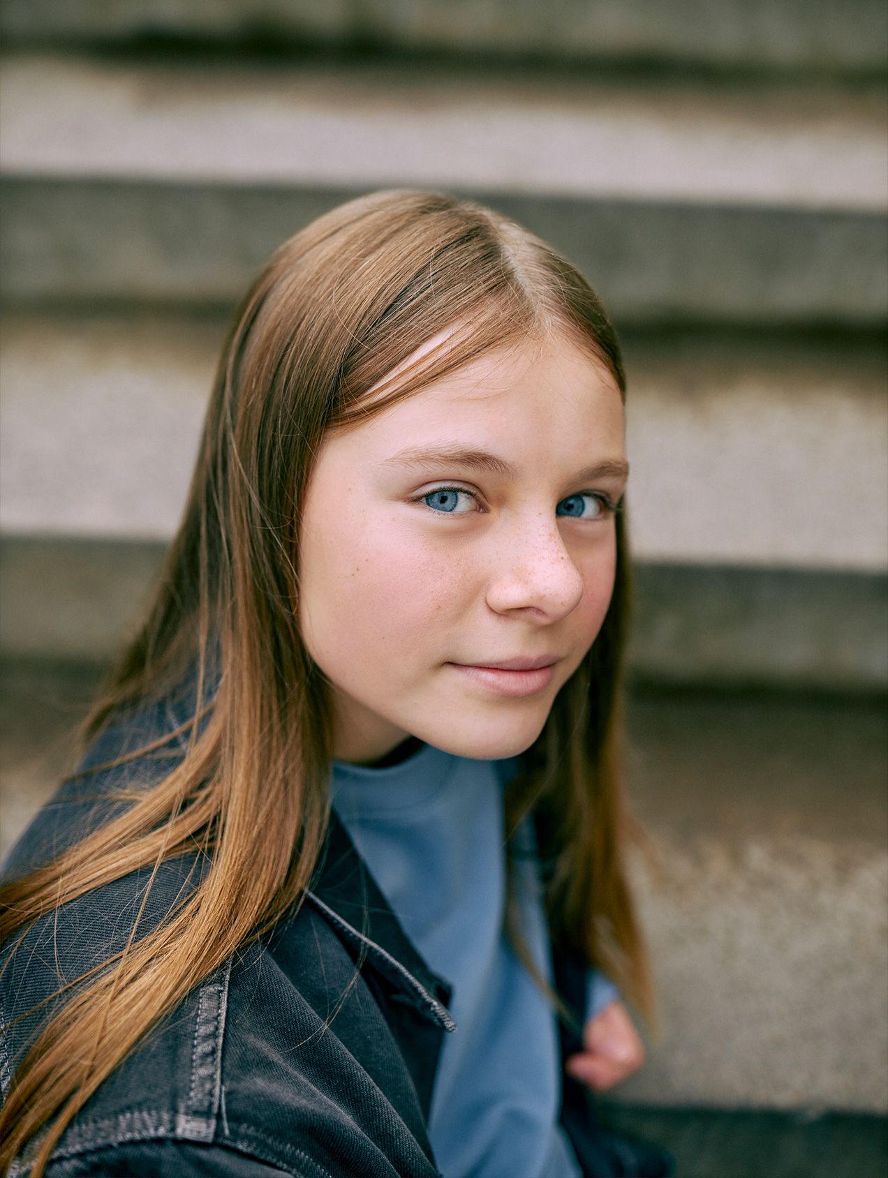
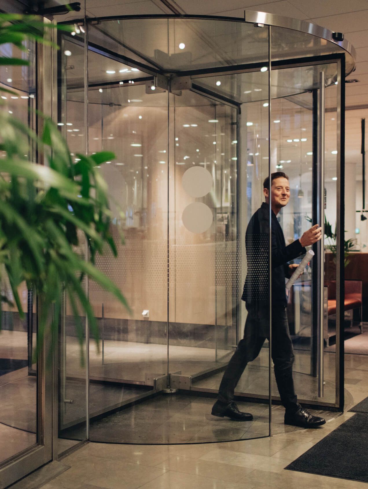
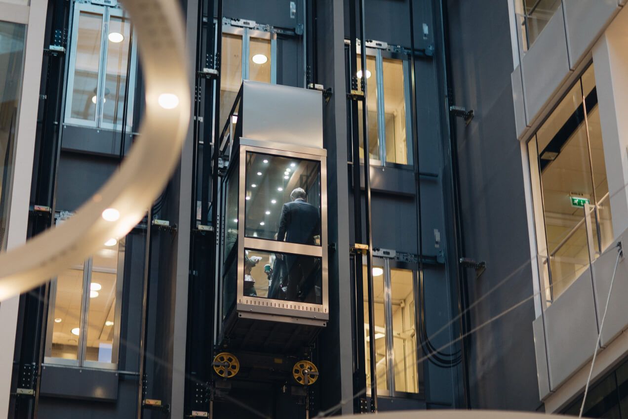
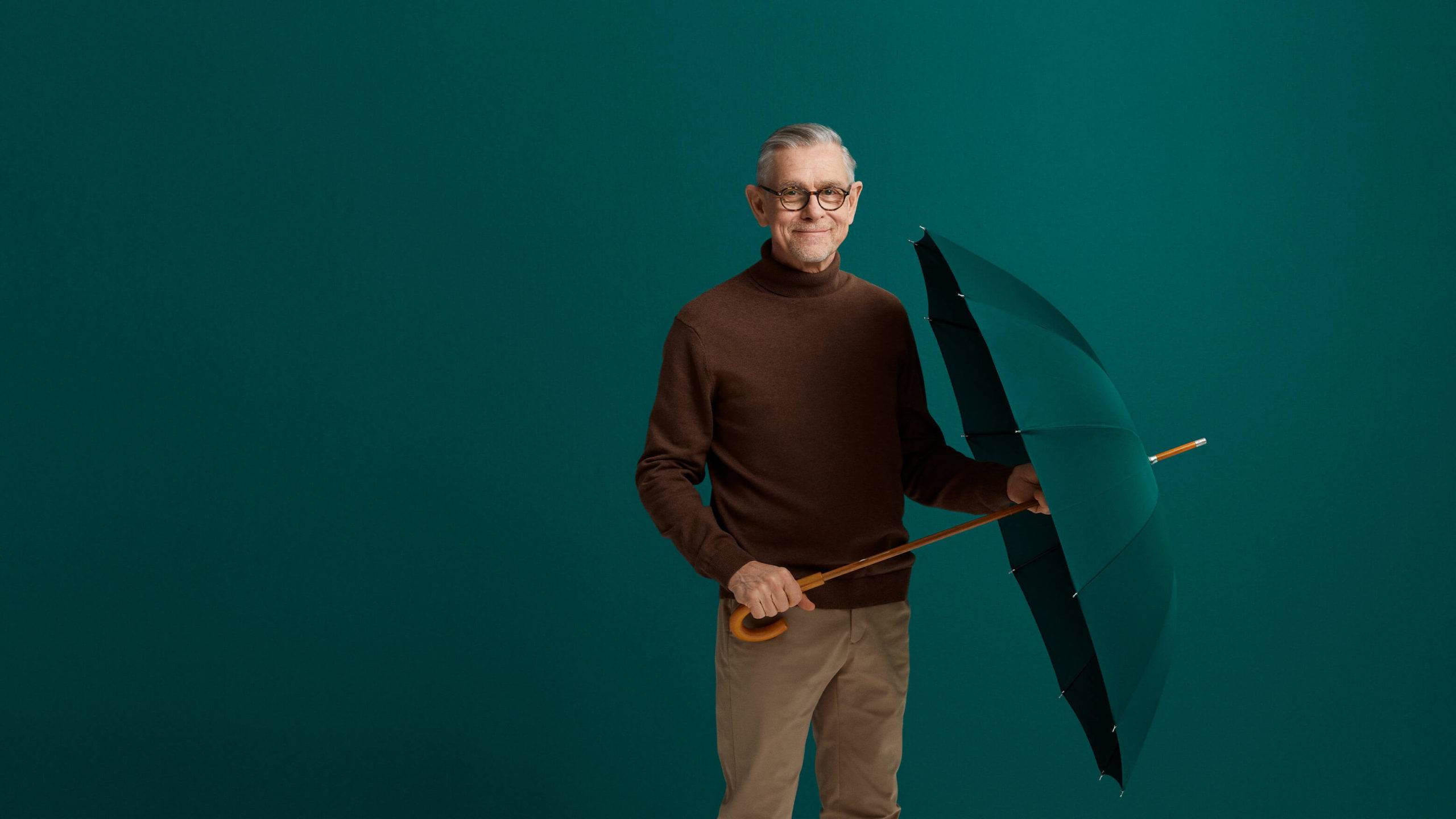
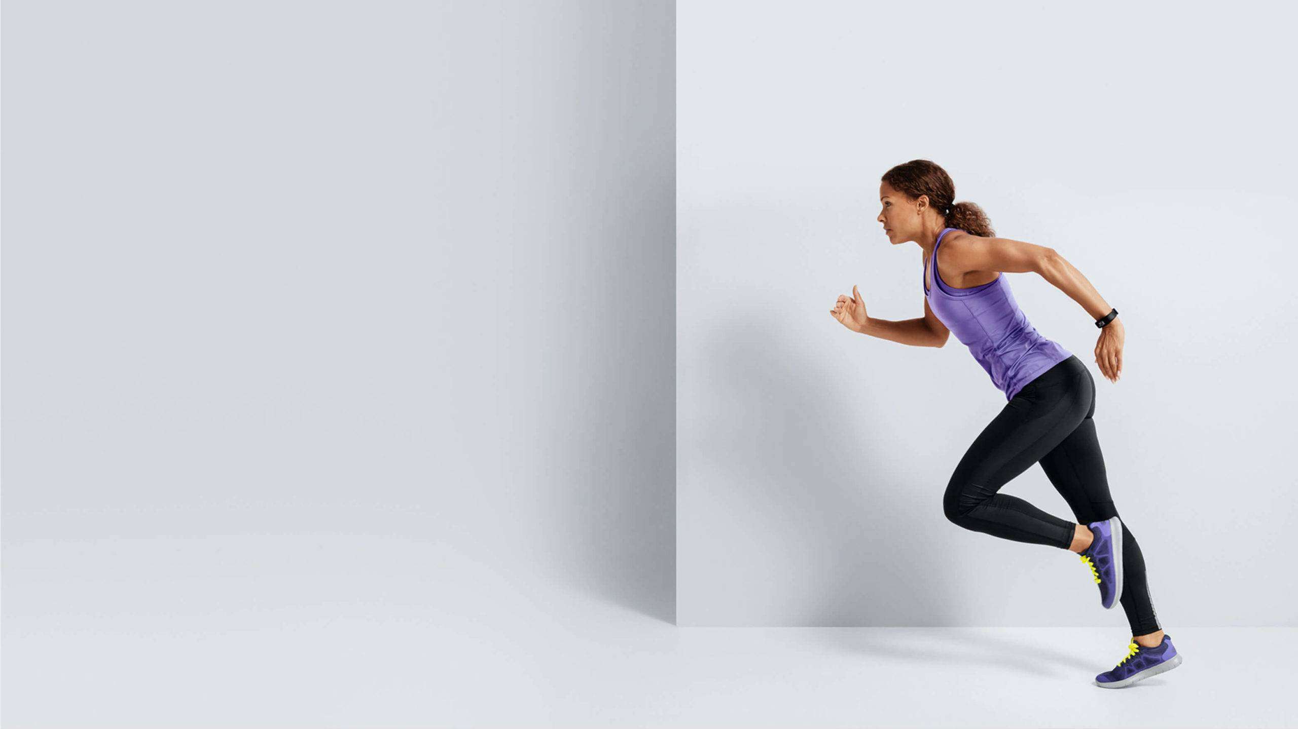
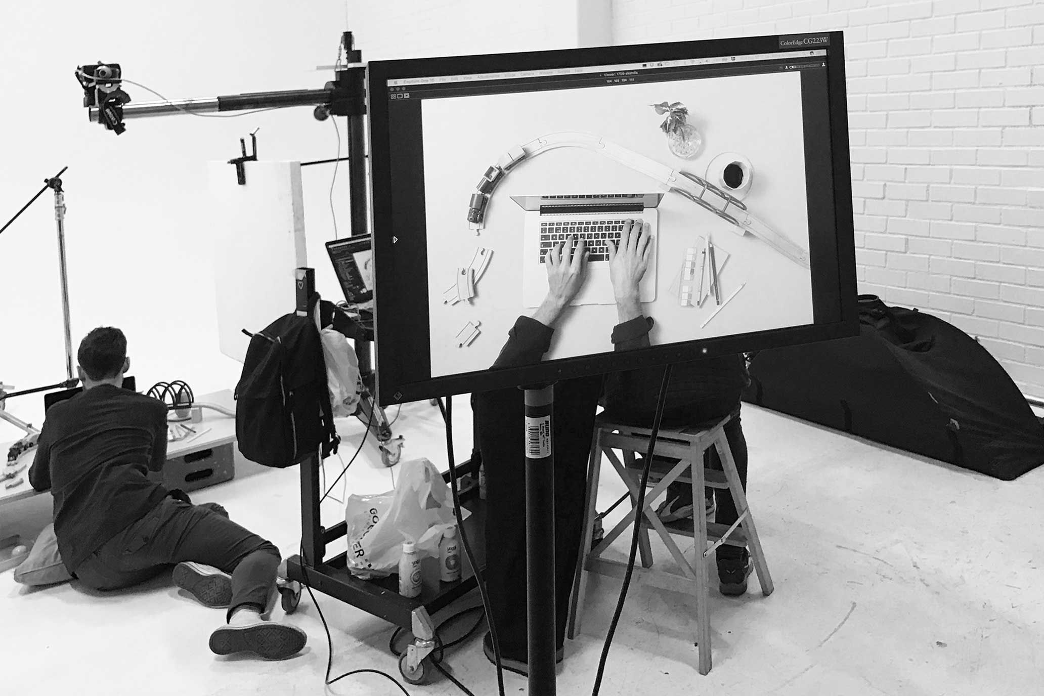
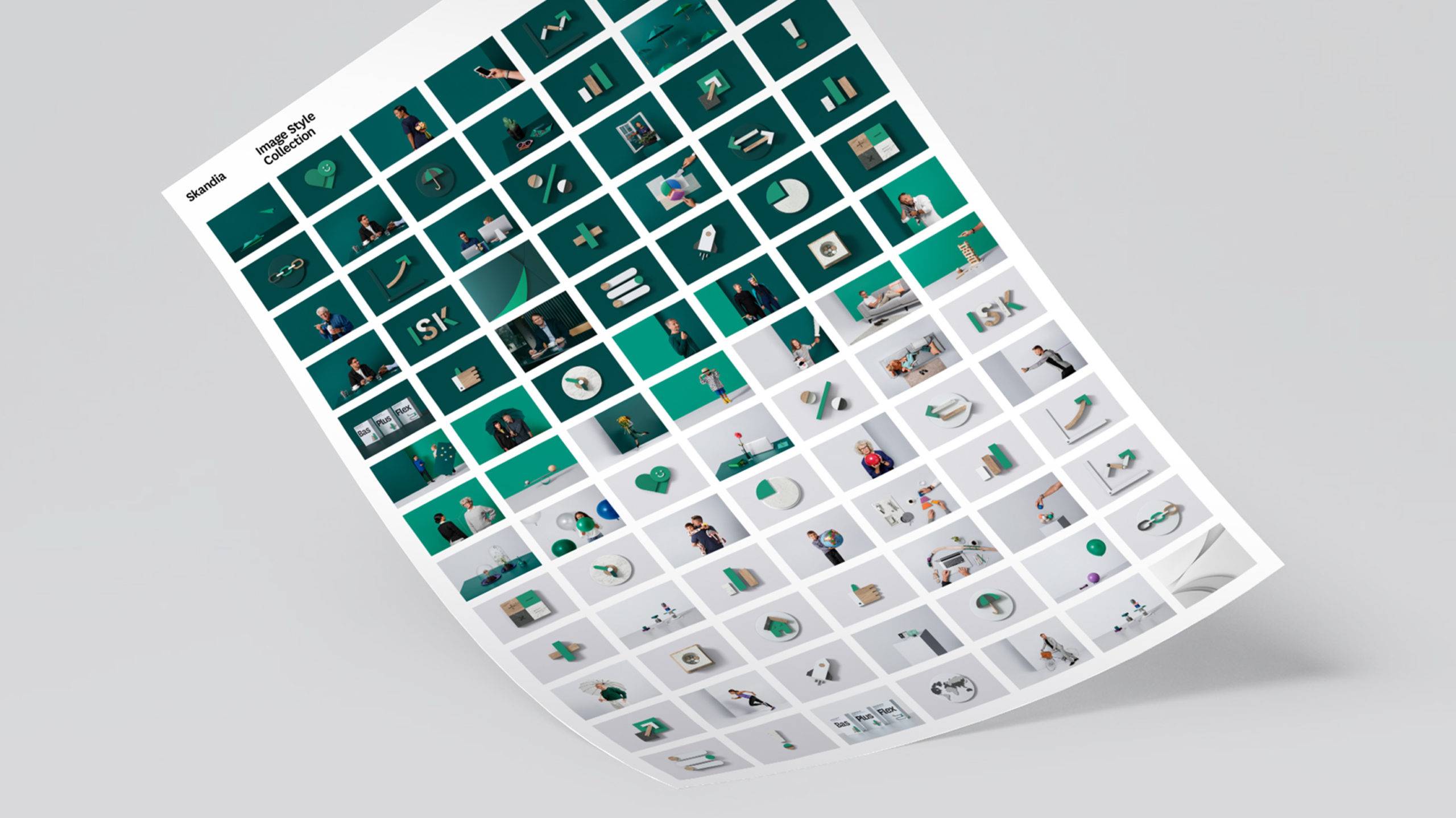
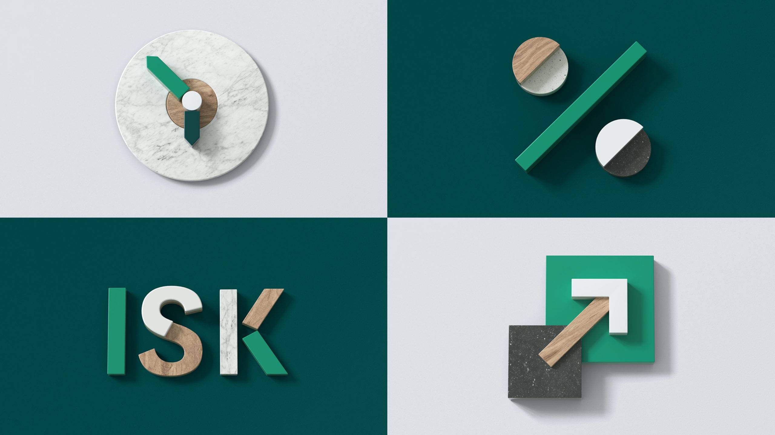
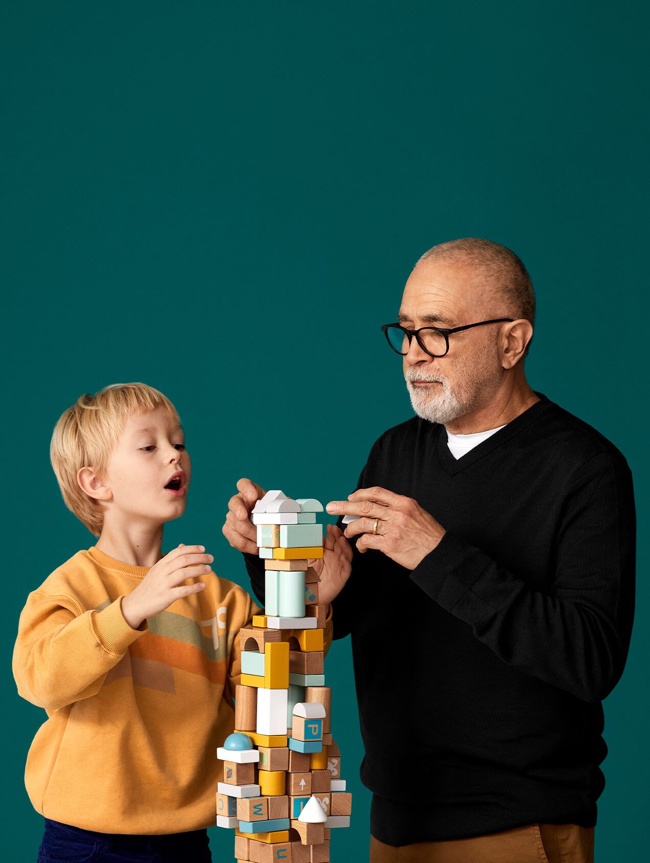
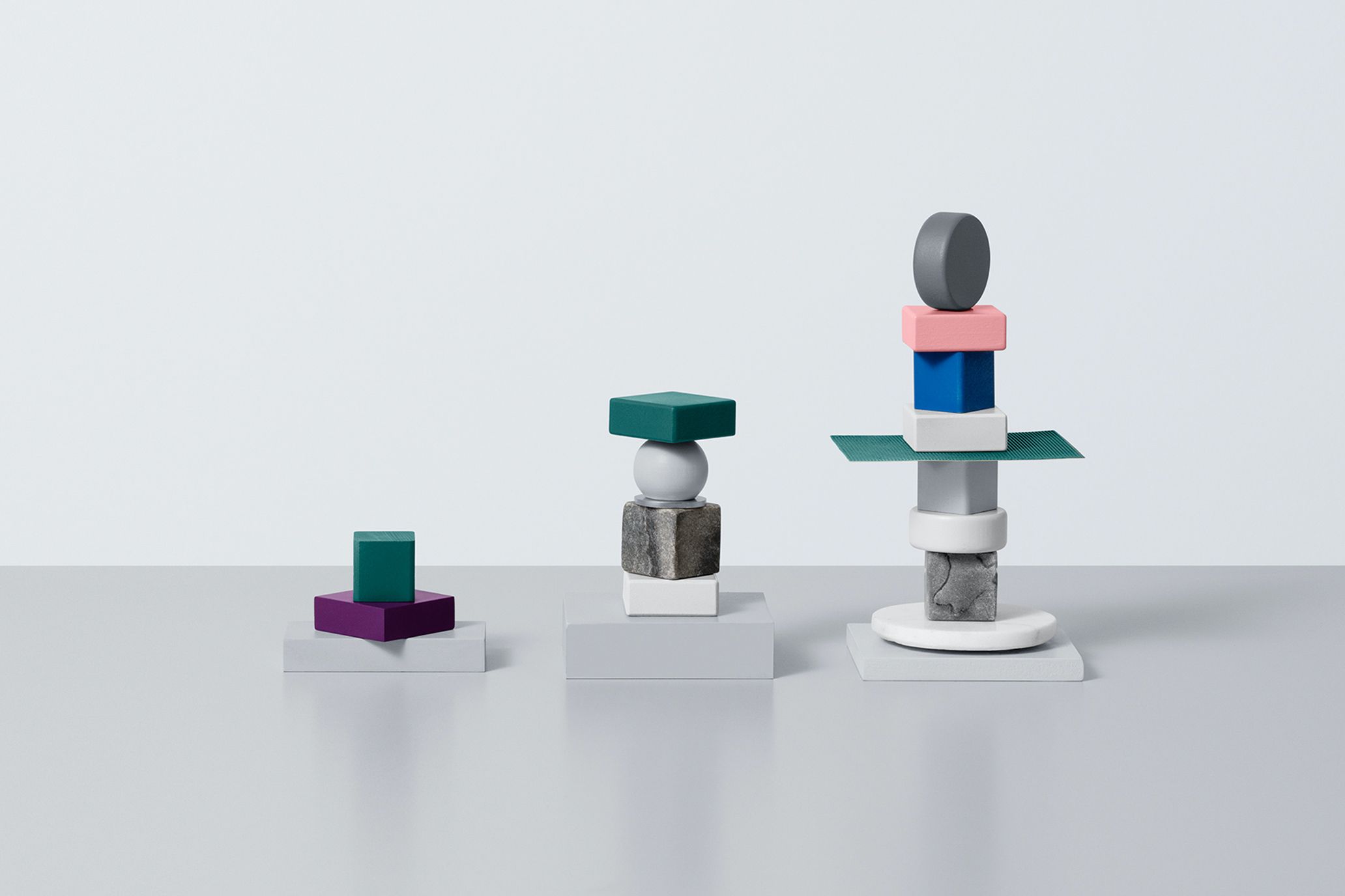
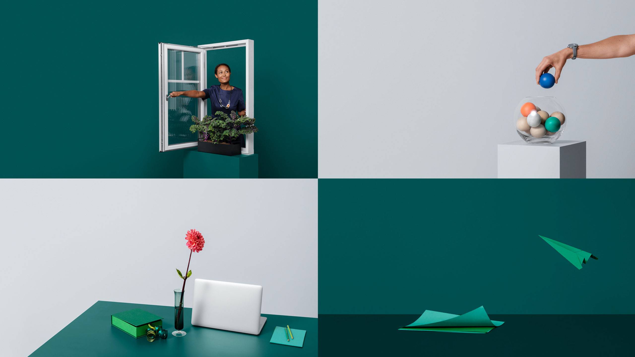
One of the most visible things we’ve done for Skandia’s is their new image bank. Almost 100 new photographs, 3D renders and animations have been developed in collaboration with photographer Klara G and 3D artist Elias Klingén. Each of them with a clear message. All in the same look and feel – premium yet warm, human and a tiny bit quirky.
A gradual revolution
Skandia is big company, and the repositioning we’ve done together has been a gradual change, not a sudden revolution. That being said, looking back at where we started just two years ago, the change is as dramatic as any rebranding we’ve ever done. Today, they have a clear position. They‘re a big player with a big heart and a unique voice.
Communicating what’s Next
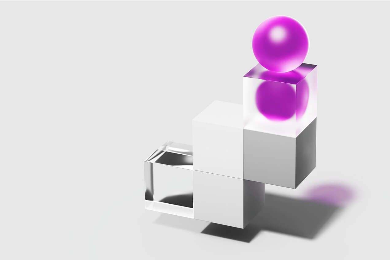
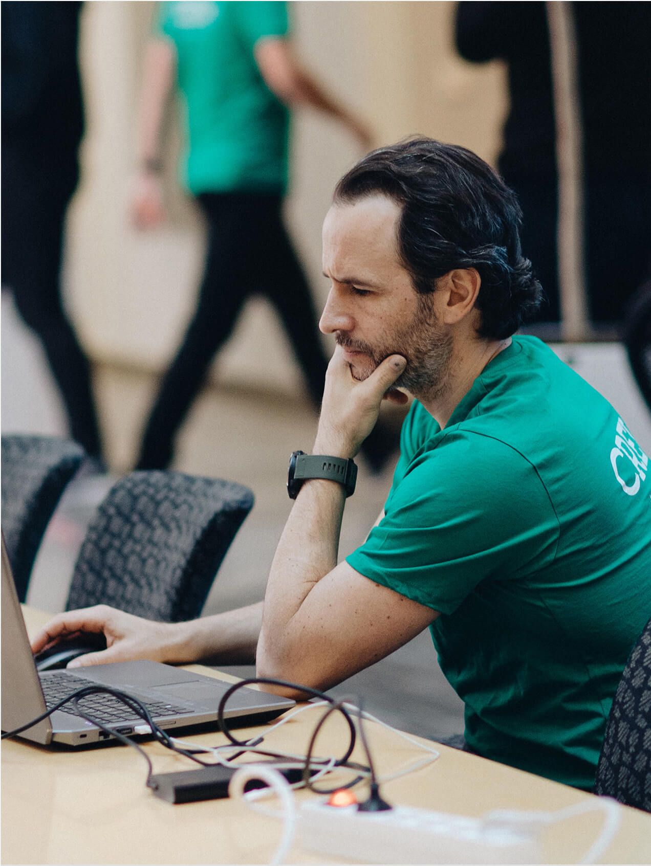
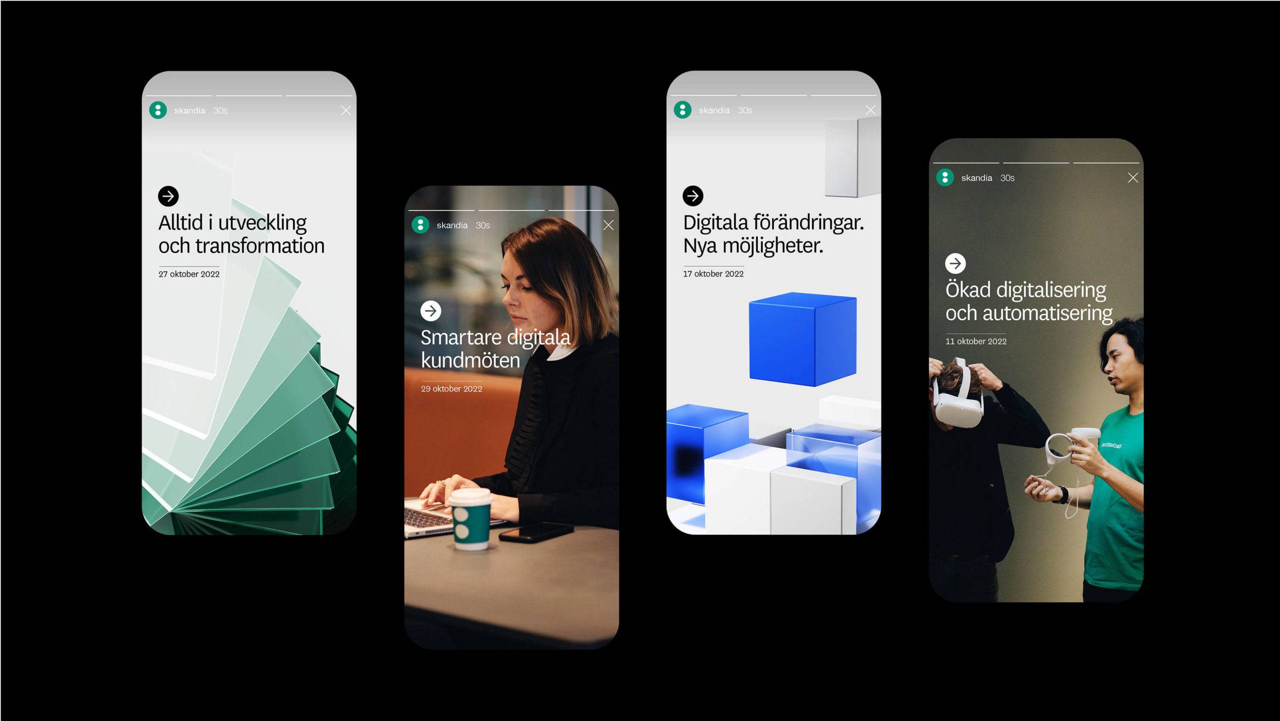
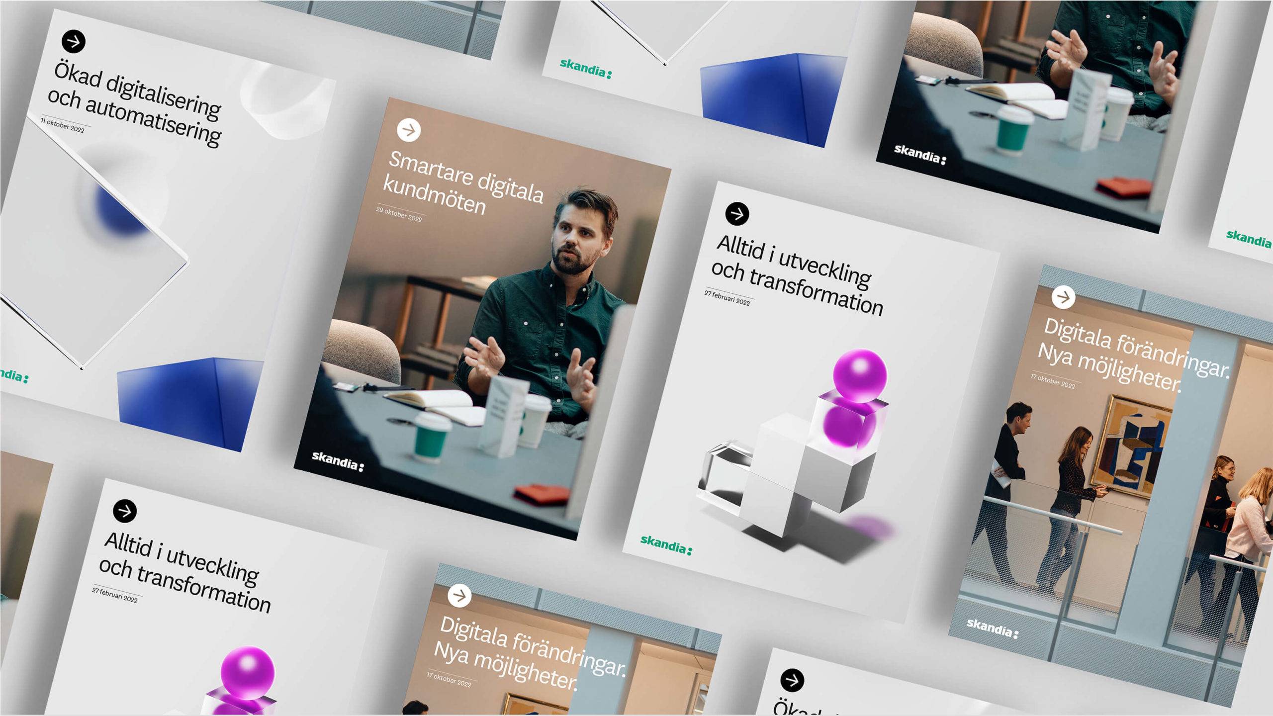
To become an even faster, simpler and more modern company, “Skandia Next” was developed. A program with the mission to lead, drive and ensure a comprehensive digital transformation of the insurance business. To help Skandia communicate the initiative internally, we created an own identity for the programme, putting great emphasize on forward motion and change, especially reflected by exciting and abstract motifs. We also brought in a scaled-down and light colour palette to create proper separation from the master brand. Finally, we developed an image concept portraying people making positive change together. Everything made with the goal to engage and include the employees in an exciting new chapter for Skandia.




Ideas for life
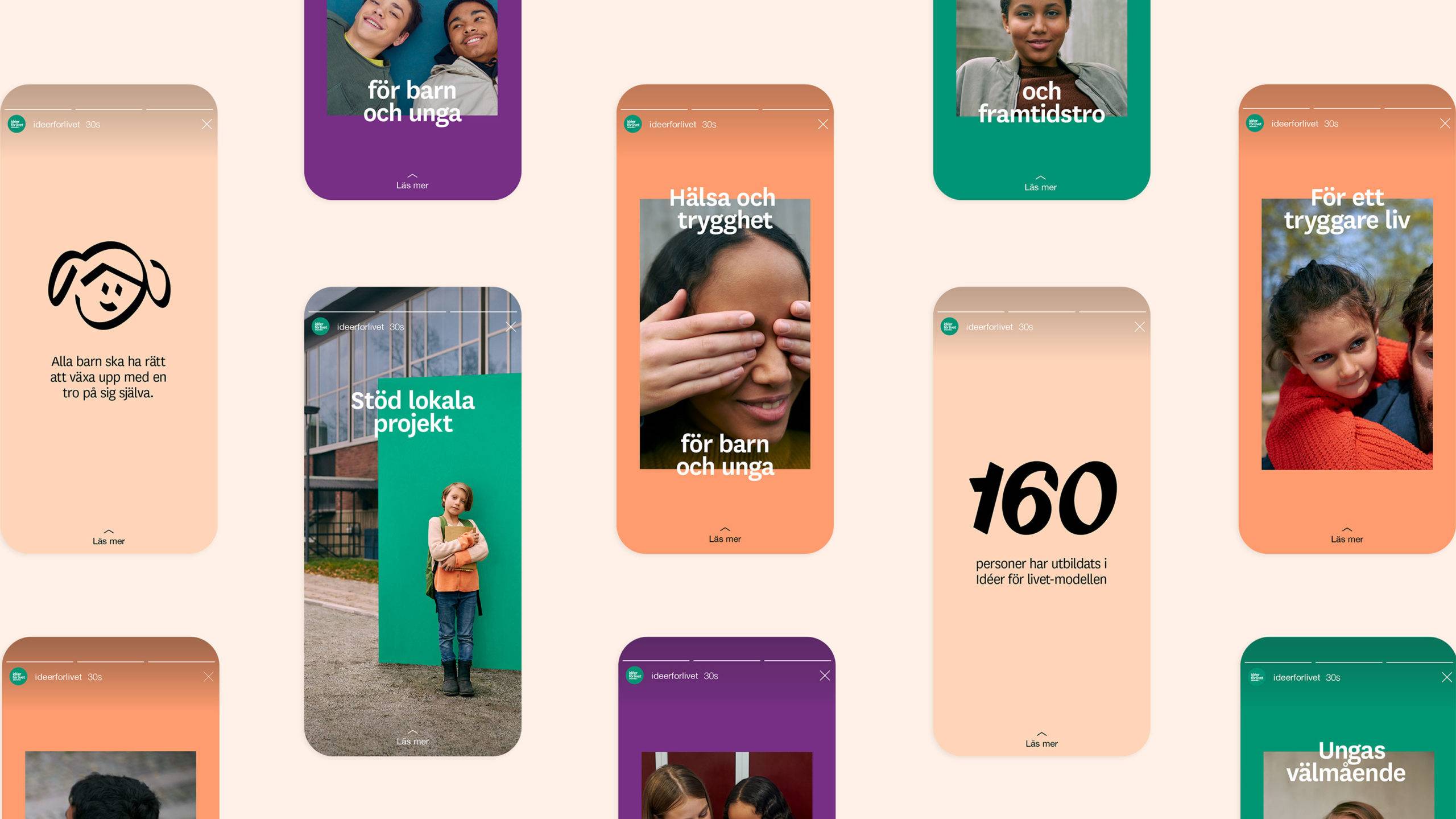
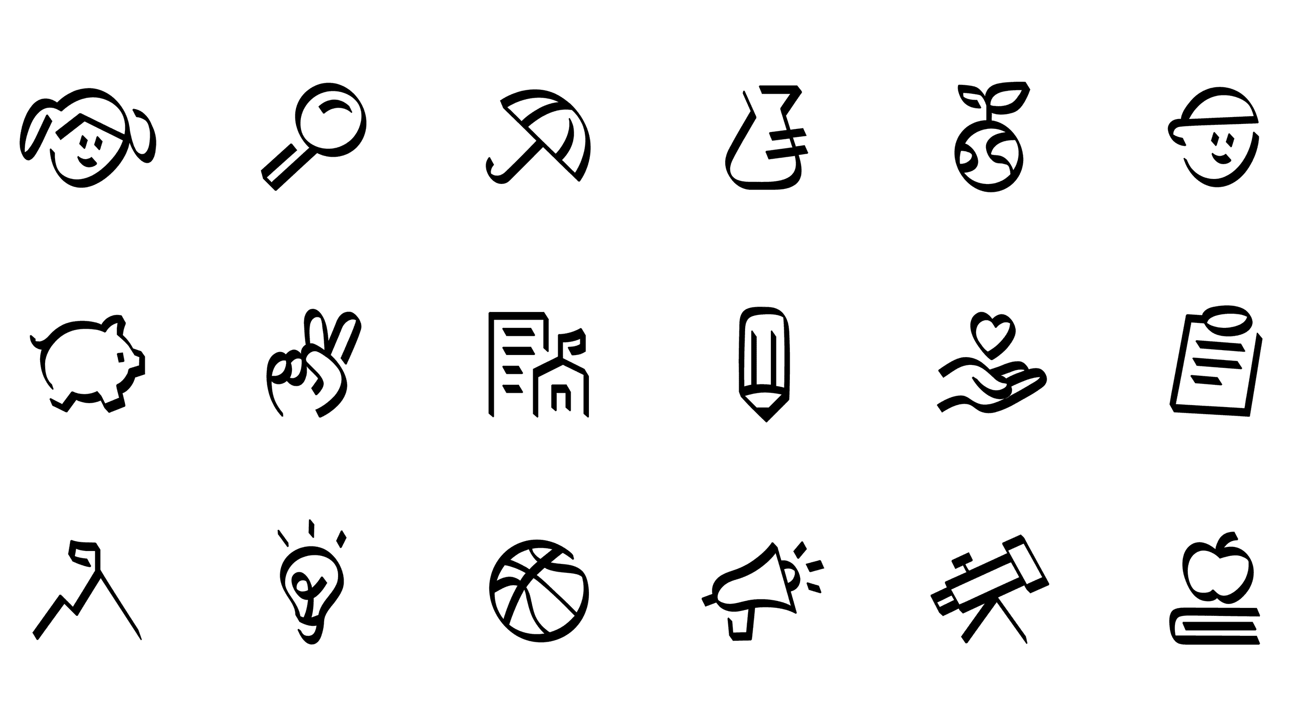
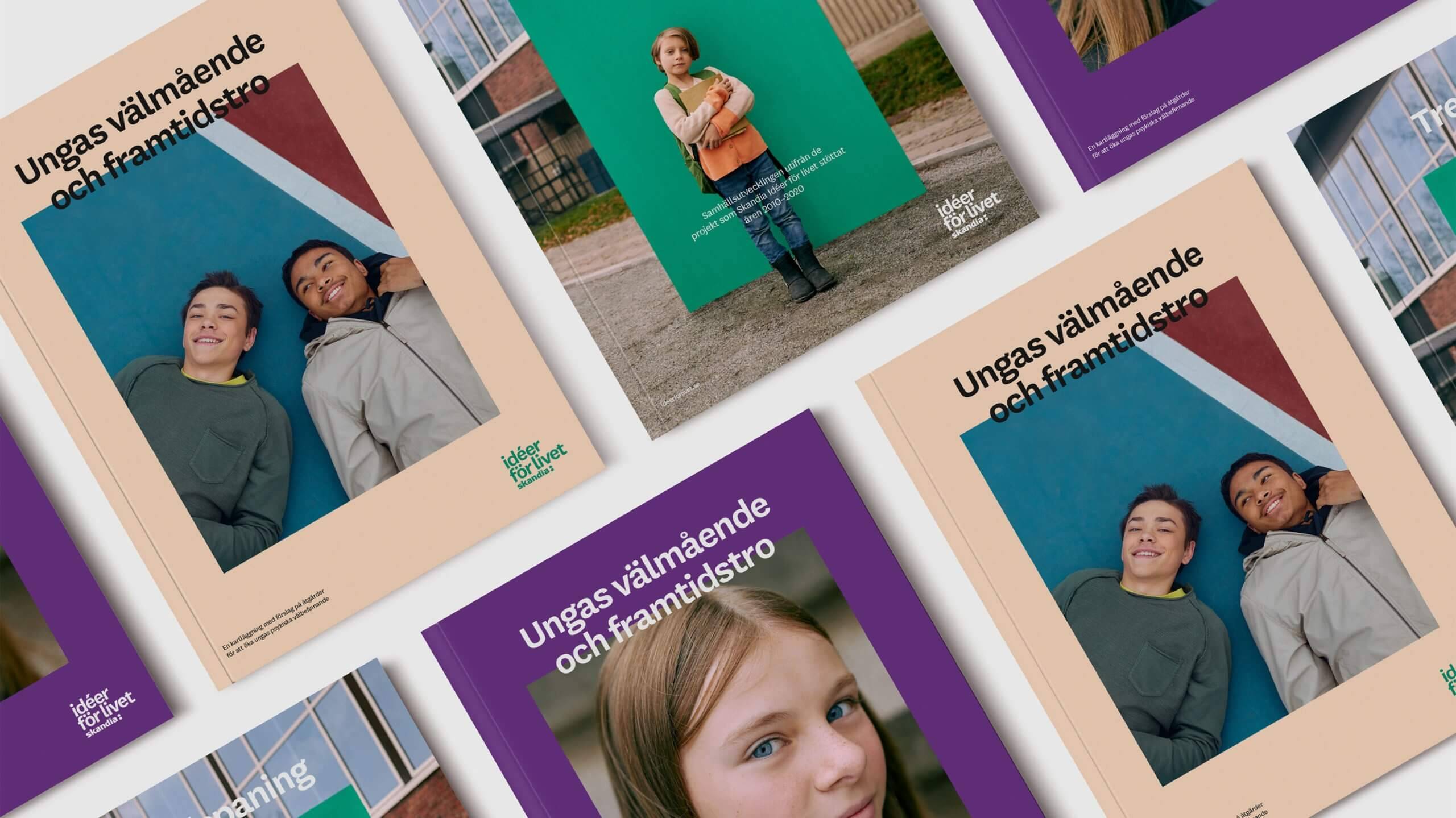
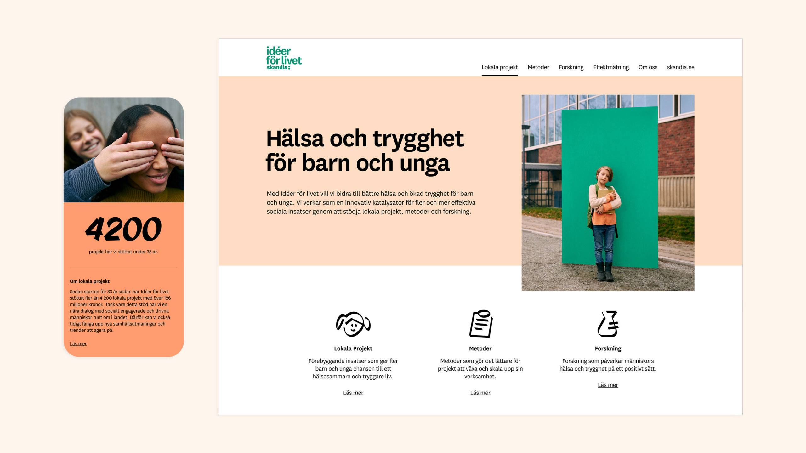
Skandia's foundation “Ideas for life” started back in 1987 and has since then worked tirelessly for better health among children and teenagers through a series of important projects and initiatives. Together with Skandia, we developed a new identity for the foundation, consisting of a warm and inclusive graphic manner, inspiring portraits with high recognition for the target group, as well as typography and icons with a sense of progression and forward movement. The result was a clearer and stronger brand for the foundation. And a big step forward in building a stronger relationship with Sweden’s youth.

