Making things fit
SIS
The Swedish Institute of Standards is a government organization appointed to ensure that things fit with each other. From the simplest wall plug and screw to global data networks and healthcare systems. Its members pay an annual fee and are typically large companies in the manufacturing or technology industries.
What we did:
Design
Visual identity Iconography UI design Motion design
Content
Copywriting Illustrations
Press
“Ny strategi för SIS”, Cap&Design

In search of something more fitting
When SIS contracted us, it needed to update its identity. The current one no longer reflected those members who operated in future-facing technology companies. The organization needed to modernize and increase the relevance of its operations and make all its paying members feel at home.

The essence of SIS
SIS clearly specializes in the development and promotion of standards. So, it follows that the organization’s brand identity should communicate just that. Making things fit and work together. This was a common denominator for all members of the organization regardless of product or technology. A simple insight was boiled down to the concept “it fits”. This laid the groundwork for everything from design principles and brand identity to individual assets.
A new standard
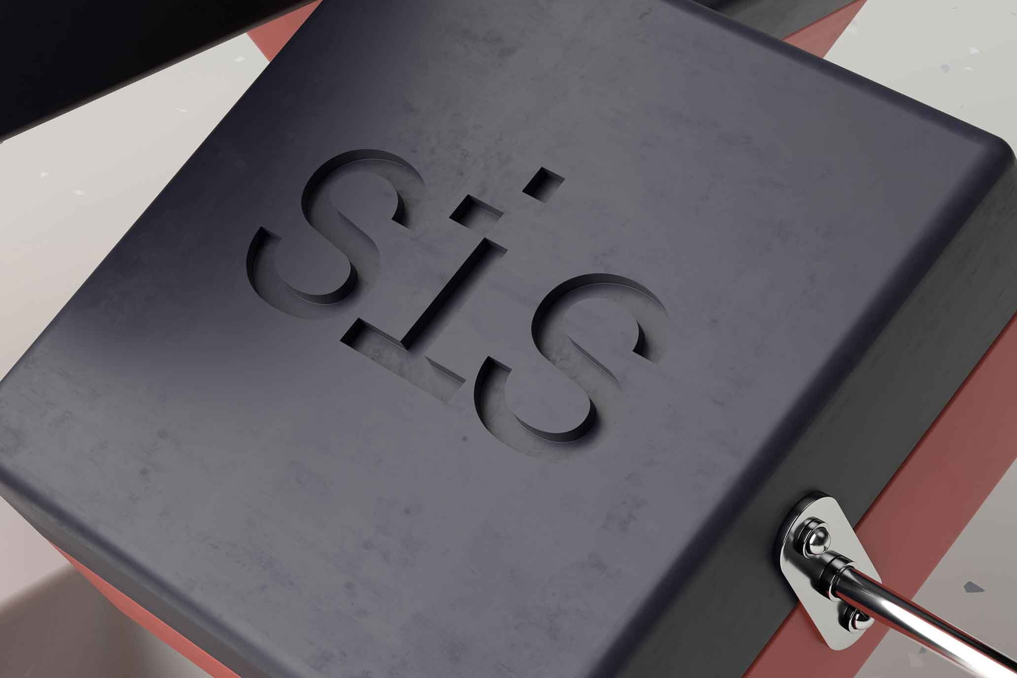
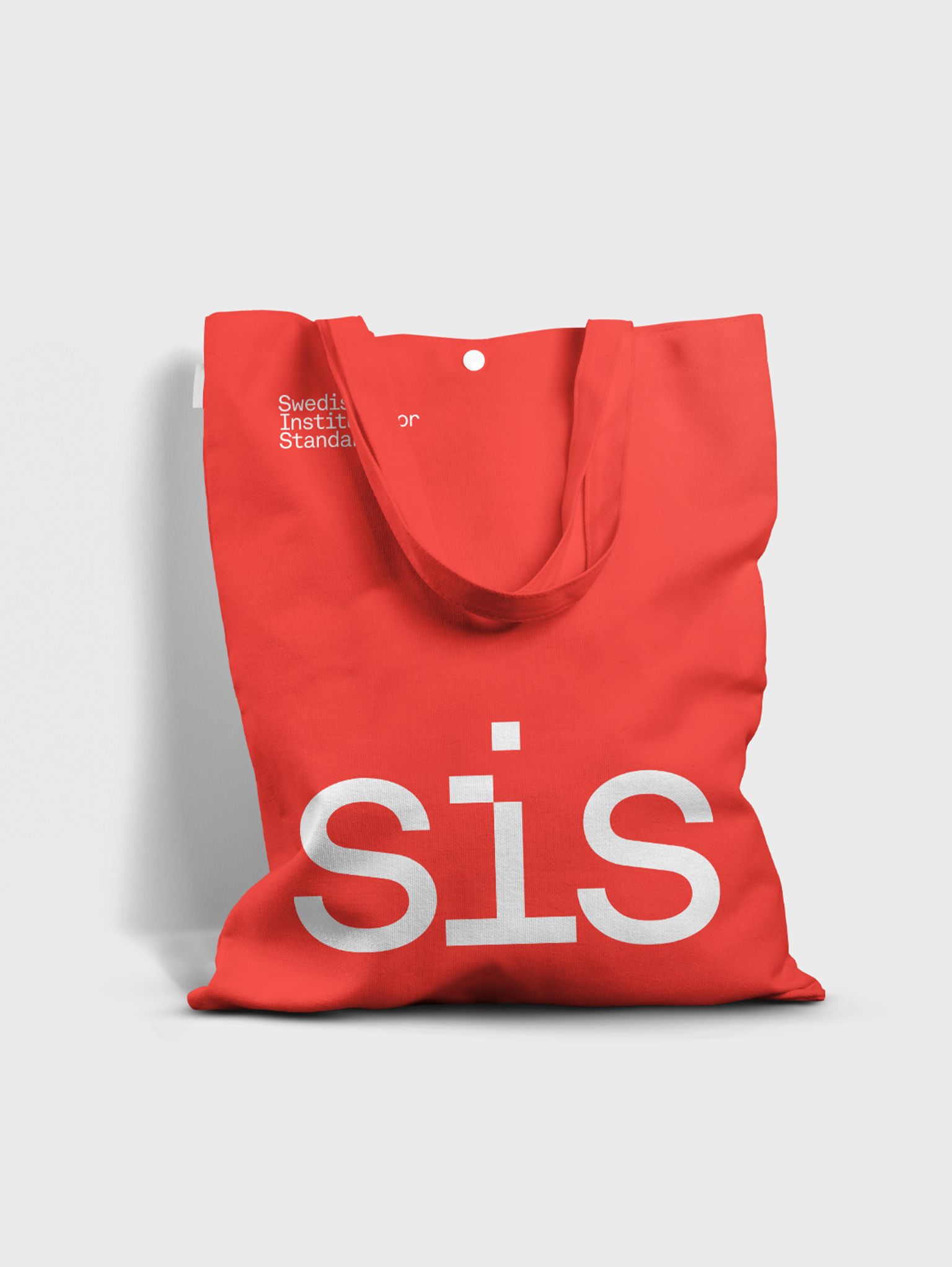
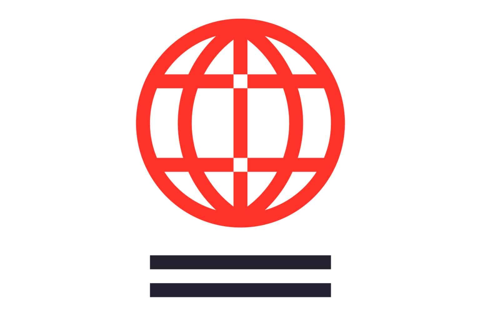
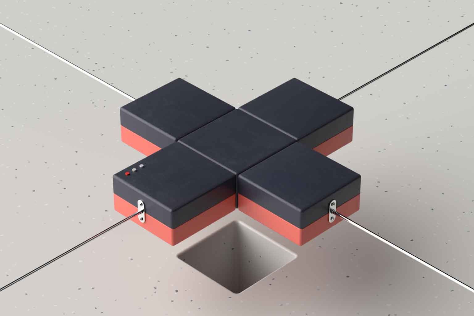
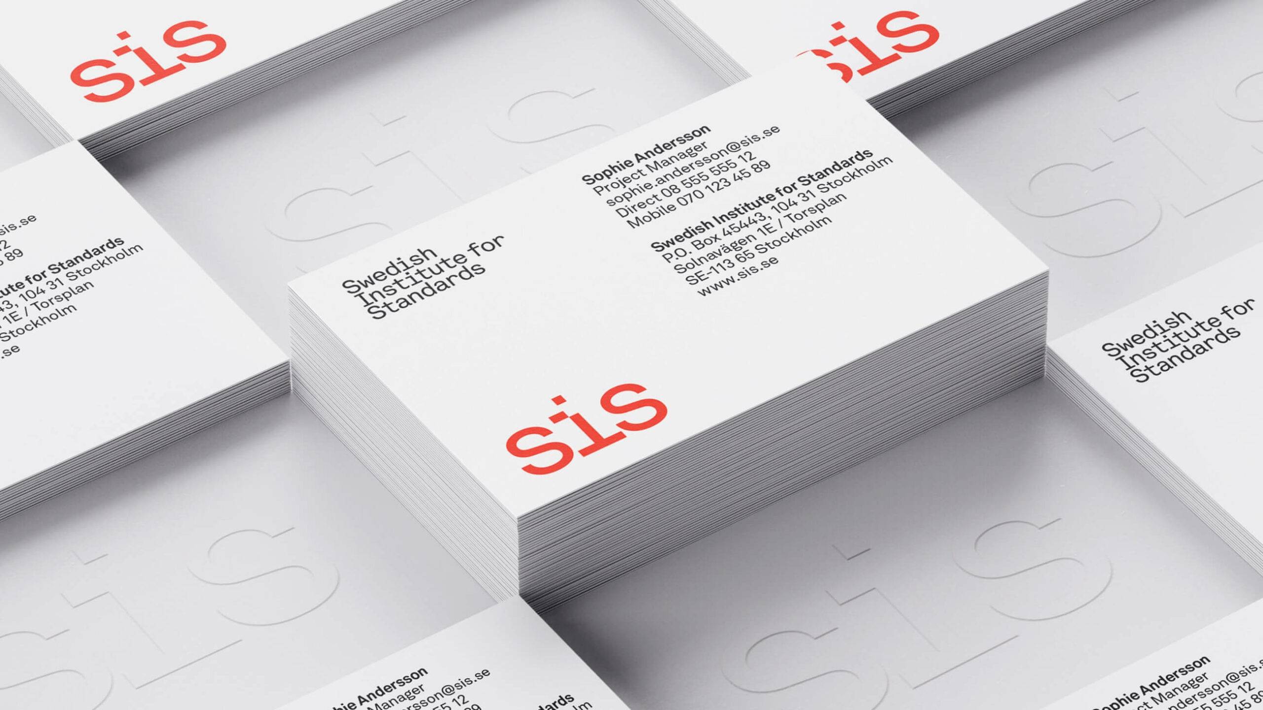
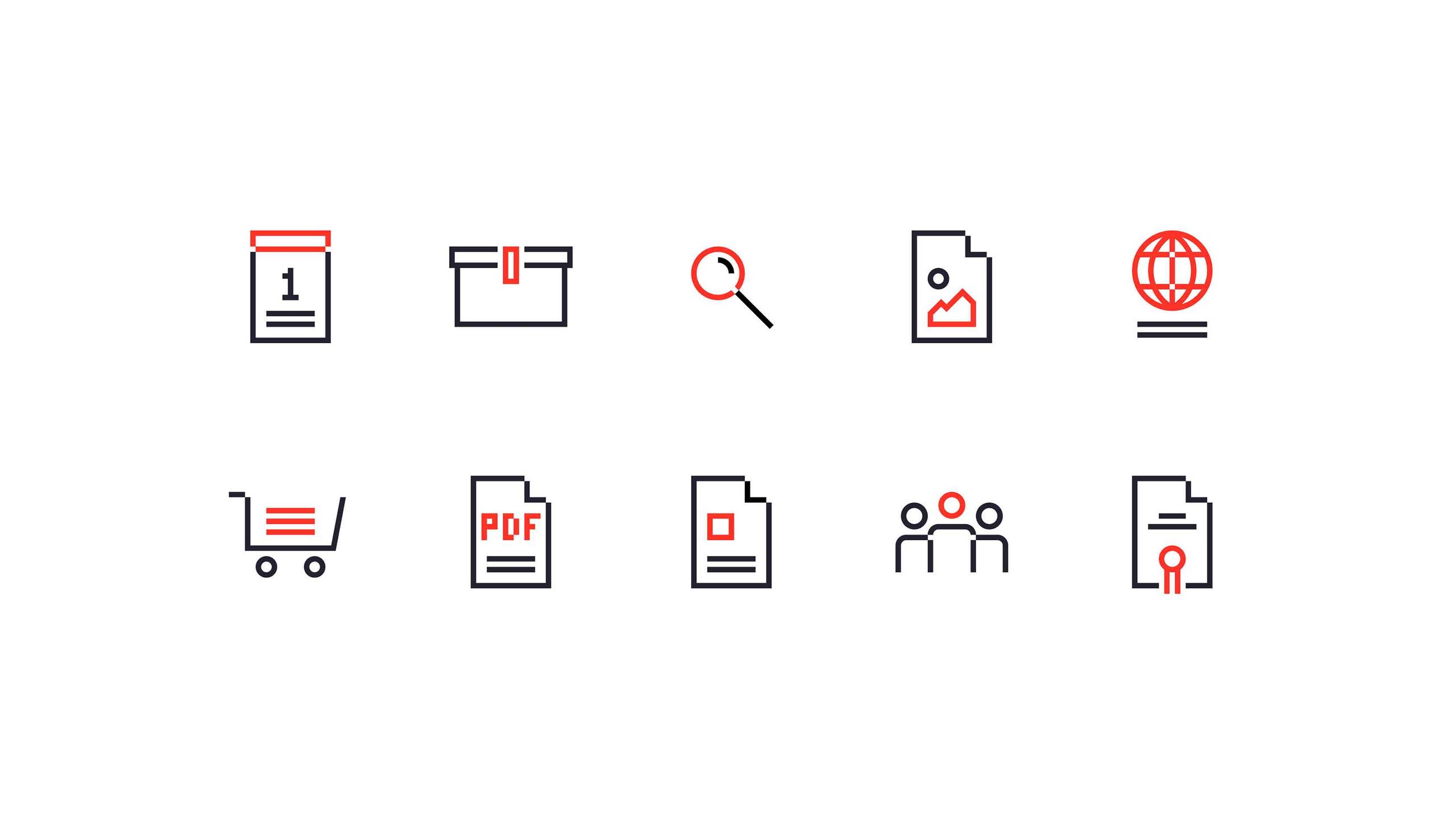
The notion of “it fits” permeated the brand identity and its implementation. The new logotype had a puzzle-like quality to it, and the iconography too, to name a couple examples. The color palette was updated with a primary red to strengthen SIS’s ties with its parent organization ISO, and 3D imagery was developed. The new SIS brand identity was launched to the public in the spring of 2019. They now have an identity that stands out and raises the bar. A new standard, if you will.
