Rebranding Stockholm
STOCKHOLMS STAD
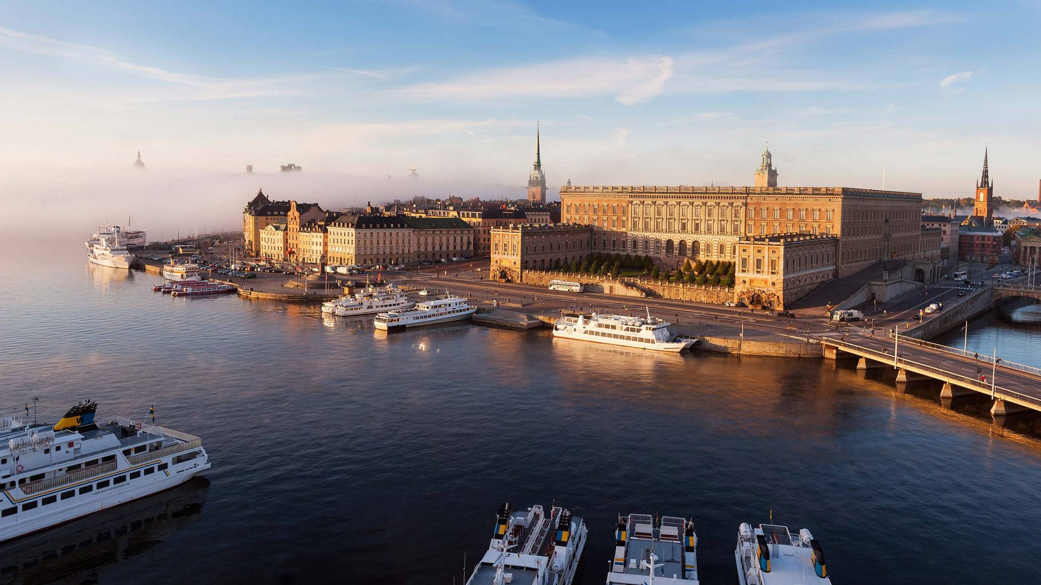
Everything the City of Stockholm does is funded by taxpayers. Yet, their habit of creating a new brand for every single initiative was obscuring their accomplishments. Citizens felt they were not getting their money’s worth. In 2012, a five-year process to rebrand the entire City of Stockholm took off. The brief was to create a brand that reflected the vision of a world-class city.
What we did:
Strategy
Brand architecture Brand platform Brand positioning Naming Communication strategy Content strategy Social media strategy Change management program Qualitative and quantitative research studies
Design
Visual identity Verbal identity Bespoke typeface Iconography Illustrations Motion design UI design Packaging Websites and apps Environmental Guidelines / Brand portals
Content
Copywriting Scriptwriting Photography direction and production Motion video direction and production SEO Campaign Marketing plan Content plan Social media plan Implementation plan Design templates Office templates
Technology
Prototyping
In search of unity
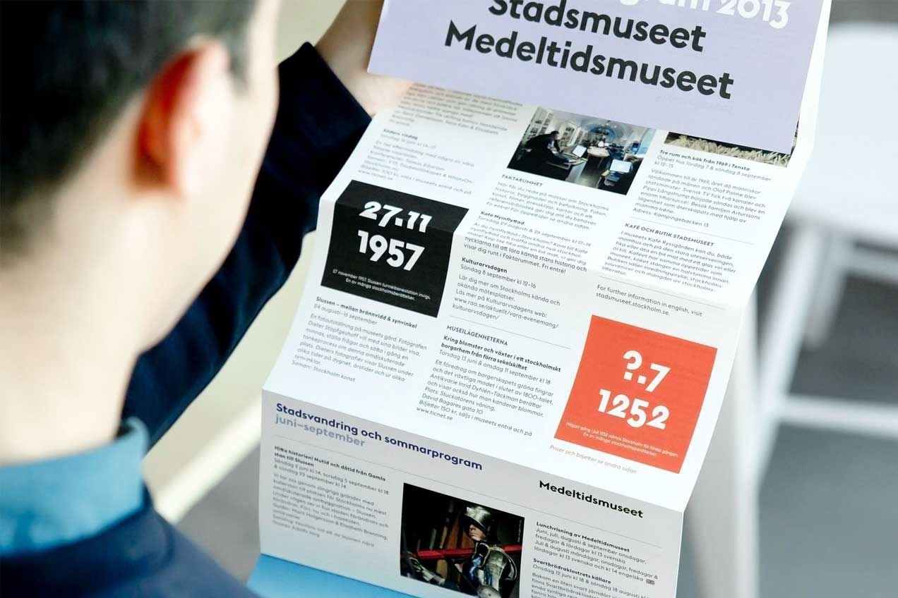
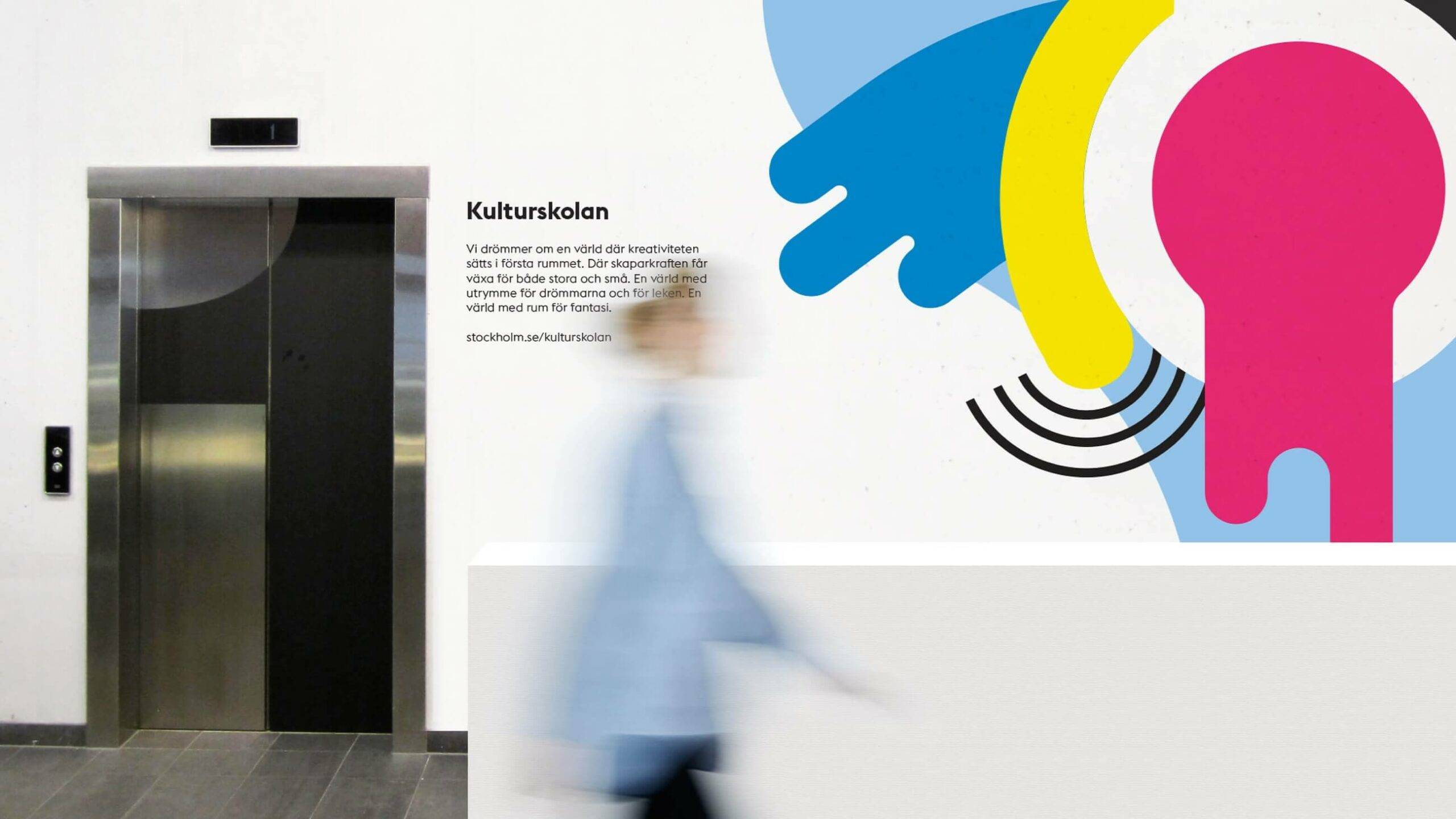
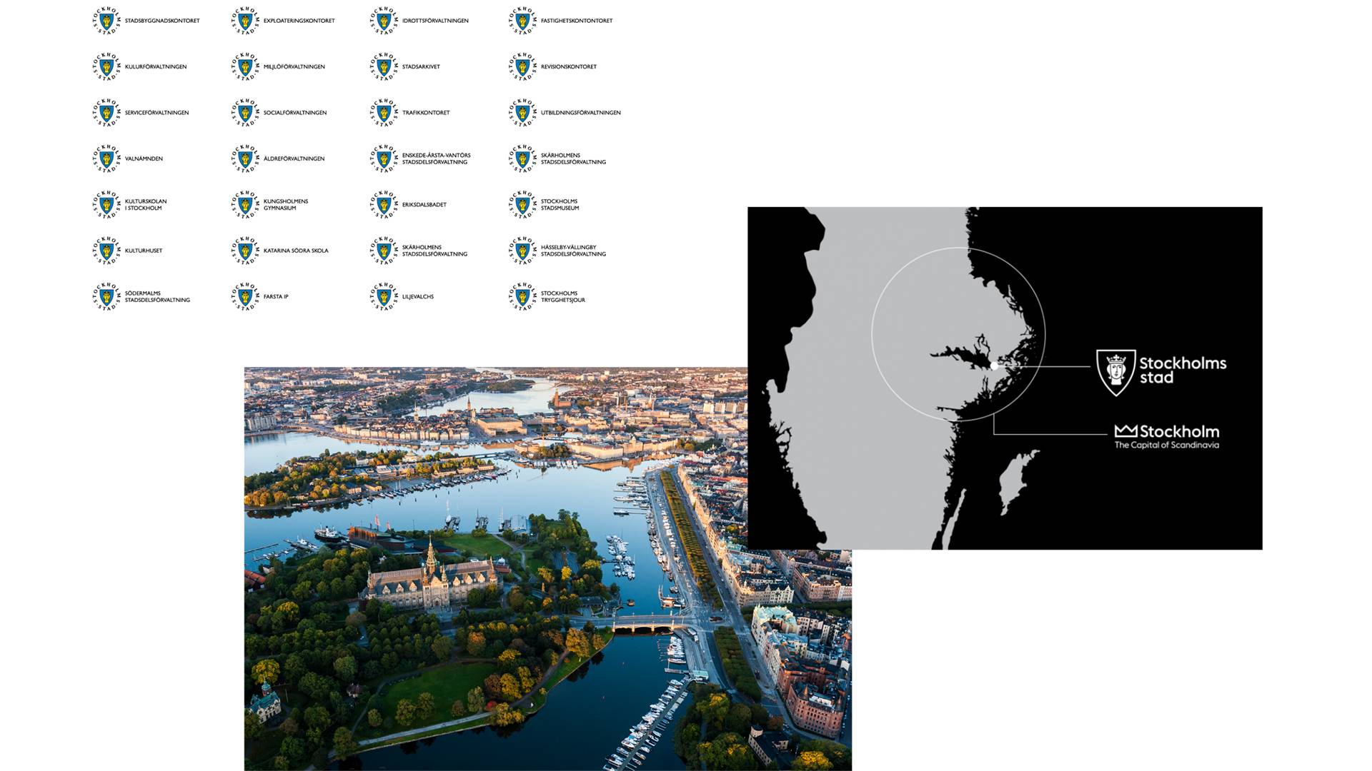
Since alignment was key, the new identity needed to work across all different sectors and applications and be just as suitable for the suburban pre-school as for the gym downtown. Adding to the project’s complexity were the city-owned brands Stockholm Archipelago and the Capital of Scandinavia which needed to be merged into the identity. The target group? One million people who had little else in common other than living in Stockholm.

“With the new graphic identity, all the city’s activities are linked together and become much clearer, making it easier for the people of Stockholm to understand what we do.”
Hanna BrogrenDirector of Communications, Stockholm City

One brand in town
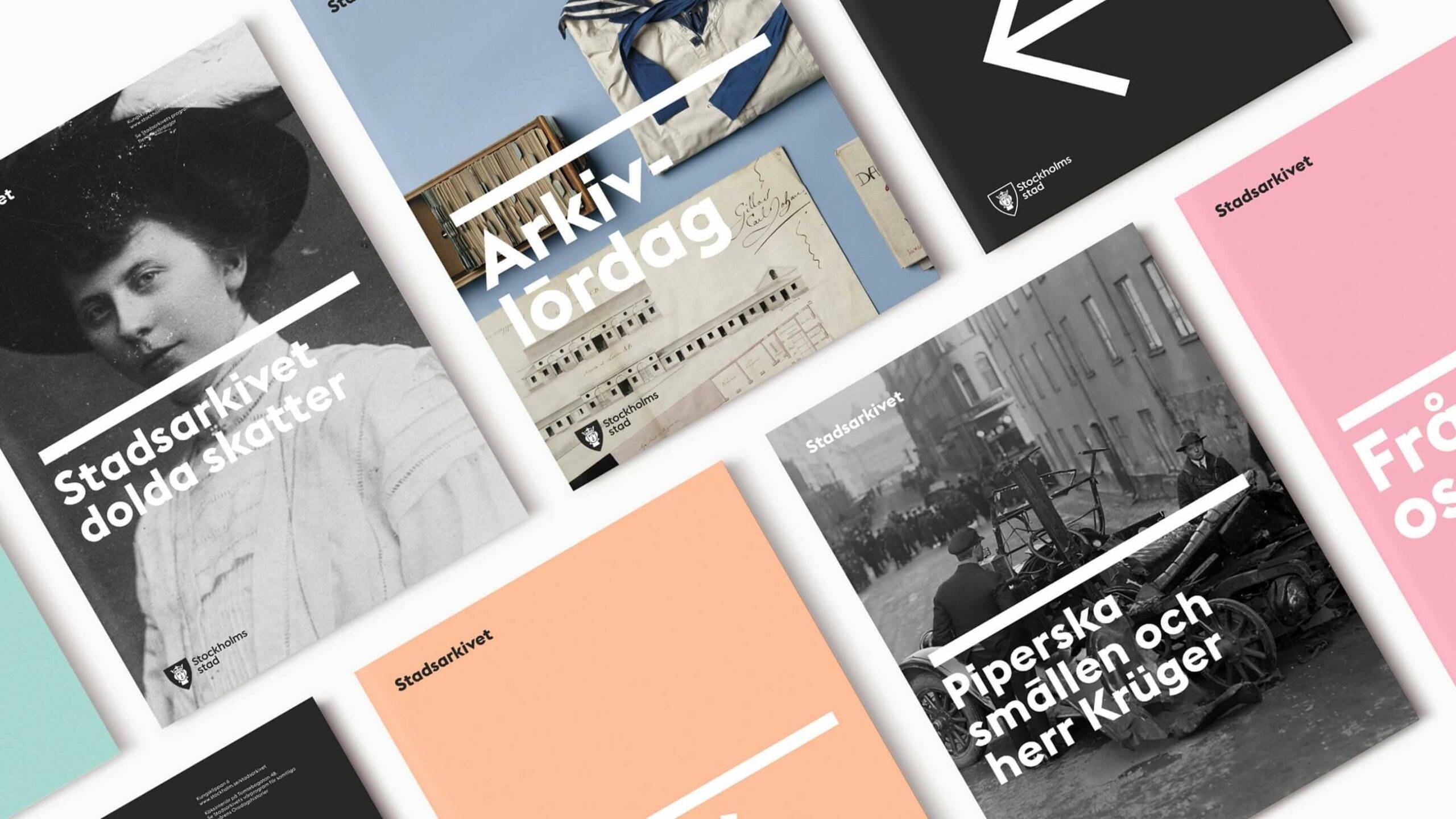
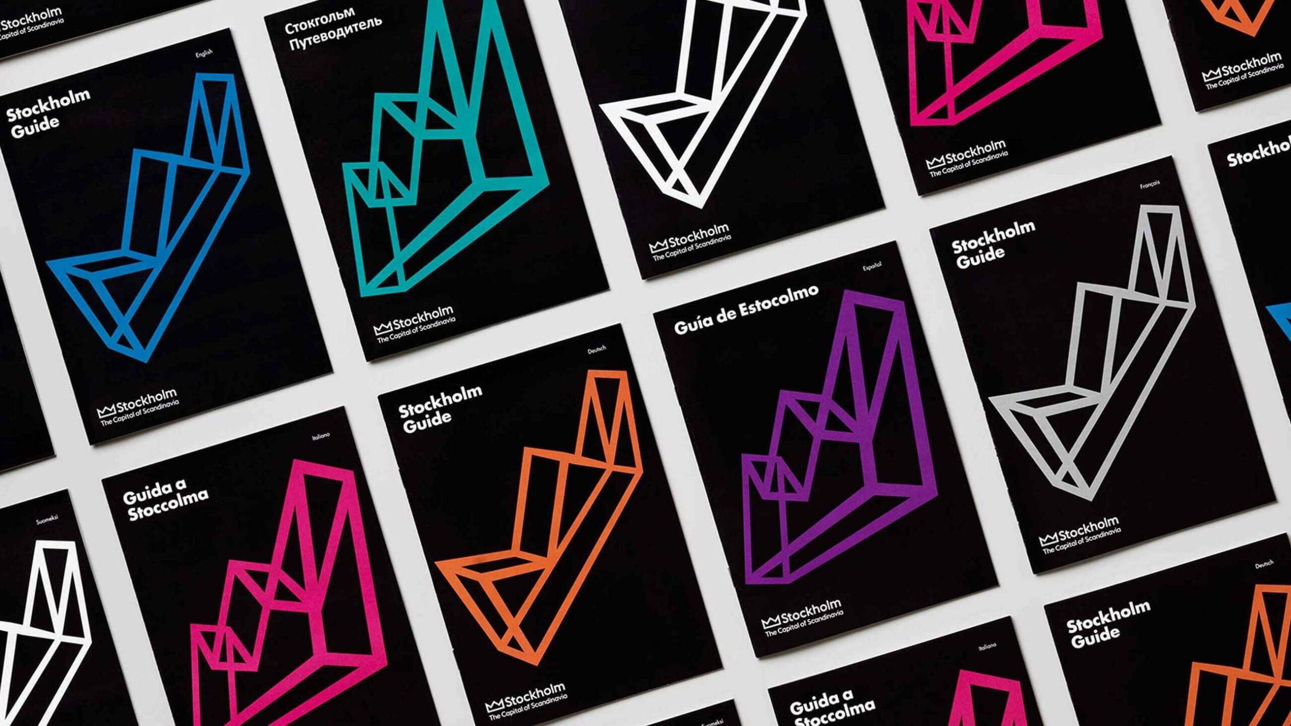
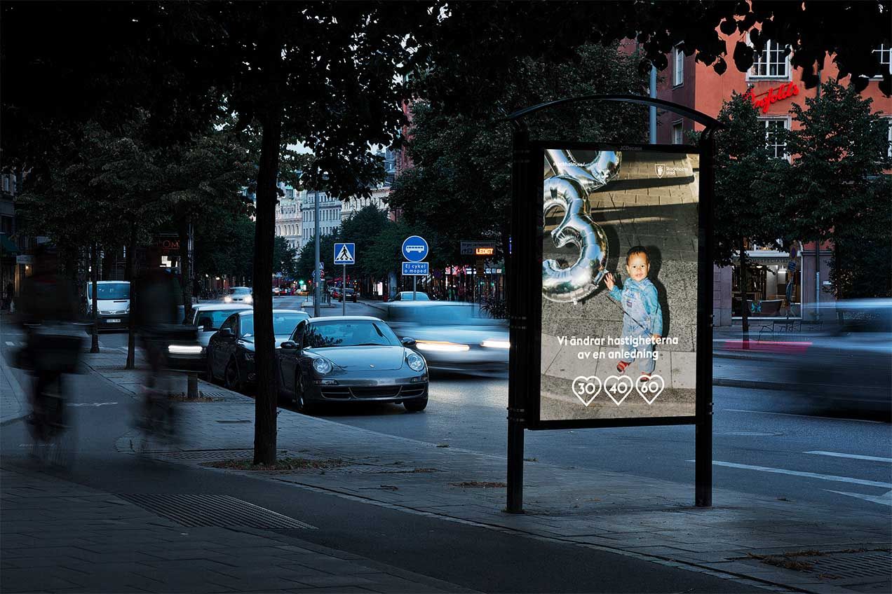
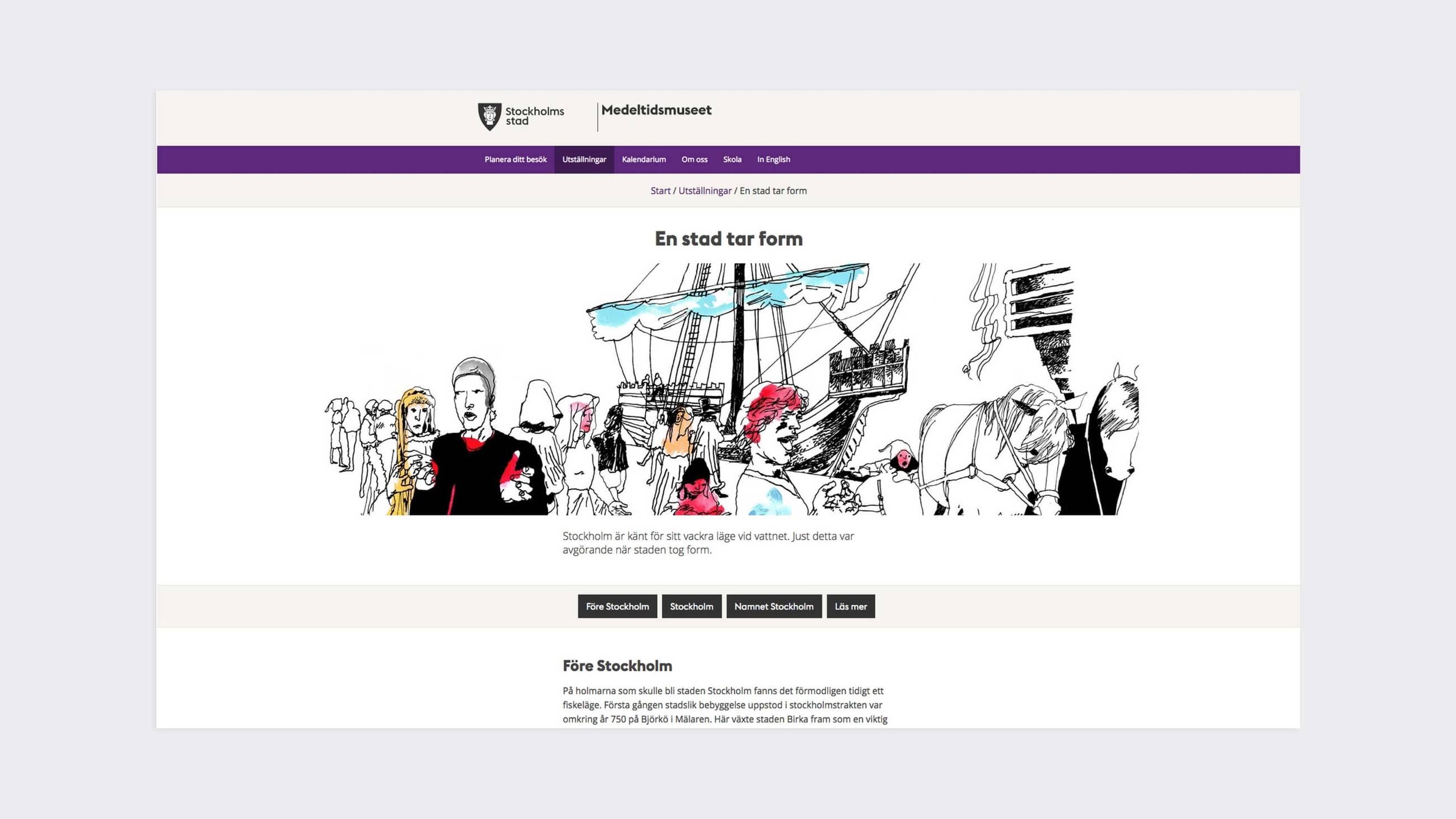
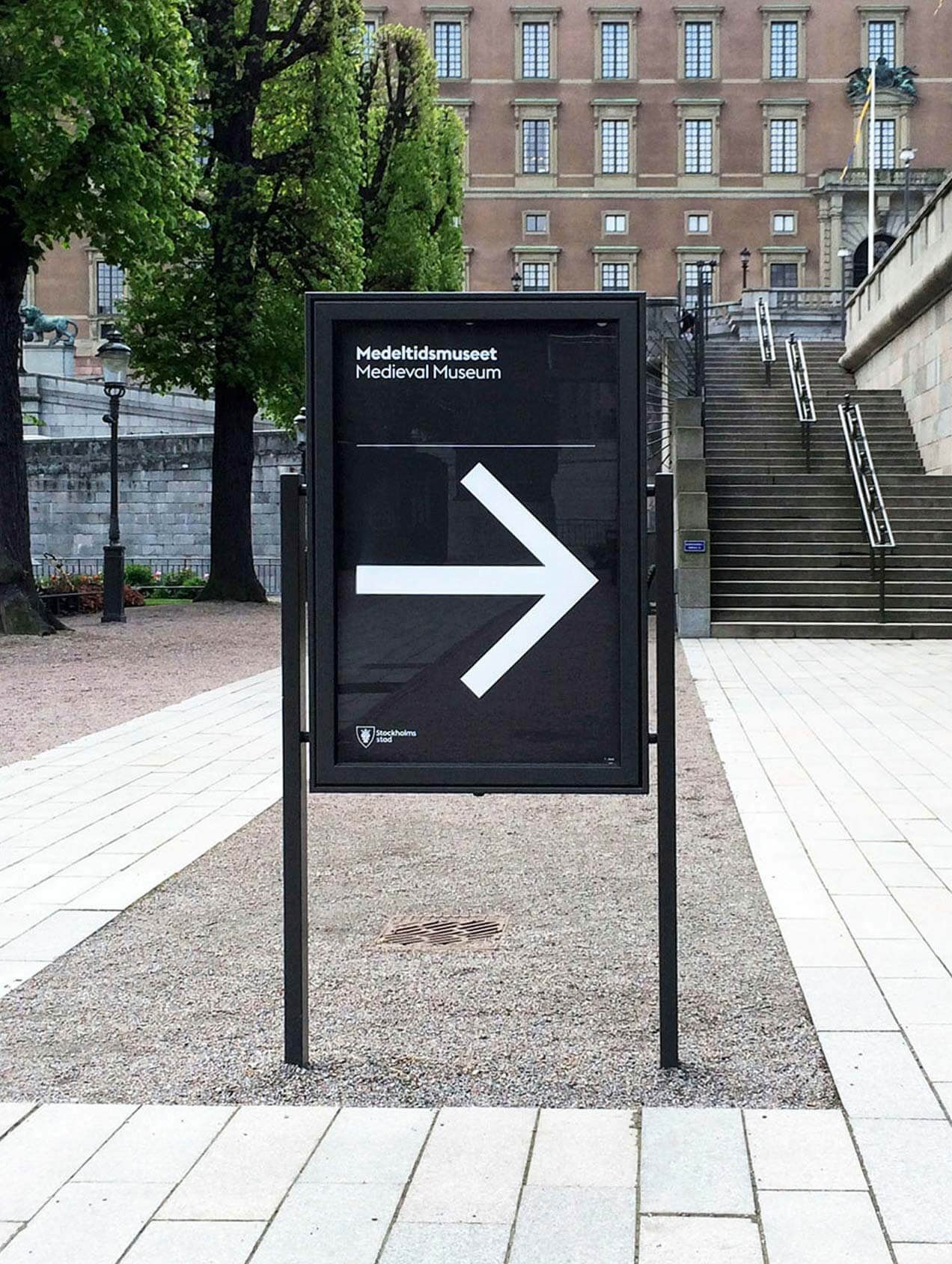
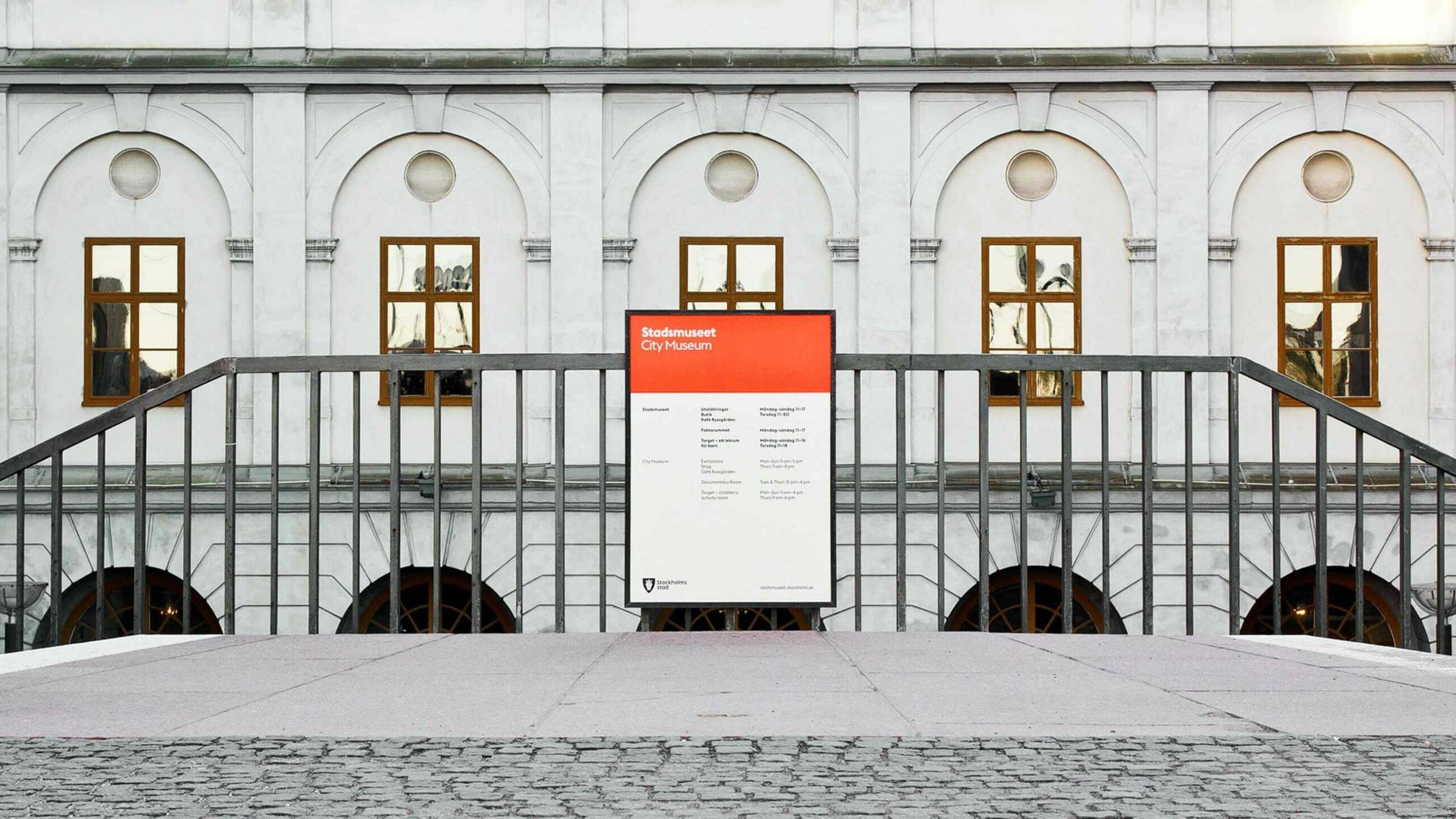
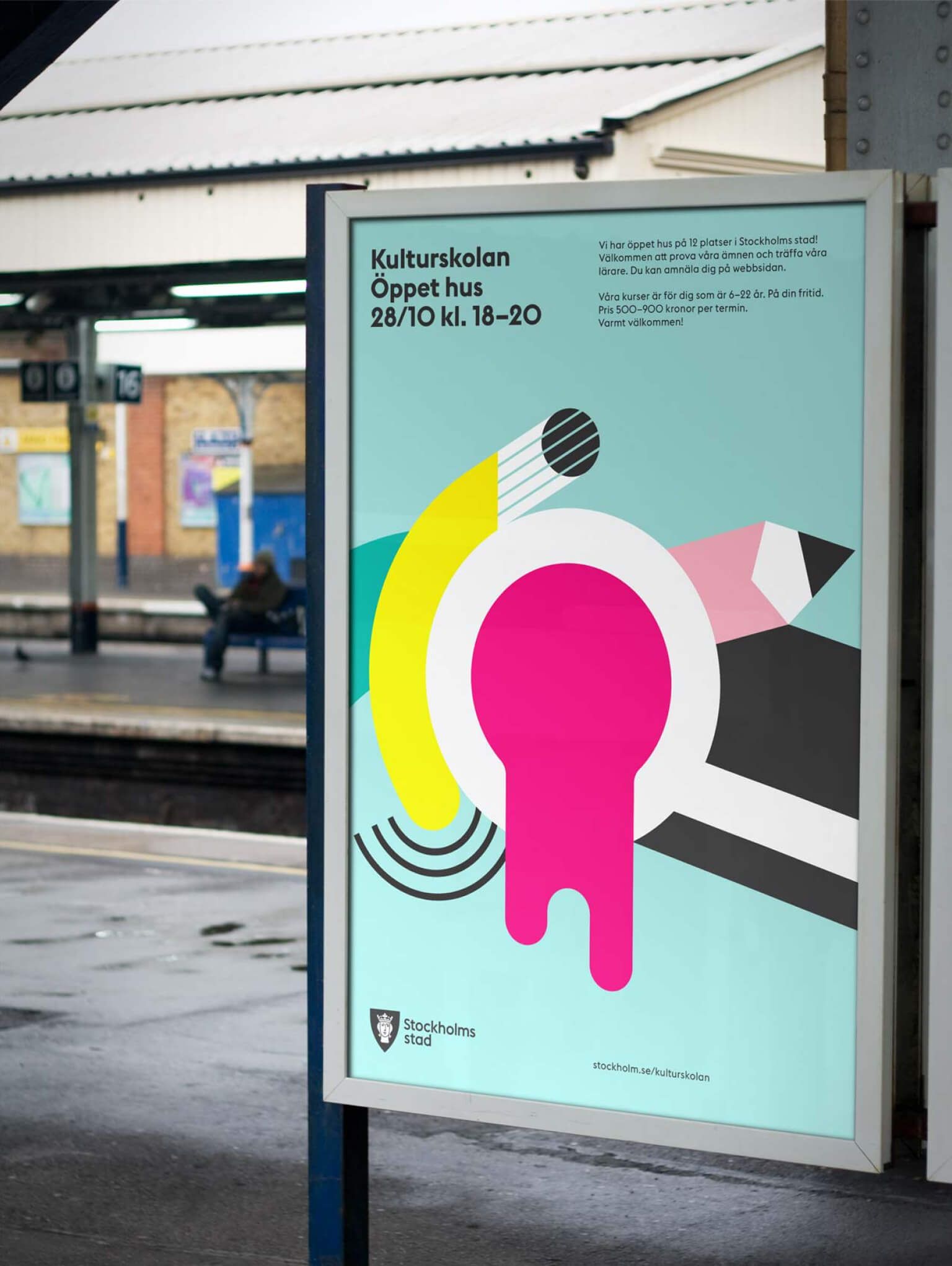
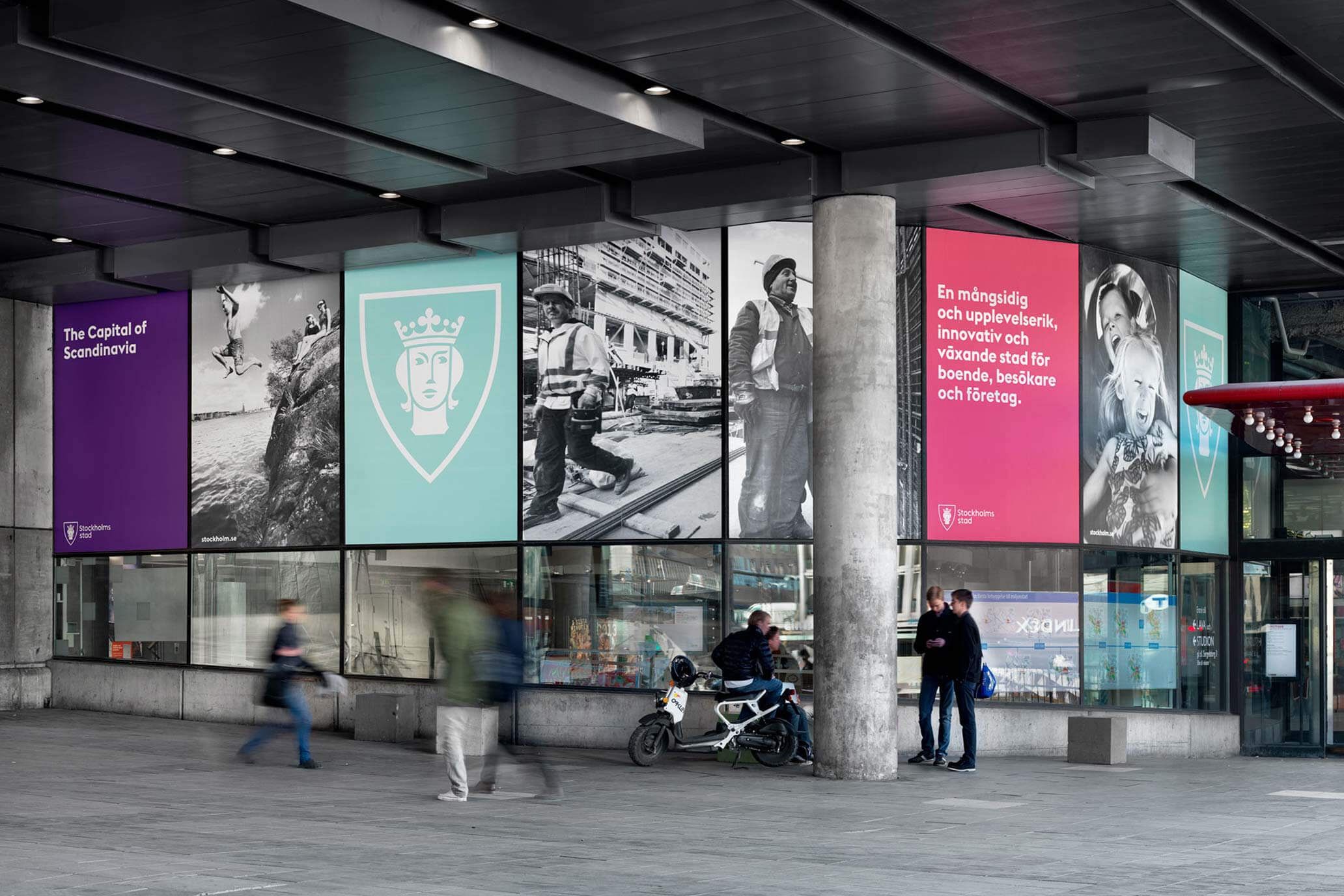
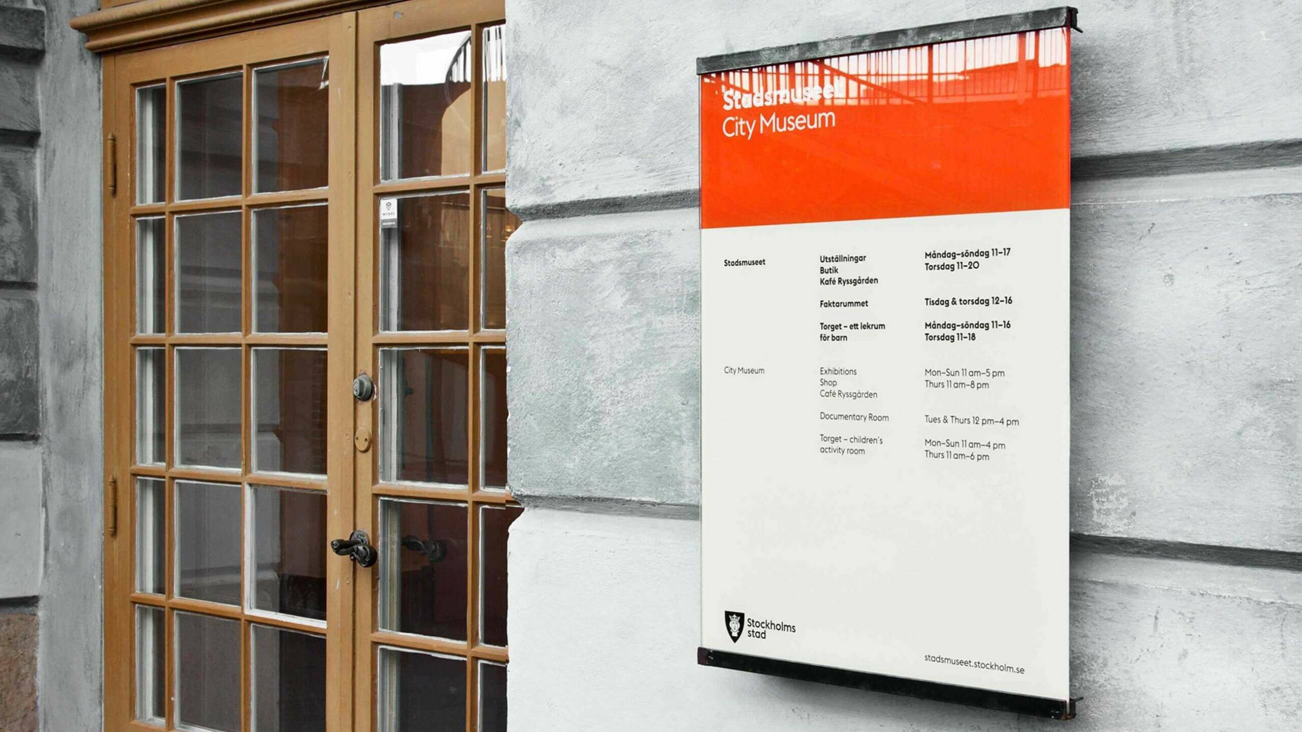
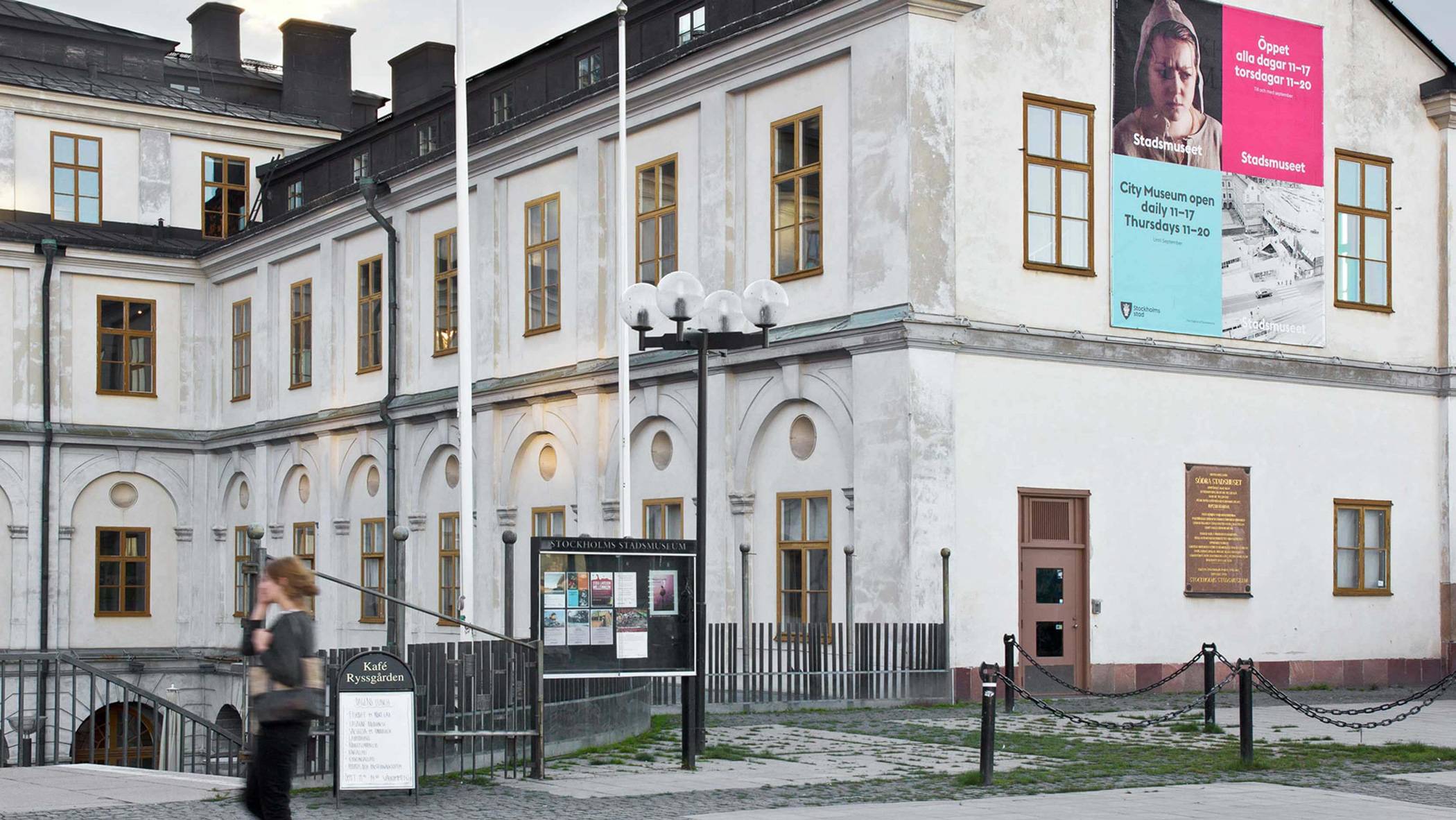
After 1 year of explorations, considerations and evaluations, Stockholm finally had a new brand – but most importantly, one brand. We updated the city crest, crafted extensive iconography, created a bespoke typeface and brought in a completely new color palette – everything flexible enough to fit everywhere, coherent enough to stay connected.




Pointing out a new direction
The new identity marked a decidedly new direction for Stockholm –a progressive, yet inclusive direction. But most striking of all was the extent of the city’s involvement, once it was made visible. The City of Stockholm was everywhere. To be accessed and enjoyed by everyone. Now that is truly world-class, if you ask us.
