It’s all about people
RATOS
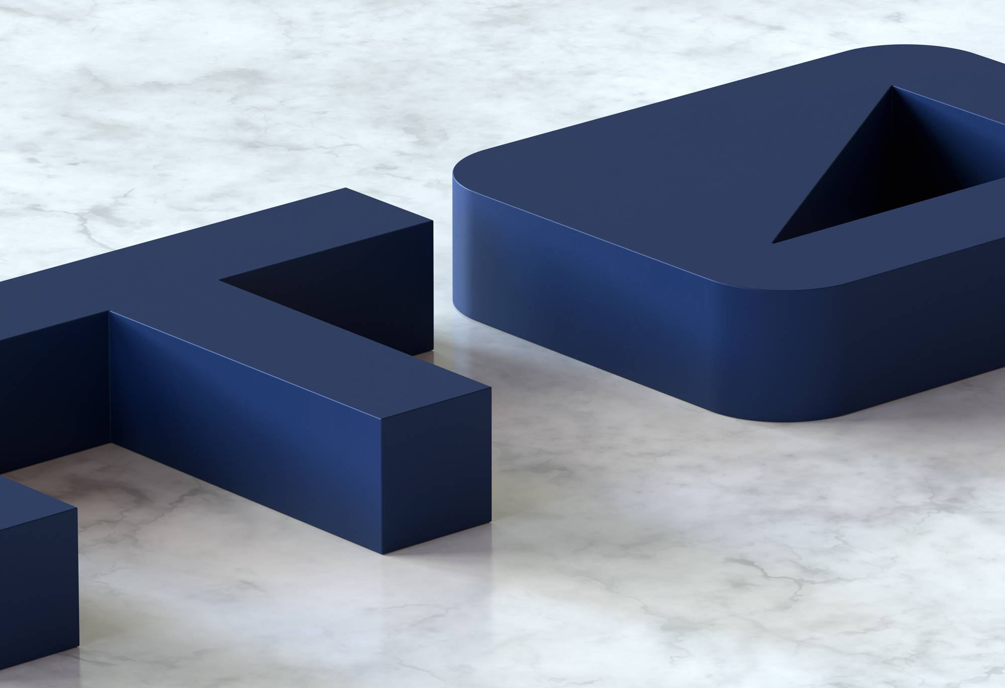
Ratos is a Nordic business group of 11 companies with a long and rich history. We were brought in to reignite their brand, website and communication and show that they were not just a brand of the past, but of the future. We centered the positioning around It’s all about people, reflecting Ratos’ firm belief that you invest in people, not companies.
What we did:
Strategy
Brand positioning
Design
Visual identity Verbal identity Iconography Illustrations Motion design UX/UI design Website Guidelines
Content
Copywriting Photography direction SEO Design templates Office templates
Technology
Front-end development Back-end development Prototyping Integration support


A most valuable asset
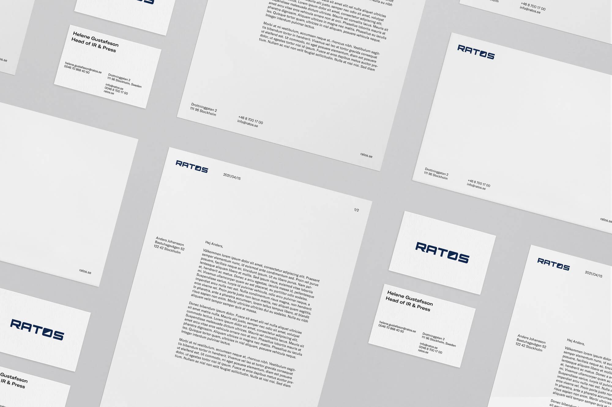
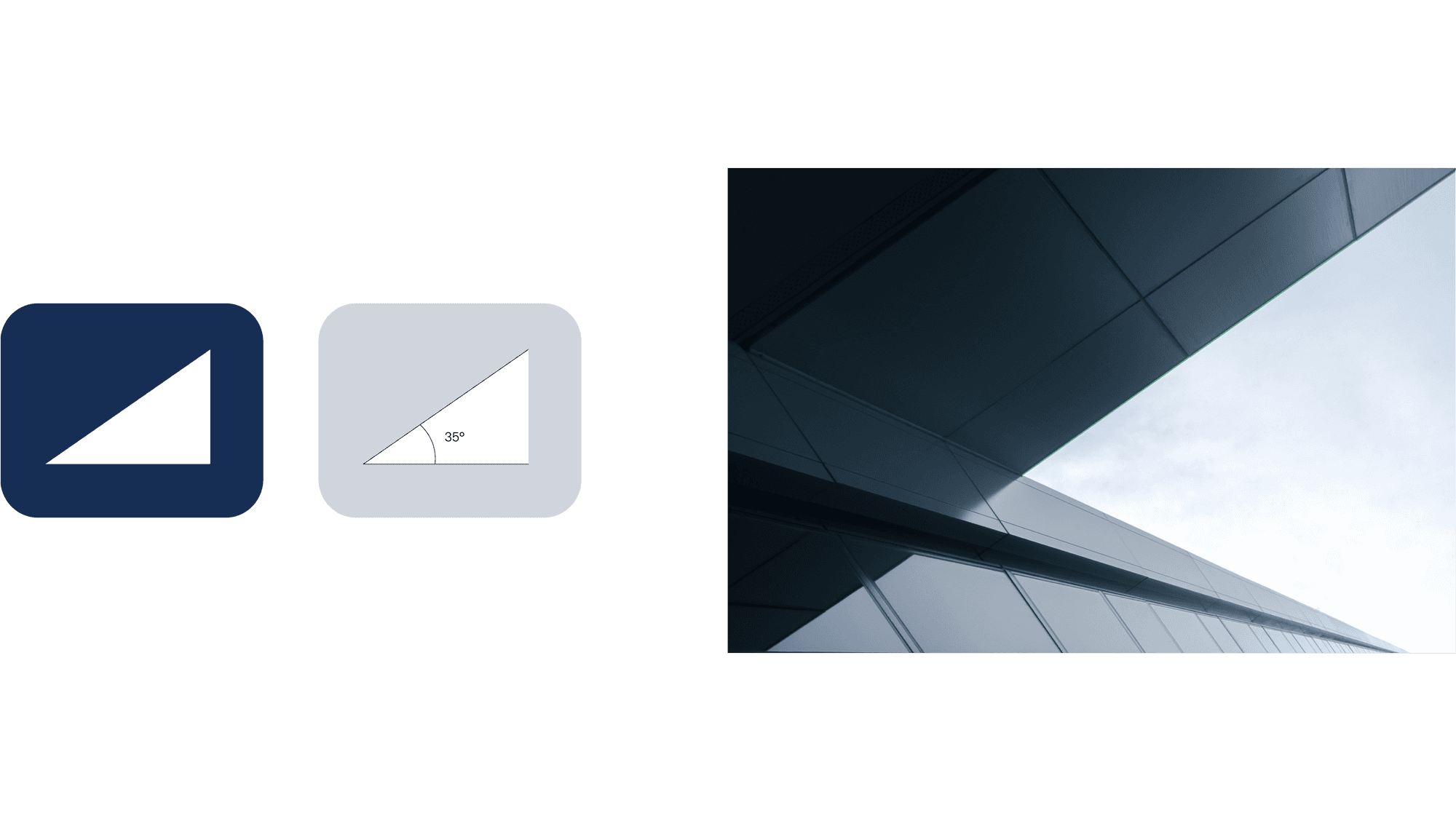
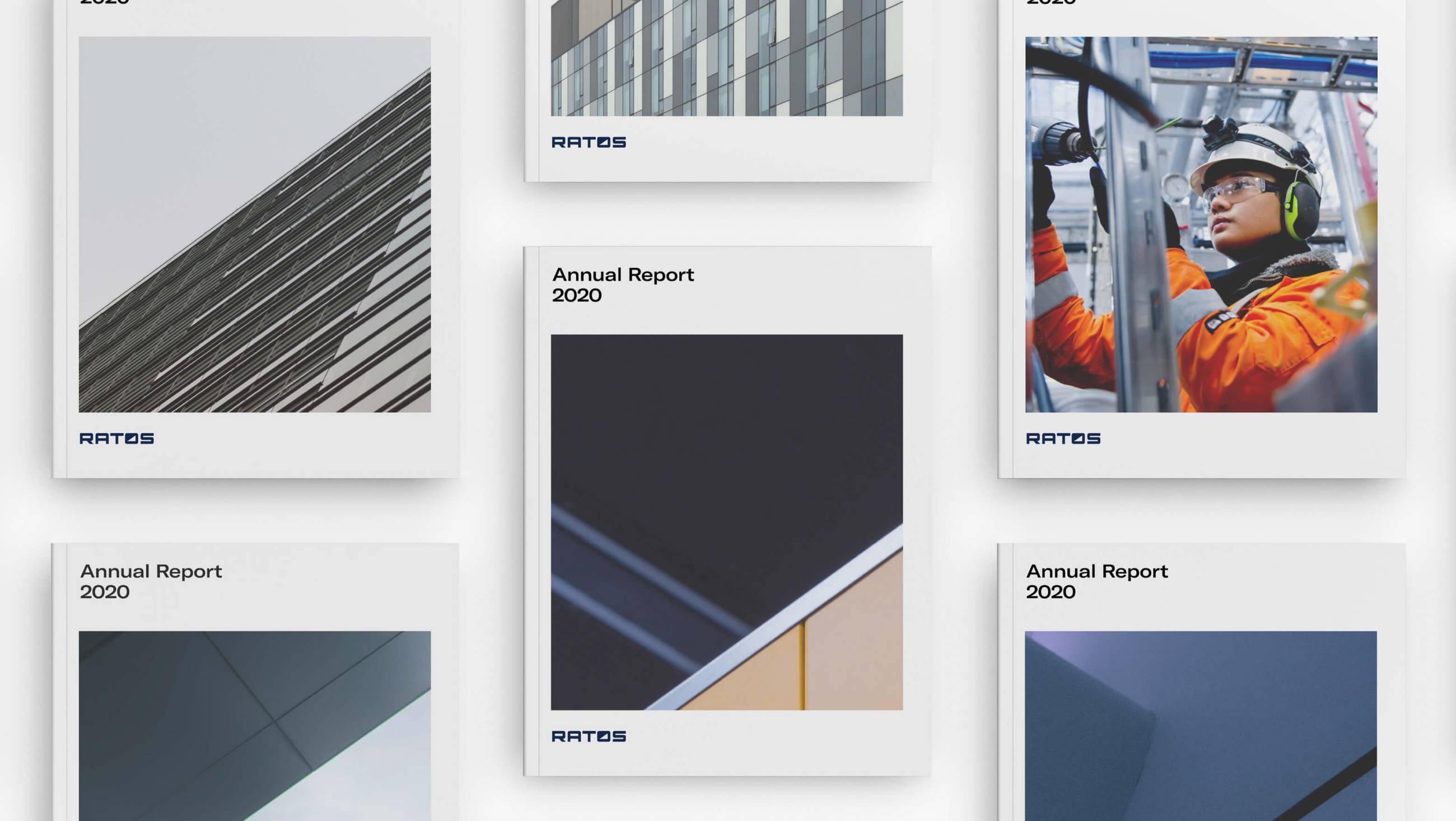
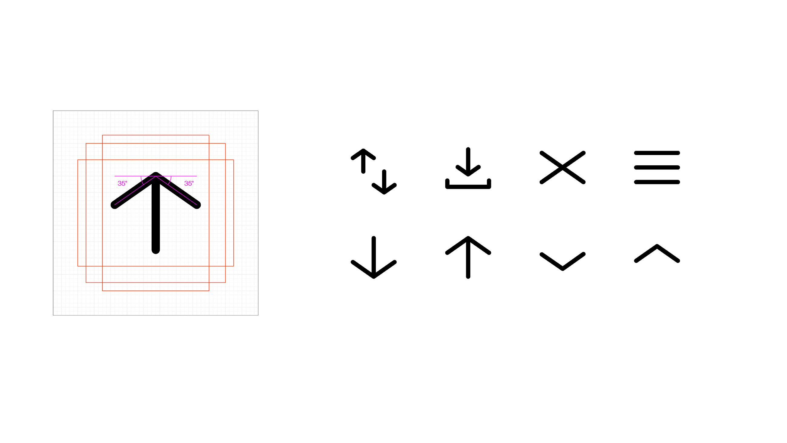
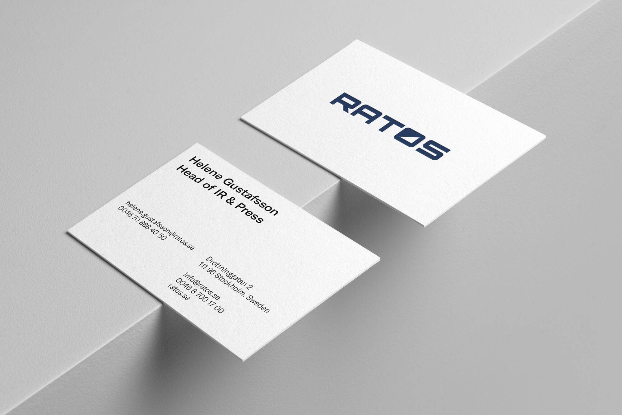
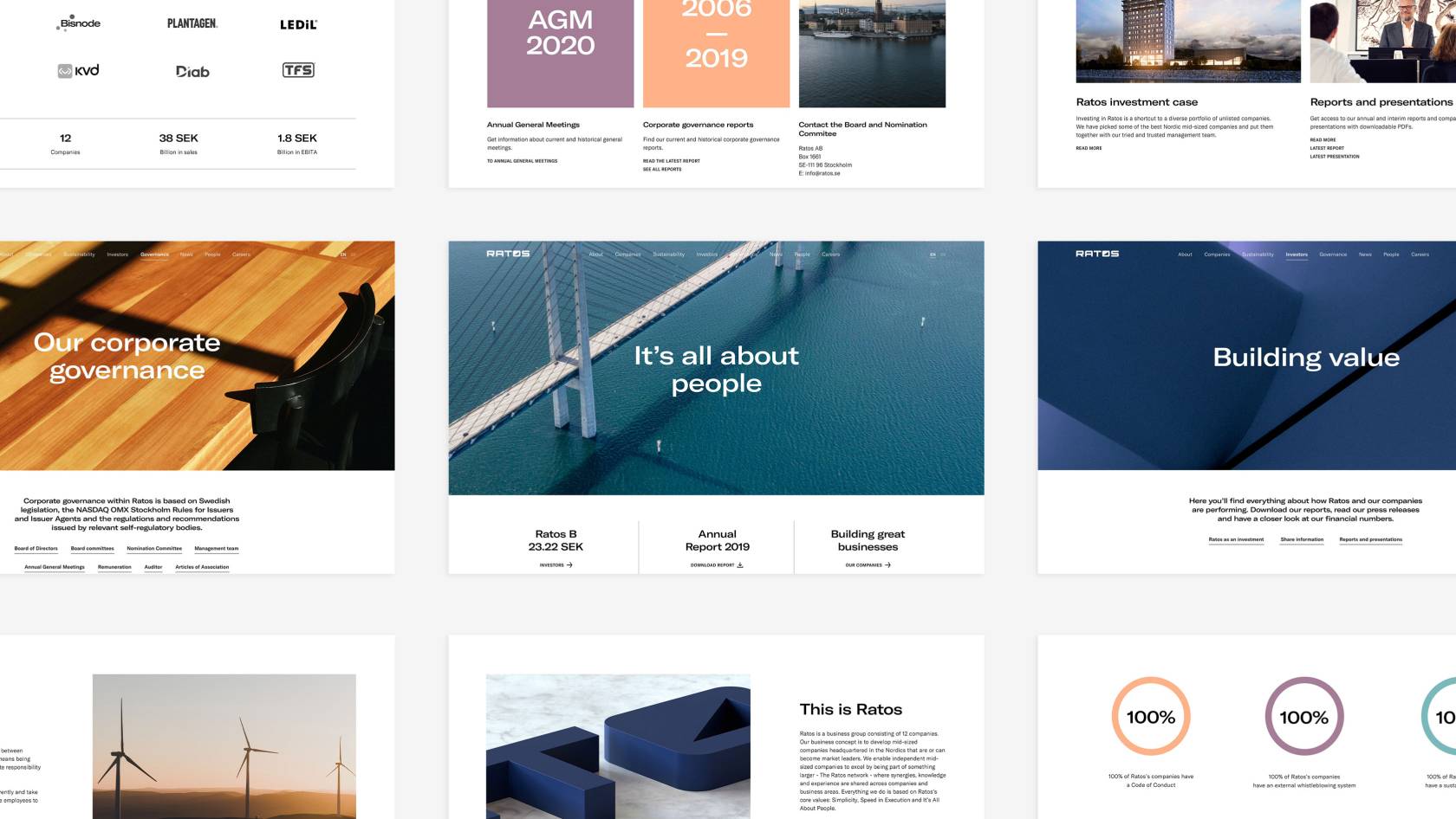
We decided to keep Ratos’ most recognizable asset, their logo. And to base the entire visual expression on the upward graph of the “o”. The curve was used in abstract photography as backgrounds for various communication assets. This made it easy to keep imagery from their different companies cohesive. The curve also influenced the iconography. We developed a timeless and sophisticated color palate consisting of 5 different colors with both warmer and cooler tones reflecting their businesslike yet human approach.
Some well-deserved pride
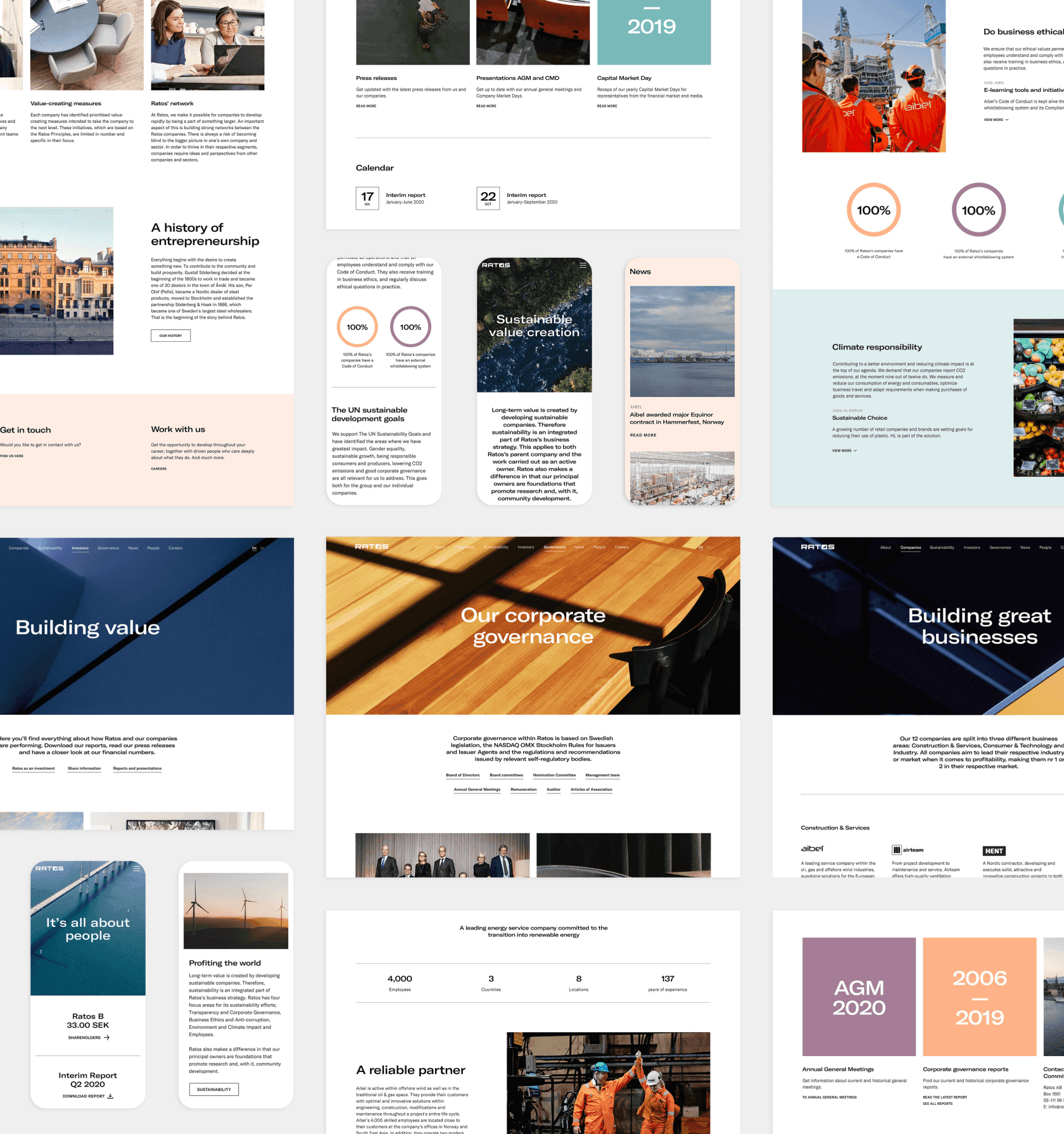
The entire identity reflected the new positioning, and a best-in-class website delivered the message loud and clear. The result is a brand that communicates pride for what has been achieved and ambition for what is to come.
