Know your world
NORSTAT
Founded in 1997, Norstat is one of the leading data collectors for market research in Europe. With a network of over 2 million respondents across 19 countries, they’re on a mission to provide their customers with data of the highest quality. Precise and relevant to each business-critical situation their customers face.
What we did:
Strategy
Brand platform Brand positioning Brand architecture Offer packaging Brand integration
Design
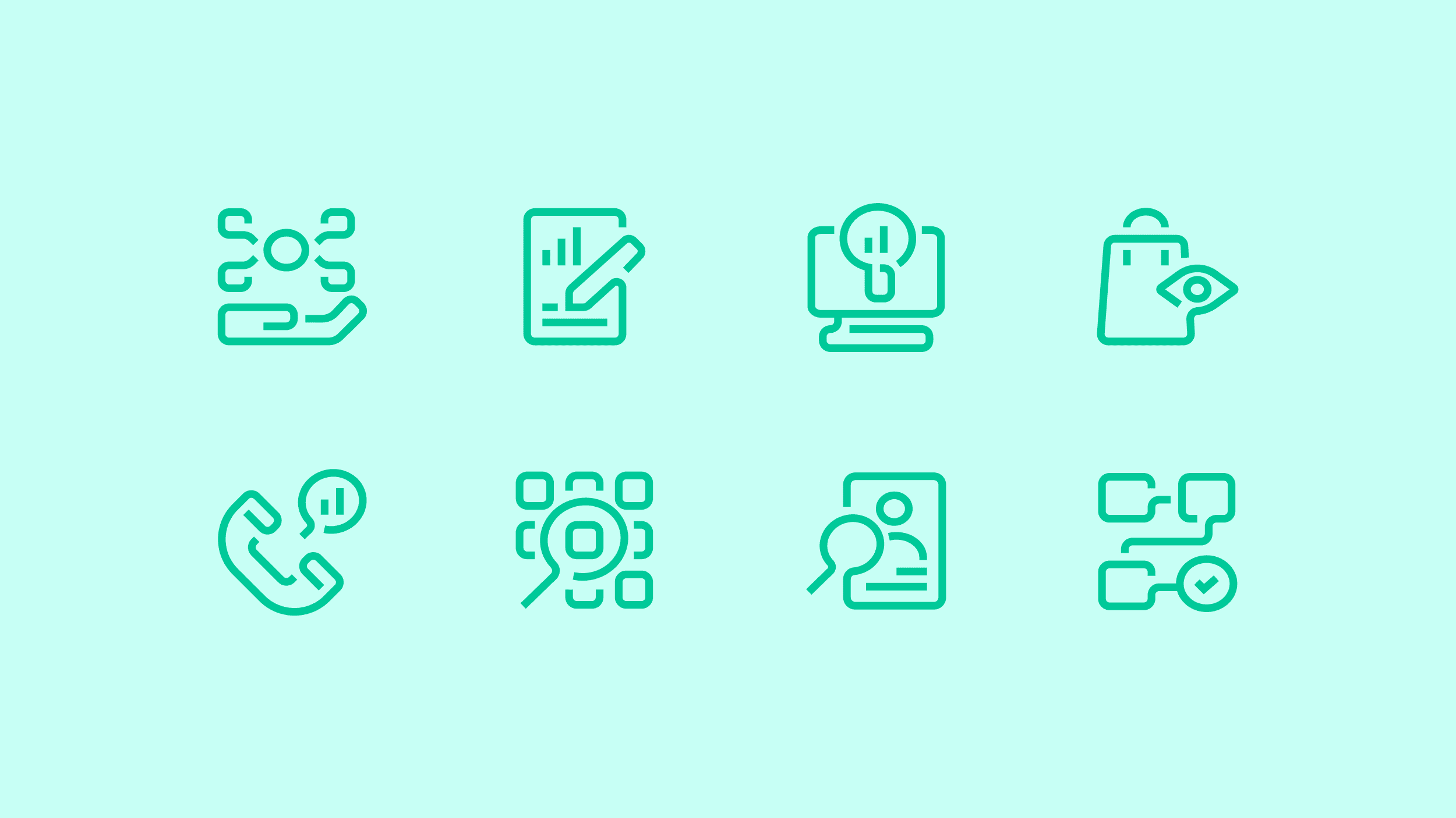
Visual identity Verbal identity Iconography Illustrations Motion design UI design Website Guidelines
Content
Copywriting Scriptwriting Photography direction Implementation plan Design templates Office templates Campaign Marketing plan Content plan
Technology
Front-end development Prototyping Integration support
It’s all about data
The competitive landscape in recent years has increased with a wide range of new companies and offers providing quick online information, and automated insights gathering. It was therefore important to make Norstat’s role very clear – a company built on a solid network of respondents, here to provide the most accurate and trustworthy data for their customers.
For decisions that matter
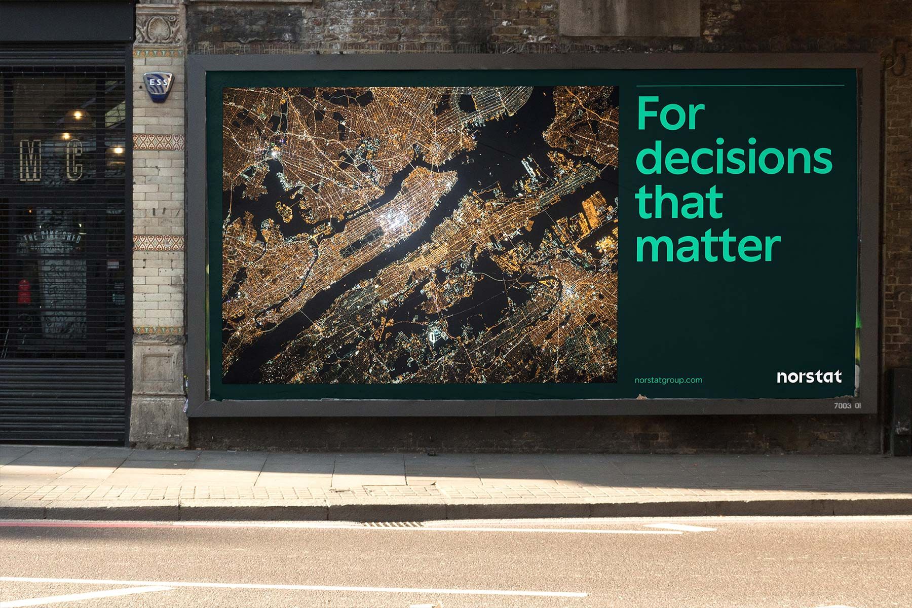
Our work started off by a simple insight – that the better informed you are, the better decisions you’re able to make. Both for you, and for society at large. This shaped the new narrative for Norstat, communicating a company providing the very best conditions for making the right decisions when it really matters.
Know your world
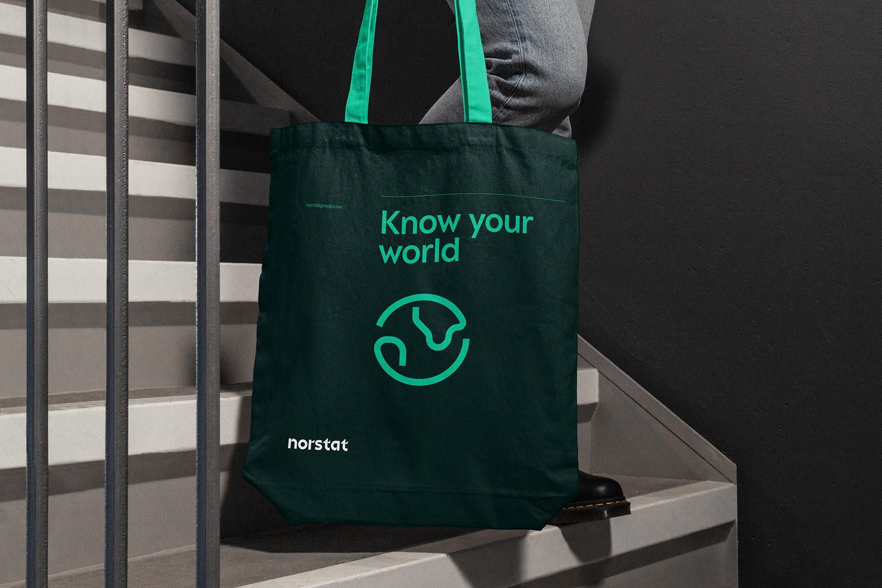
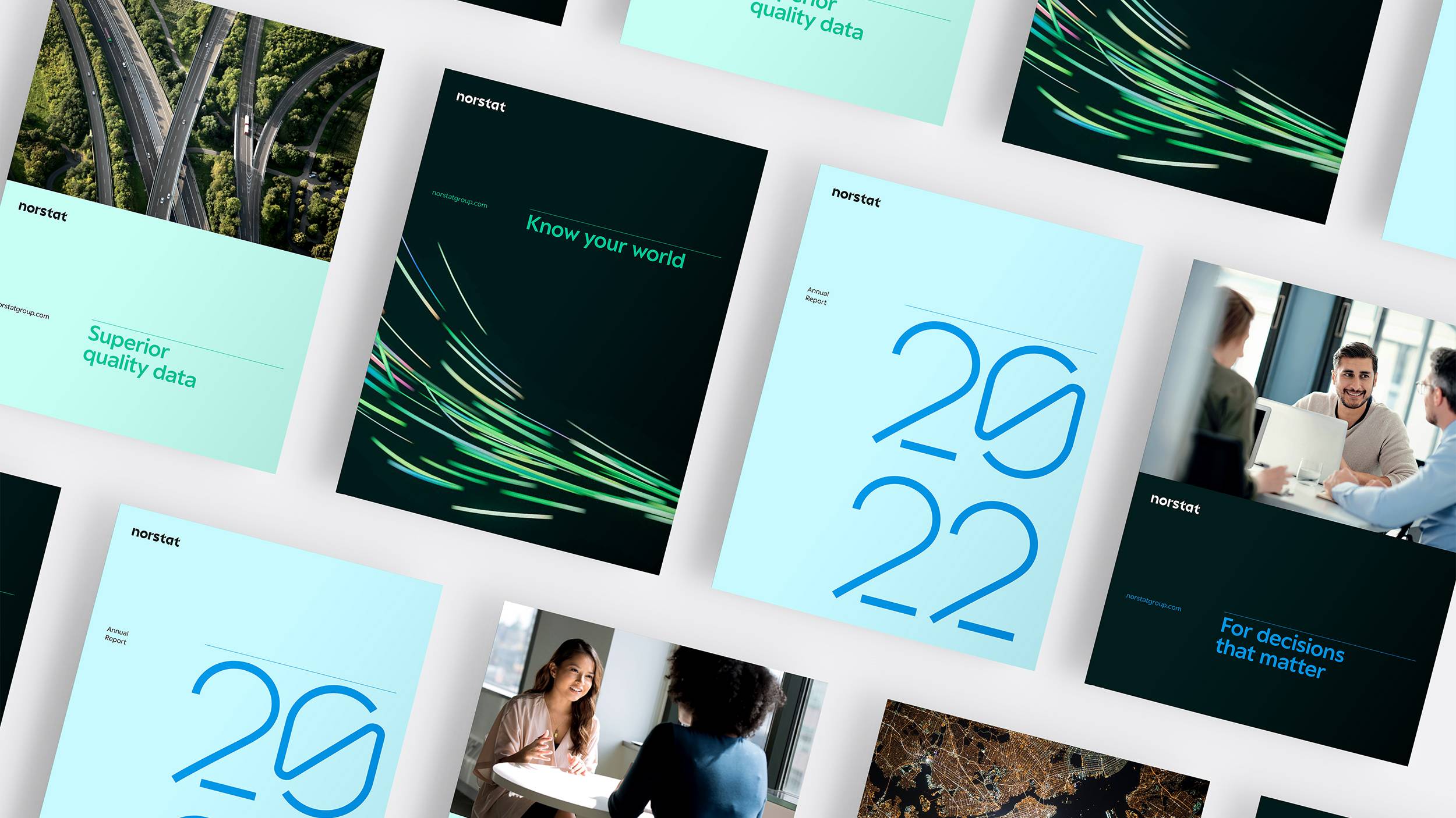
We based the new communicative platform around a key message at the very core of Norstat’s offer: Know your world. A new way to talk about data, yet capturing what data is all about – Knowledge of the world. But even more importantly, your world, and the situations and challenges you face in your unique business context.
Data, and everything around
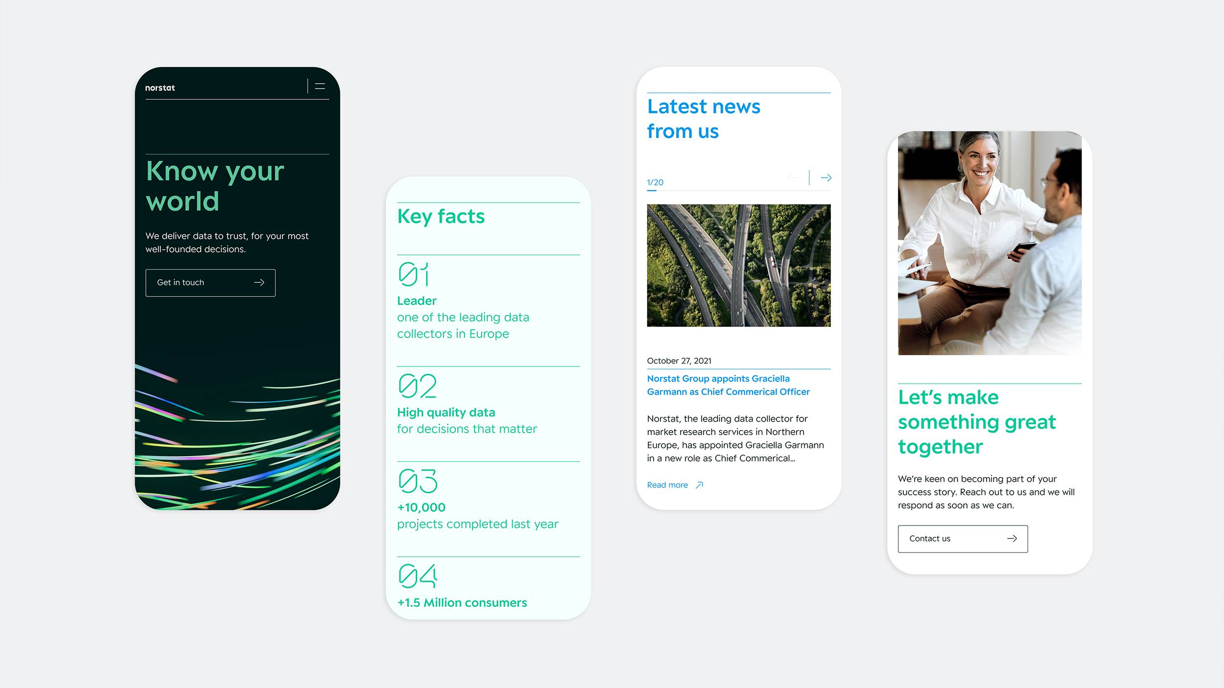
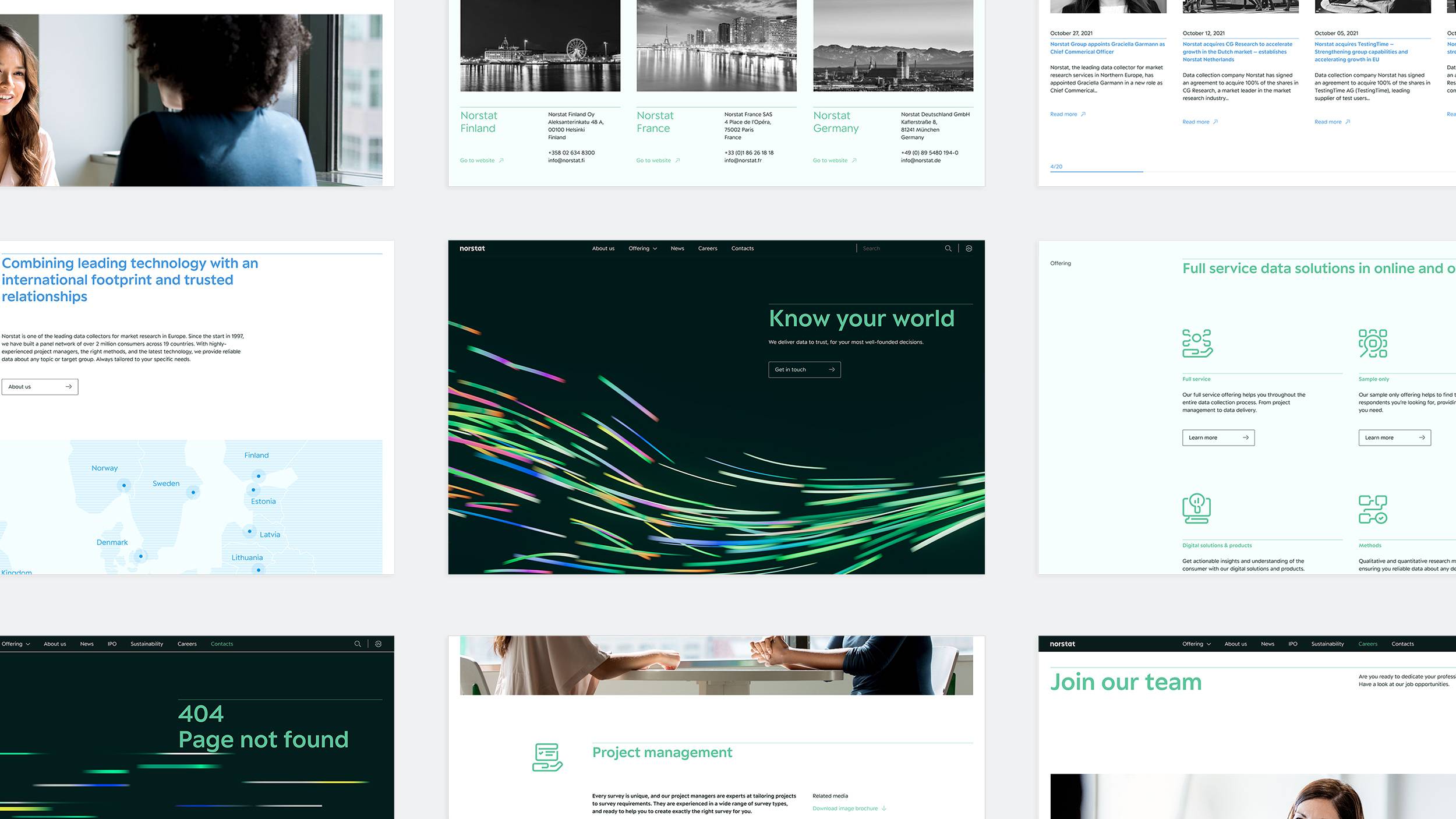
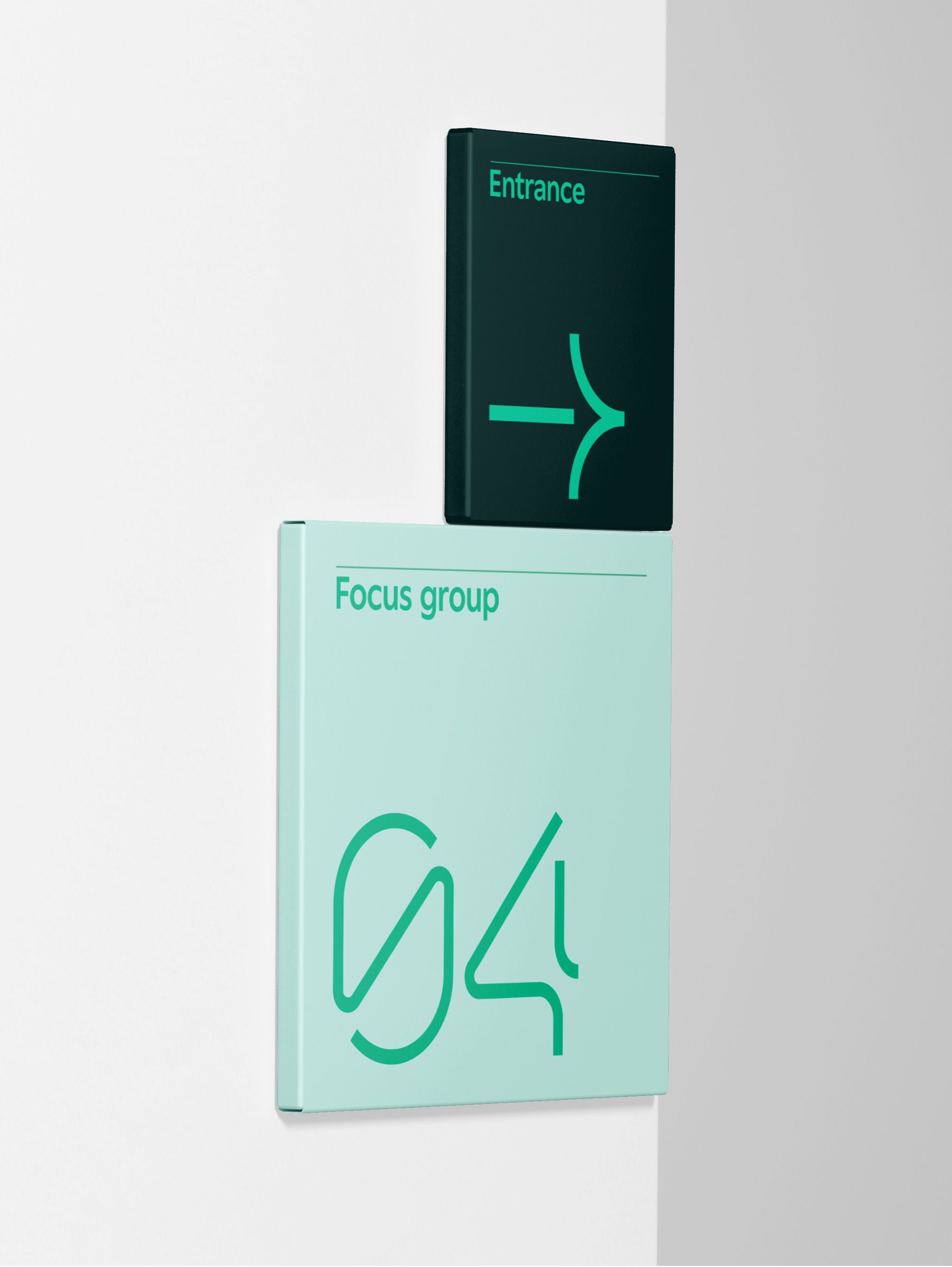
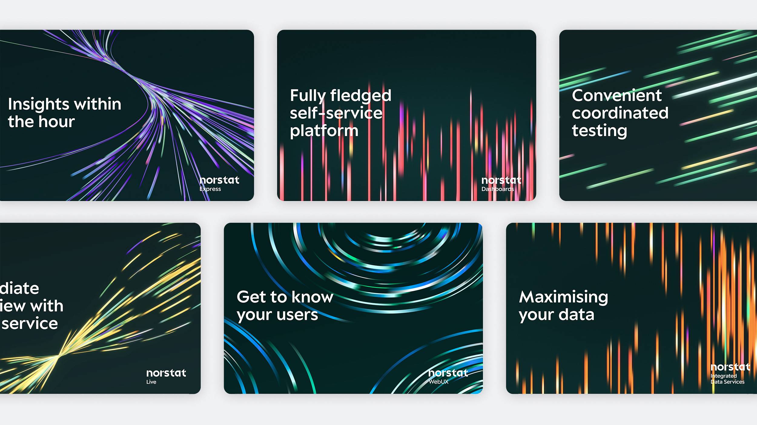
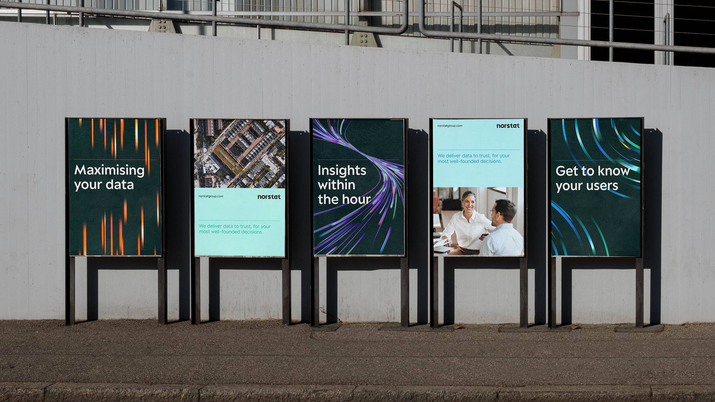
The visual identity was created to truly reflect Norstat as a company and its mission to combine leading technology and trusted relationships. We crafted a dynamic graphic pattern portraying data streams to communicate the steady flow of information. The wordmark was formed by basic geometric shapes to represent the foundations of data visualization, and the combination of round curve and sharp lines manifests the synergy of hands-on human expertise and a modern digital offering. We utilized a modern and precise yet approachable font as the brand typeface, coupled with a gridded layout system, cultivating an orderly and professional aesthetic. Finally, everything was complemented with an imagery style mirroring both the qualitative and quantitative aspects of research with a mix of micro (close-ups of people) and macro (overhead cityscapes) images.

A new world for Norstat
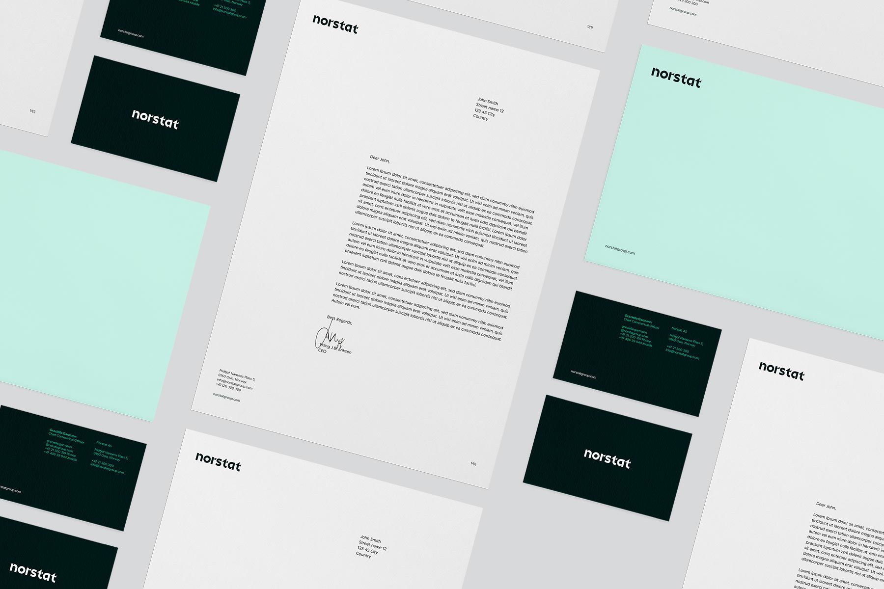
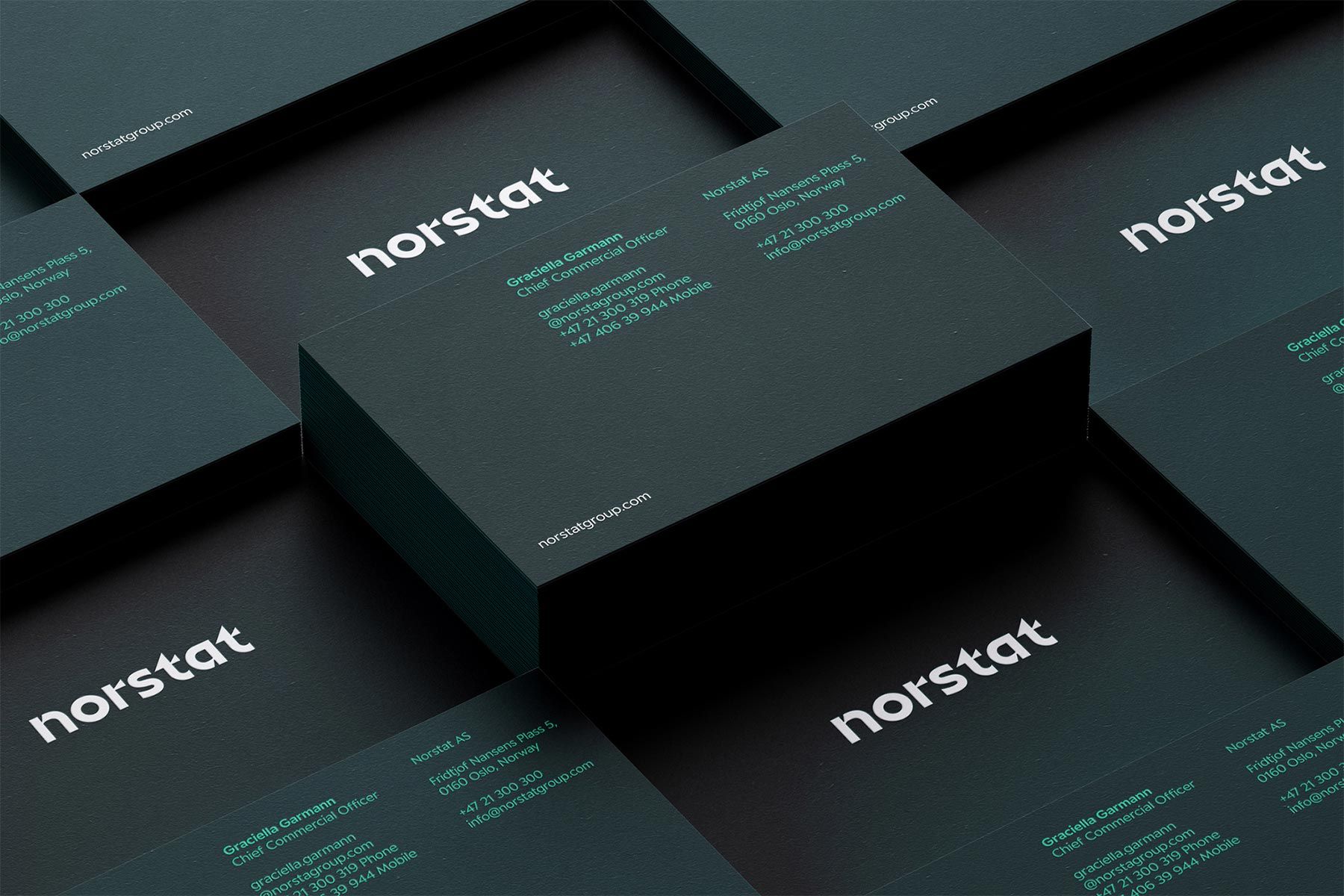
The new brand was implemented across every major touchpoint. Not to mention a new website, including an extensive retake on Norstat’s different service offerings, making them just as distinguishable as communicatively engaging. Everything well aligned and thoughtfully produced, together communicating high-quality data, packaged in precision and trust. All to strengthen Norstat’s position as the leading data provider in Europe, on a mission to let their customers make the right decisions, for years to come.
