Bringing the past to the present
GANT

After a whole century of success, the Gant brand had become outdated and irrelevant, failing to attract a young customer base. This had put the entire future of the brand in jeopardy.
What we did:
Strategy
Brand architecture Brand platform Brand positioning Naming Qualitative and quantitative research studies
Design
Visual identity Bespoke typeface Iconography UI design Packaging Retail/ Environmental Guidelines
Content
Verbal Identity Implementation plan Design templates Office templates
Legal
Legal guidance Protection
Awards
Rebrand 100 2016, Bronze consumer identity, Gant
A credible story
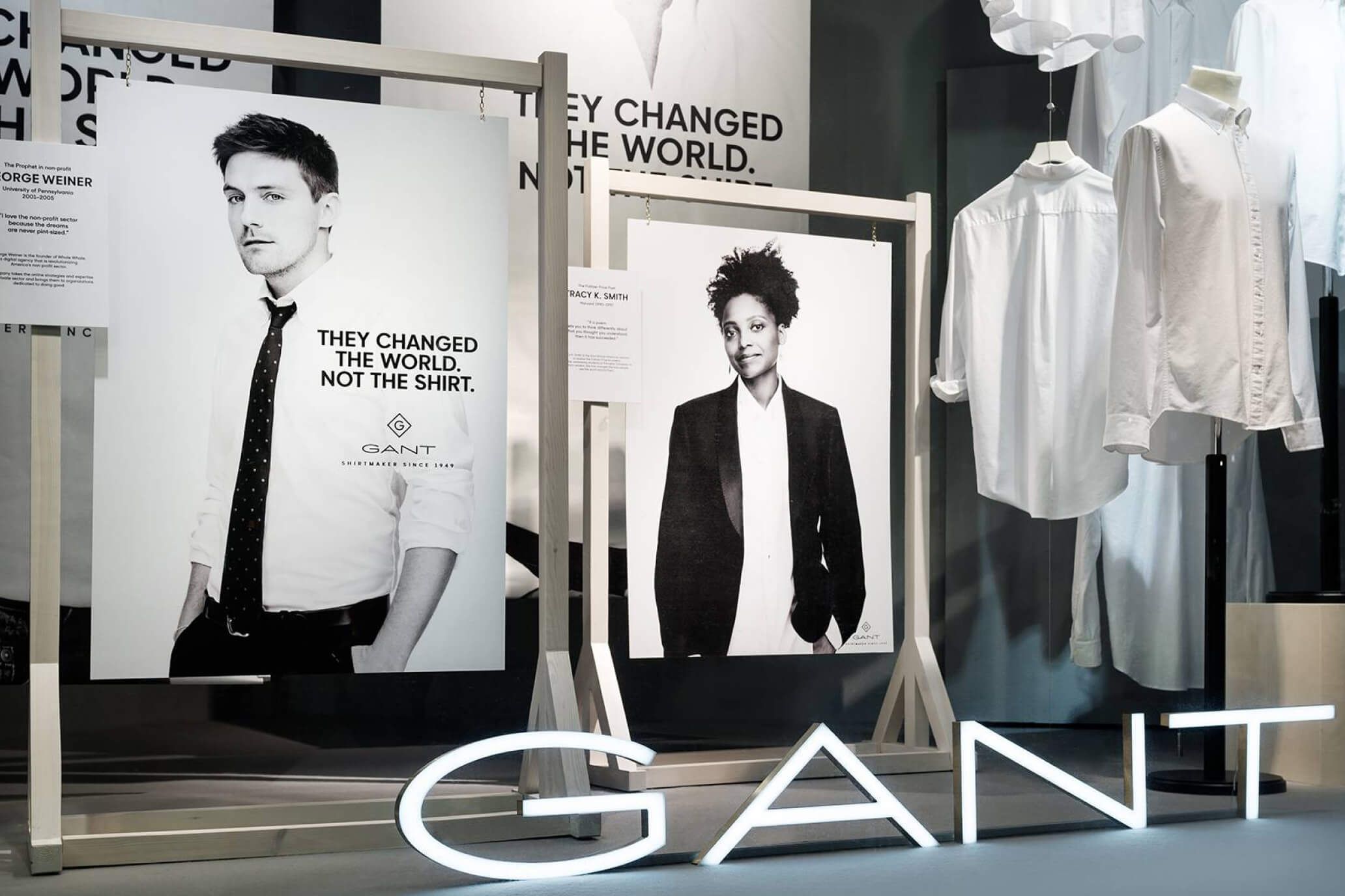
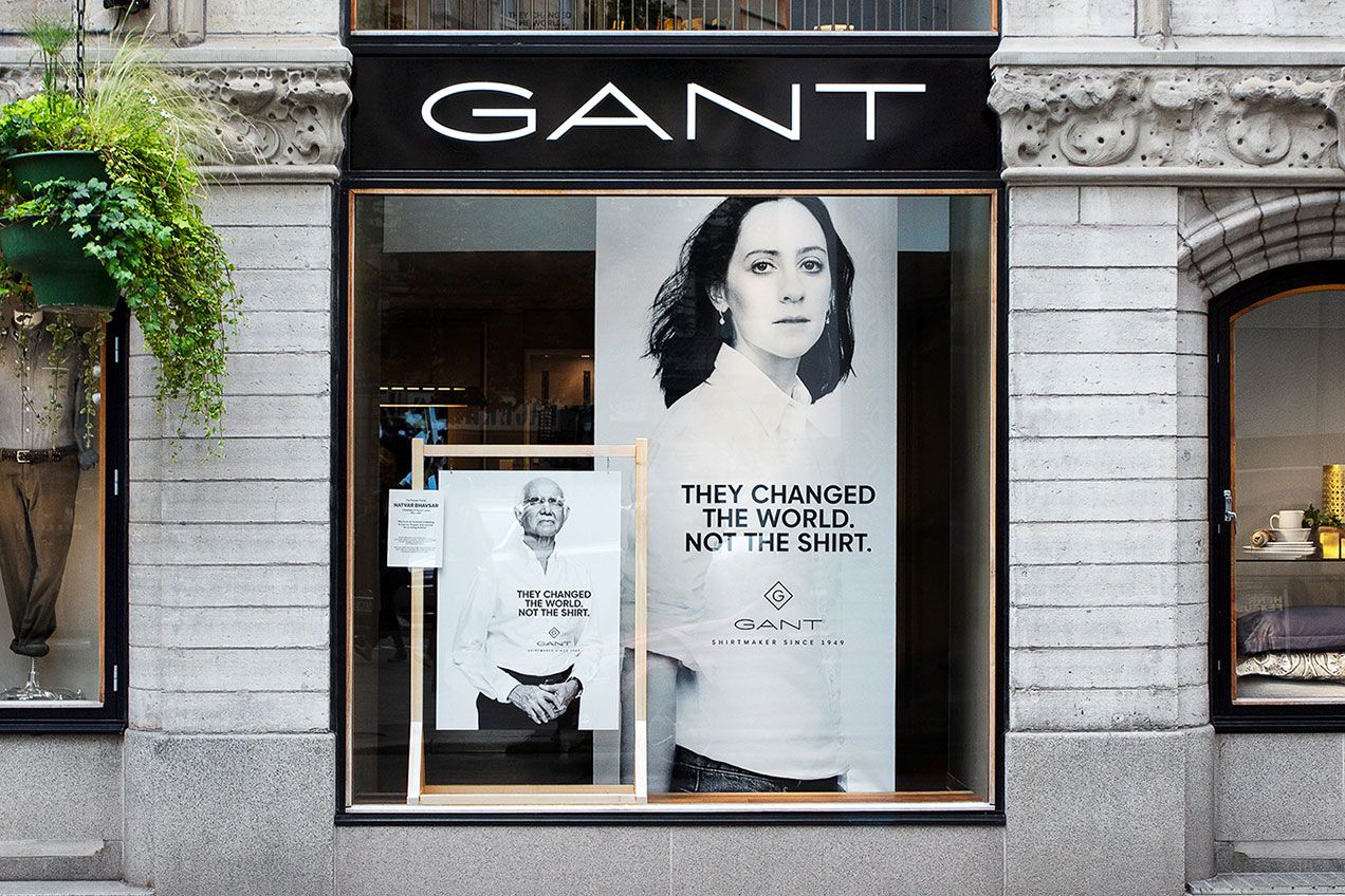
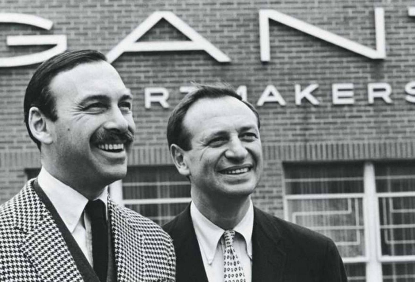
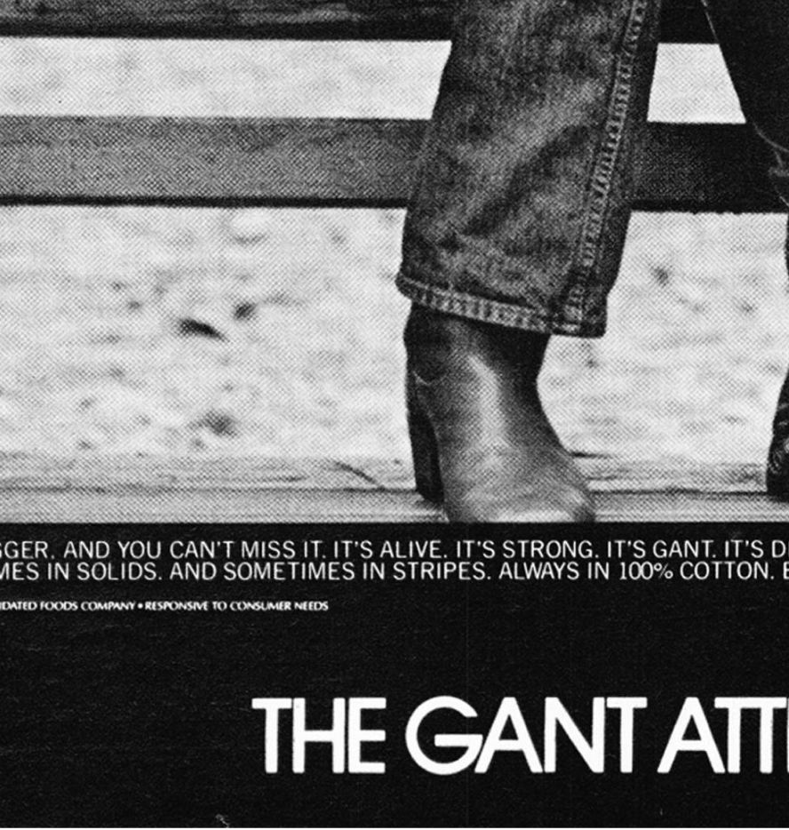
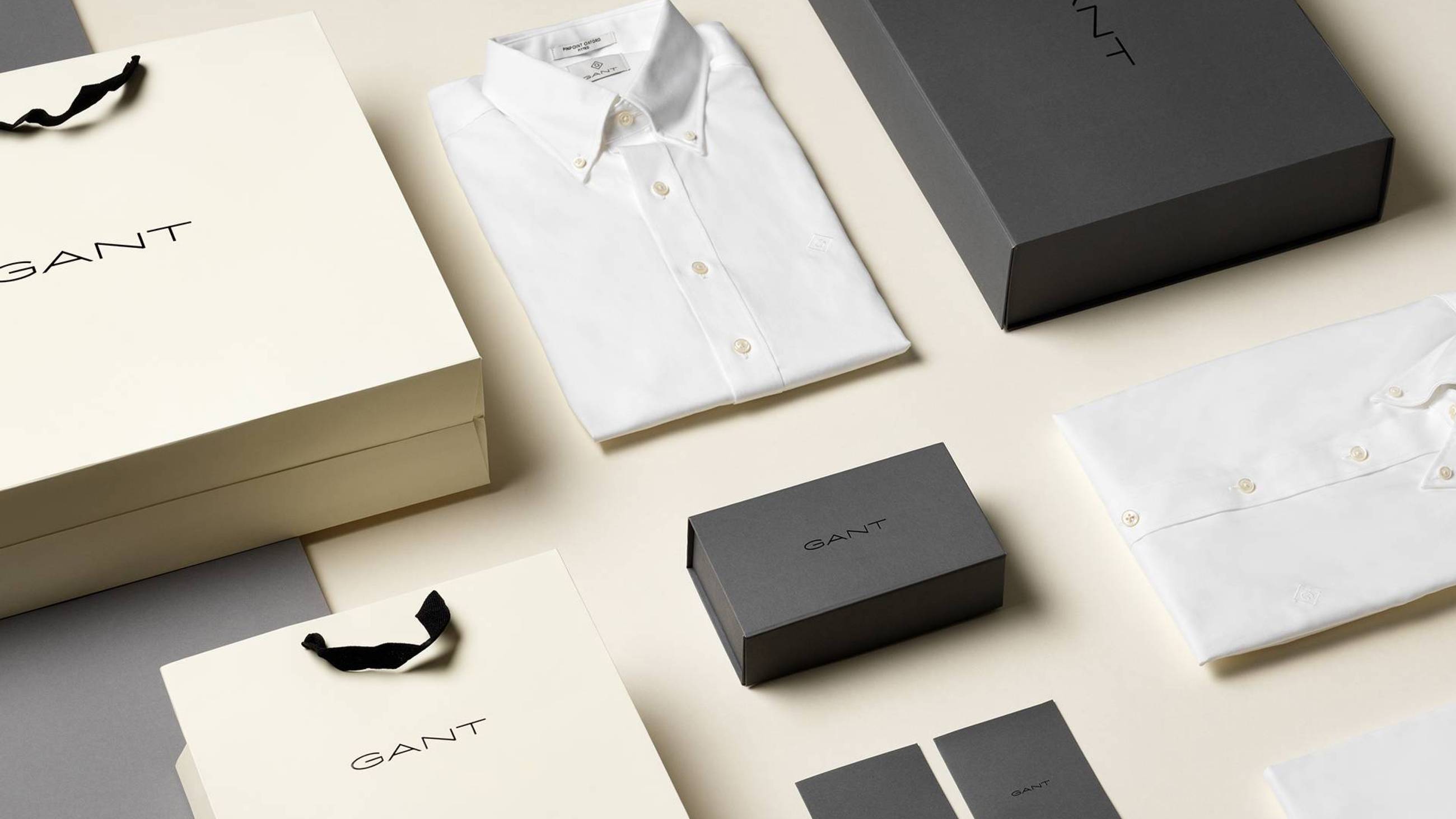
Without a doubt, Gant needed to modernize their brand. We started with Gant’s story, which had shifted so many times that it had lost credibility. What we found was not only true but astonishingly relevant. At the core of Gant’s heritage was that they were a major producer of white shirts for the Ivy League, and they’d been around since 1949. That kind of heritage never goes out of fashion and served as a foundation for re-establishing their credibility.
Challenging brand structure
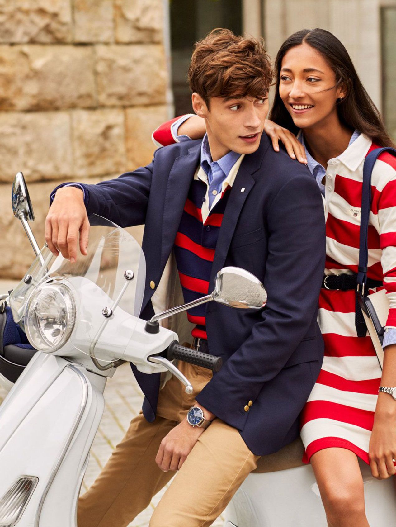
Another troubling matter was that Gant had created a new brand for every new product line. This had several implications. One of these was that Gant’s youth brand Gant Rugger was completely separate from the master brand, which meant that they could not draw from its allure. Secondly, having to manage a large number of brands, expansion into new markets was very costly. Also, they were missing out on a larger share of wallet. It was our recommendation that they go with a one-brand strategy – especially since they were actively seeking to internationalize. On top of that, we recommended that they focus on professional garments, as people allocate a larger budget to these than to leisure wear. This was especially relevant for their upcoming expansion plans in Asia and North America.

One brand, one identity
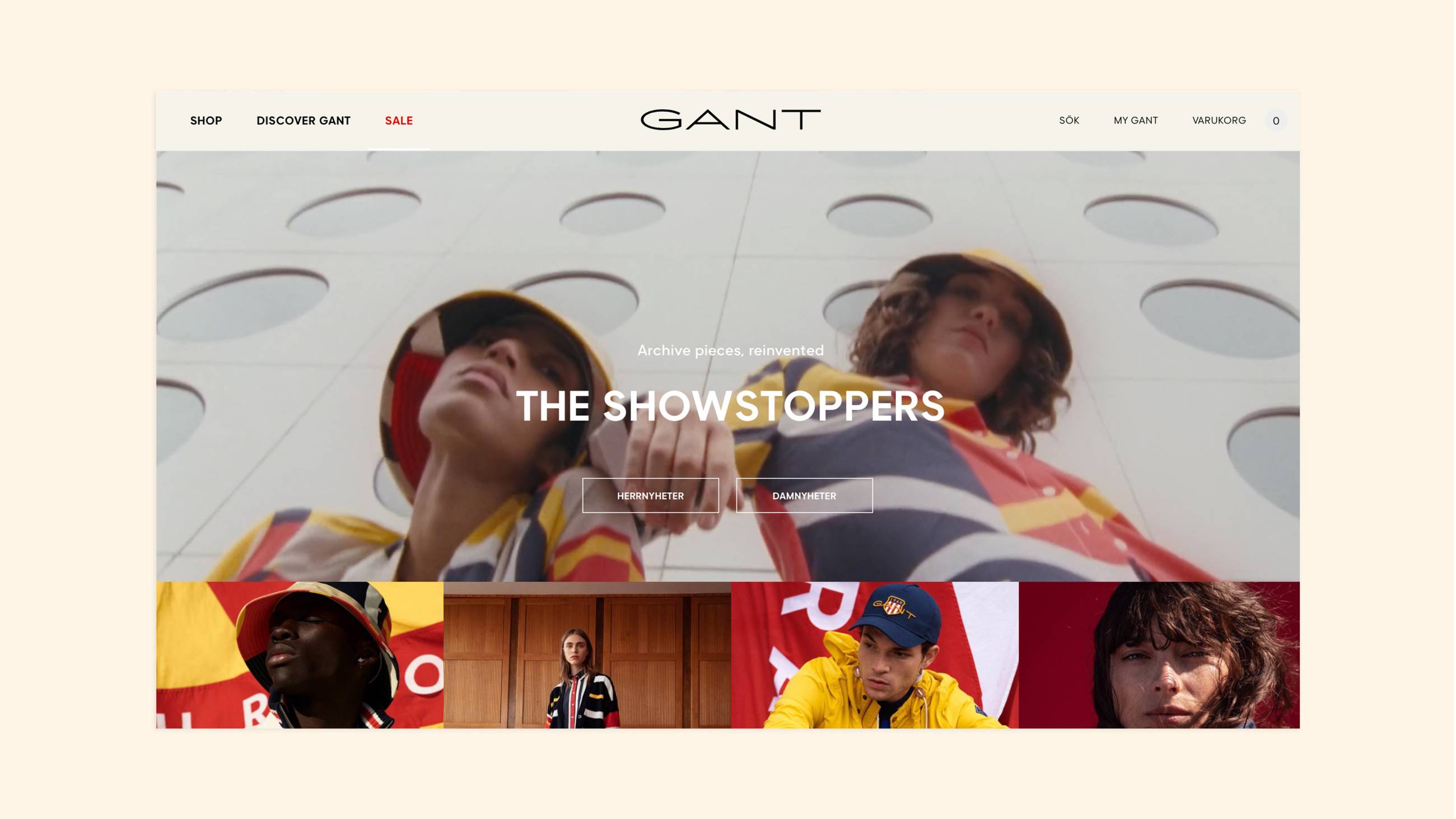
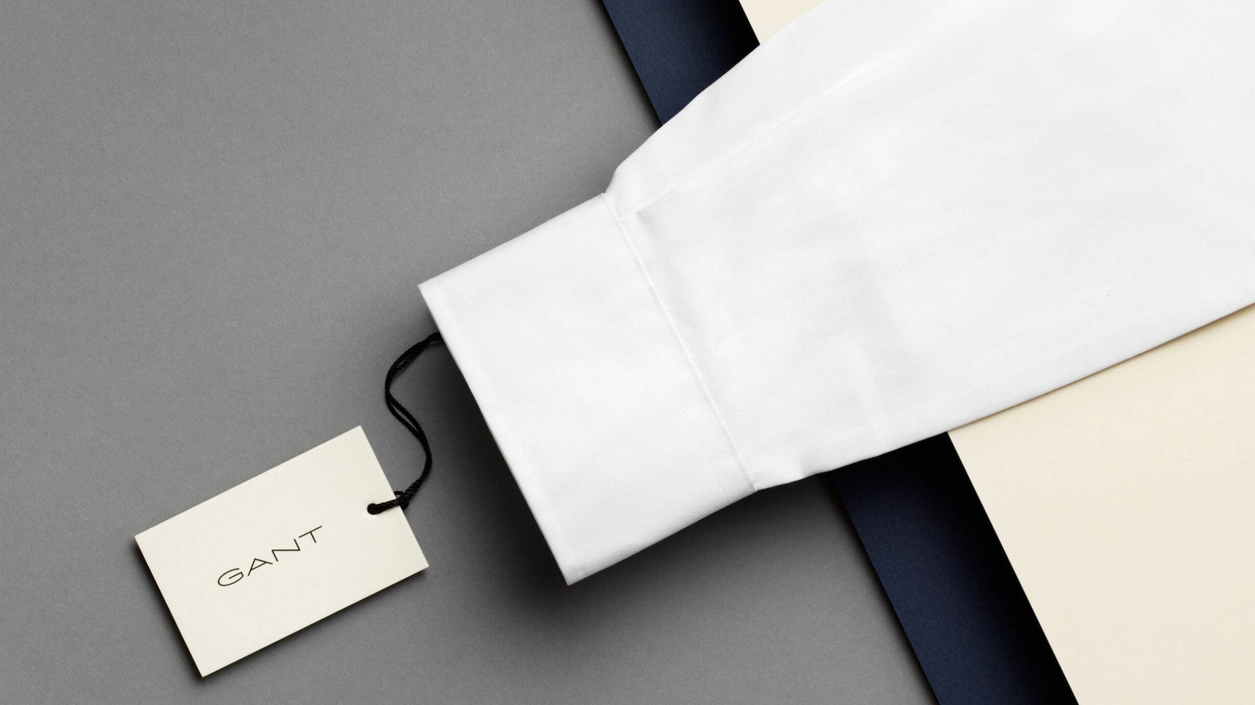
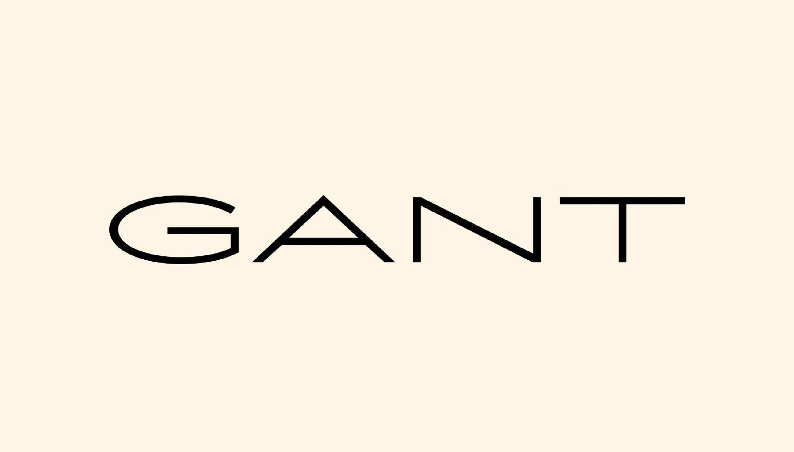
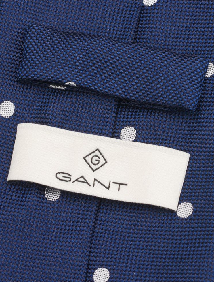
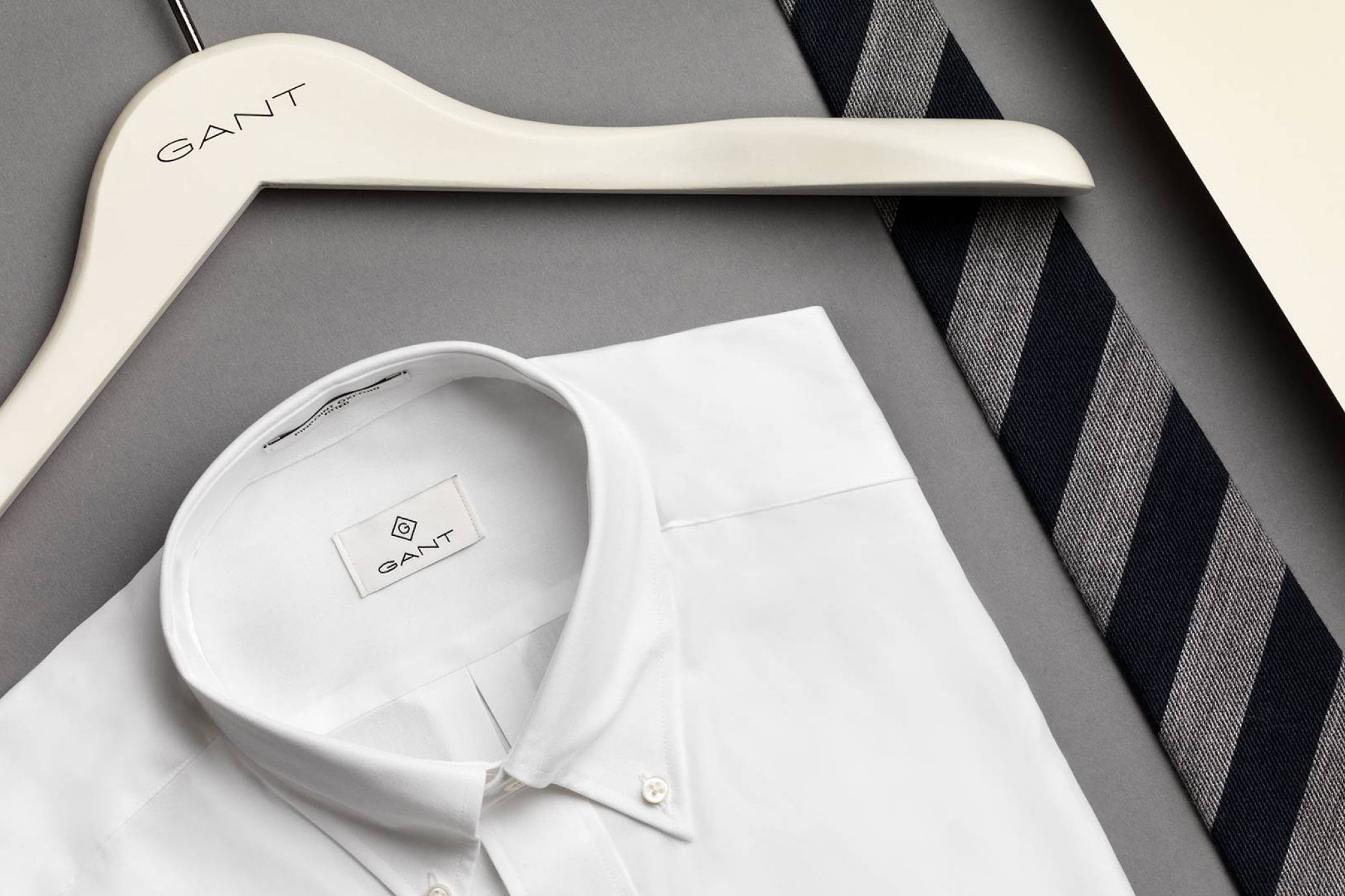
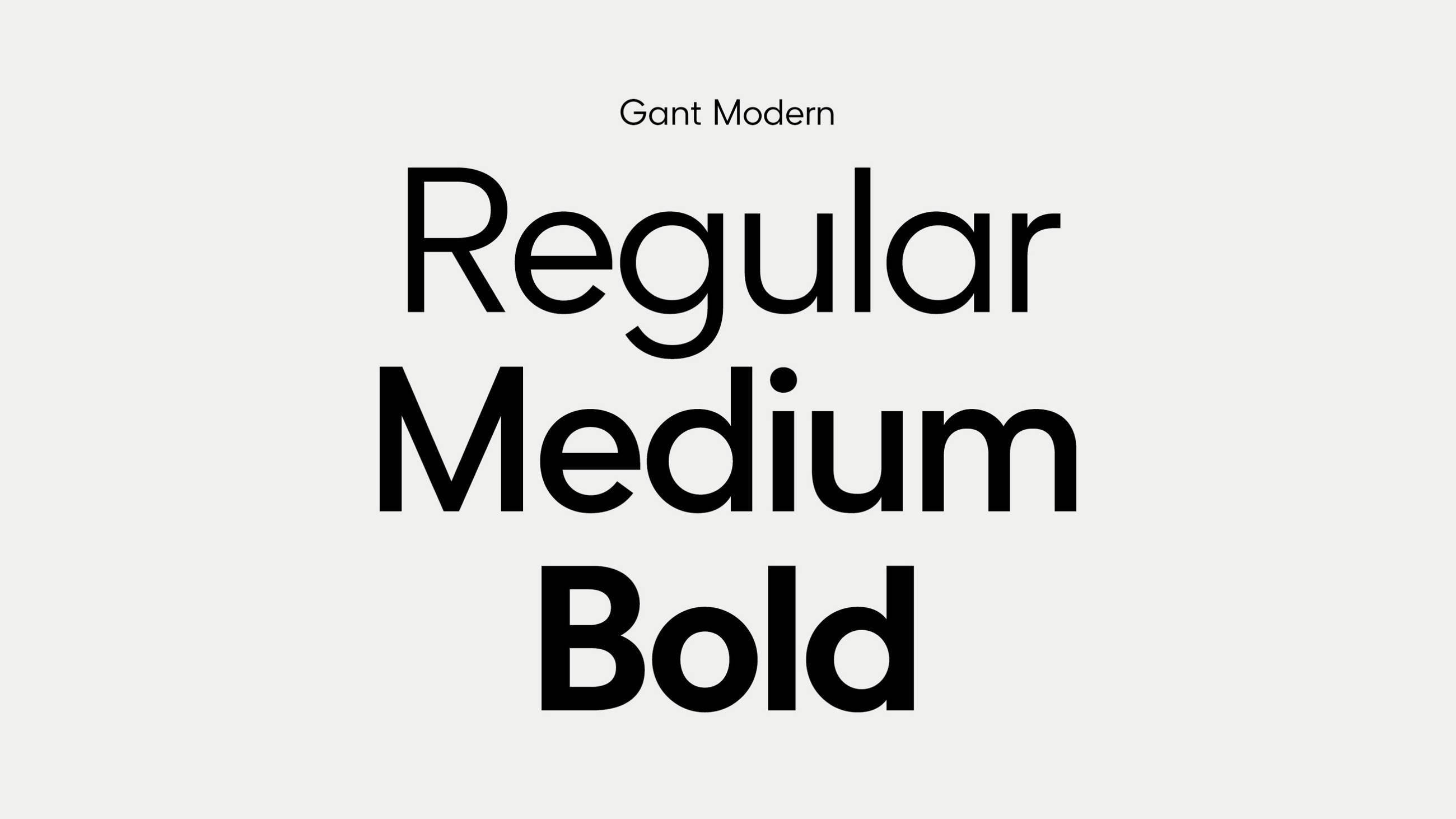
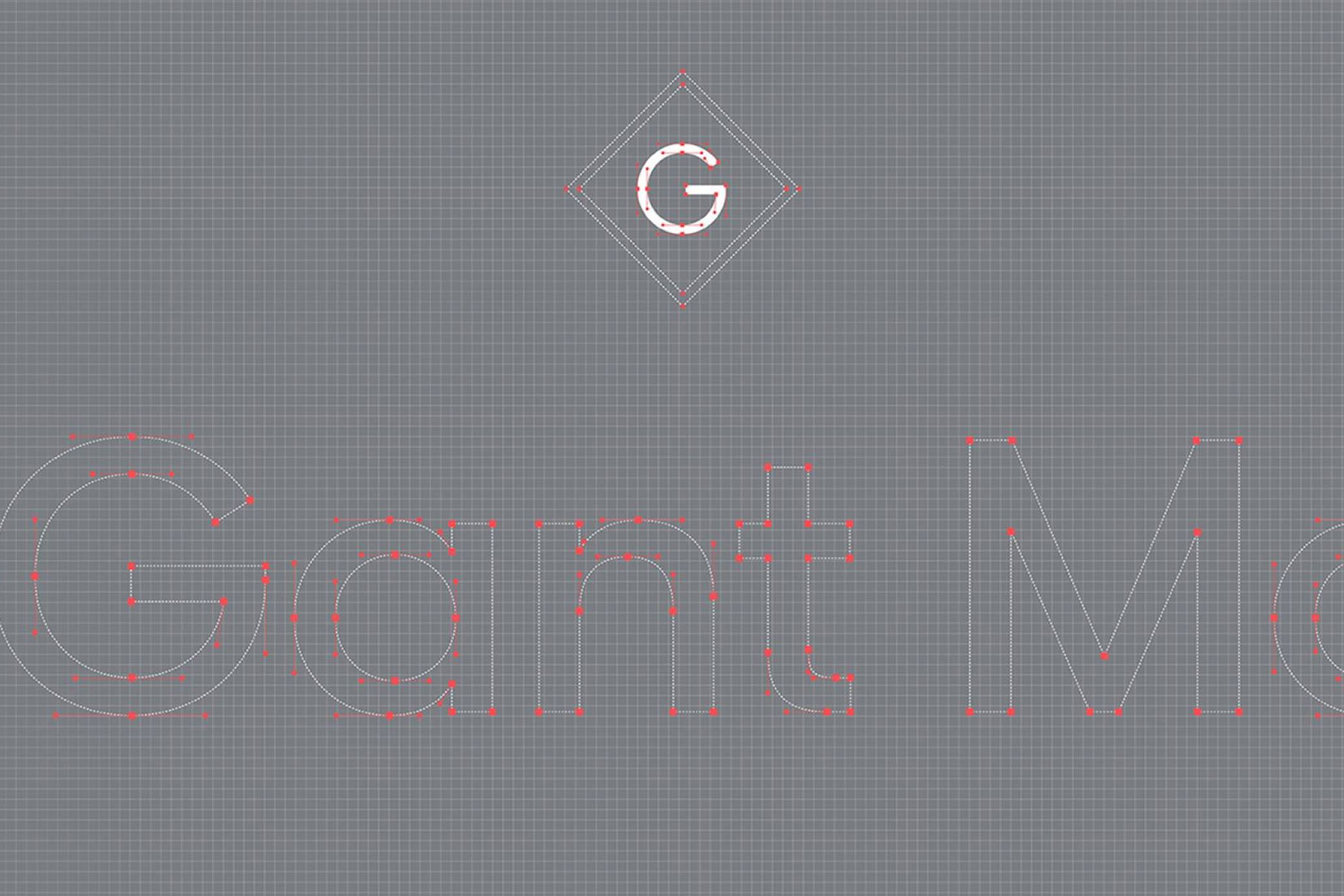
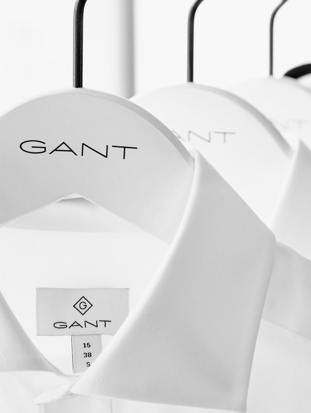
To support Gant’s premium appeal, the new identity was developed with perfect craft in mind. We also set out to streamline visual assets, developing a bespoke typeface, Gant Modern, based on Gant’s original brand symbol, “the diamond G”, from 1949, uniting all lines within one strong visual identity.

A smart move
Repositioning Gant from recreational coastal living to sophisticated cosmopolitan everyday wear, we managed to transform Gant into a true lifestyle brand with a clear product focus – the shirt – at its heart. Then, we rolled it out on every single market, globally. All in all, this was a shift towards a younger target group, and a smart move for a long-lived future – all by bringing the past into the present.
