Bringing brightness
to the world
FAGERHULT GROUP
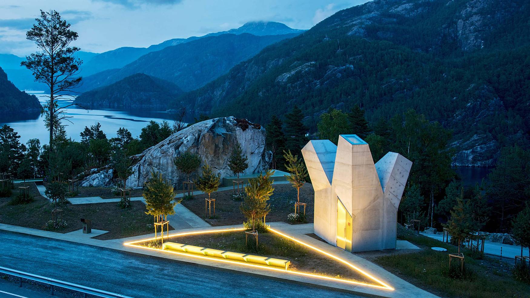
Fagerhult Group has 13 strong brands in their portfolio, making lighting solutions for the world. However, the outdated group brand itself was a poor representation of this home to bespoke lighting and advanced technology.
What we did:
Strategy
Brand Architecture Technical strategy Quantitative and qualitative research studies
Design
Visual identity Verbal identity UX/UI design Design templates Office templates Guidelines
Content
Copywriting
Technology
Front-end development Back-end development
Bringing it together
Fagerhult Group believes that better lighting leads to better living. We sought to reflect this humanistic approach while manifesting the group’s craftmanship, knowledge and collaborative mindset and not forgetting their commitment to sustainability and environmental progress. The main challenge: to create a distinct identity without overshadowing the individual brands – an umbrella they could all be proud to be a part of.
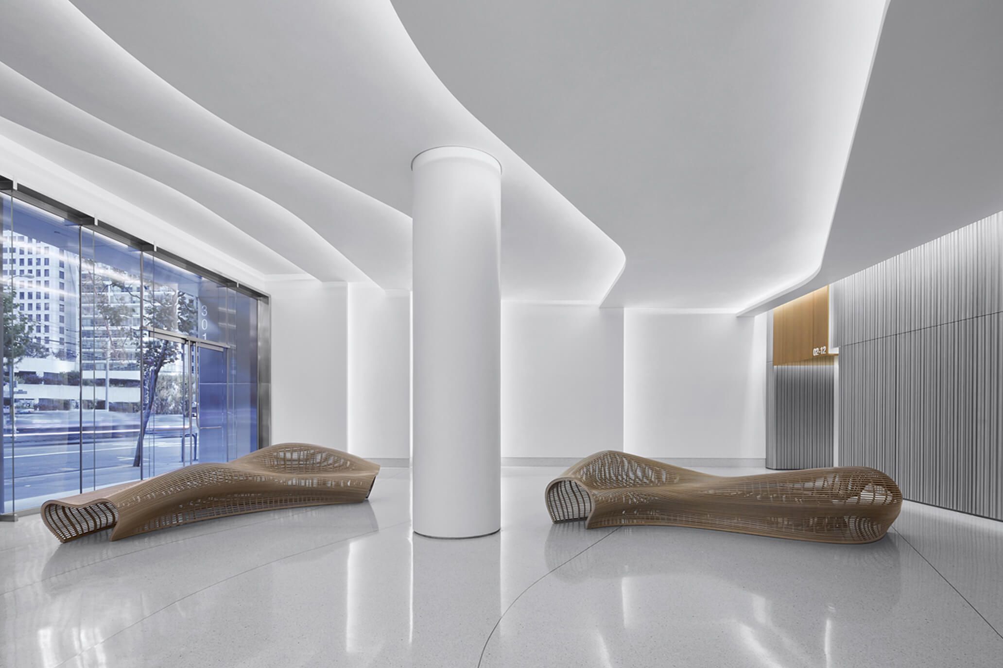
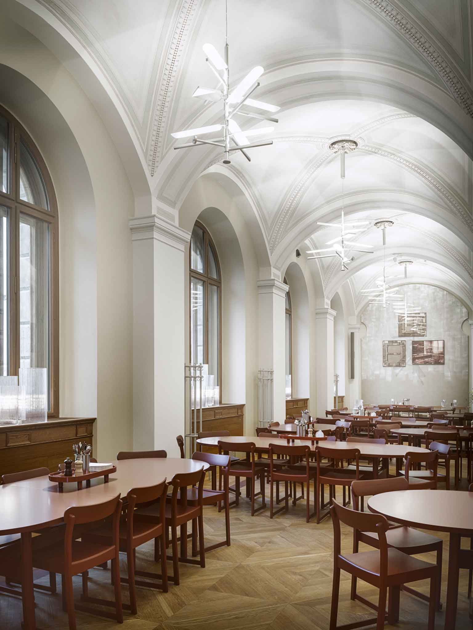
From outdated to updated
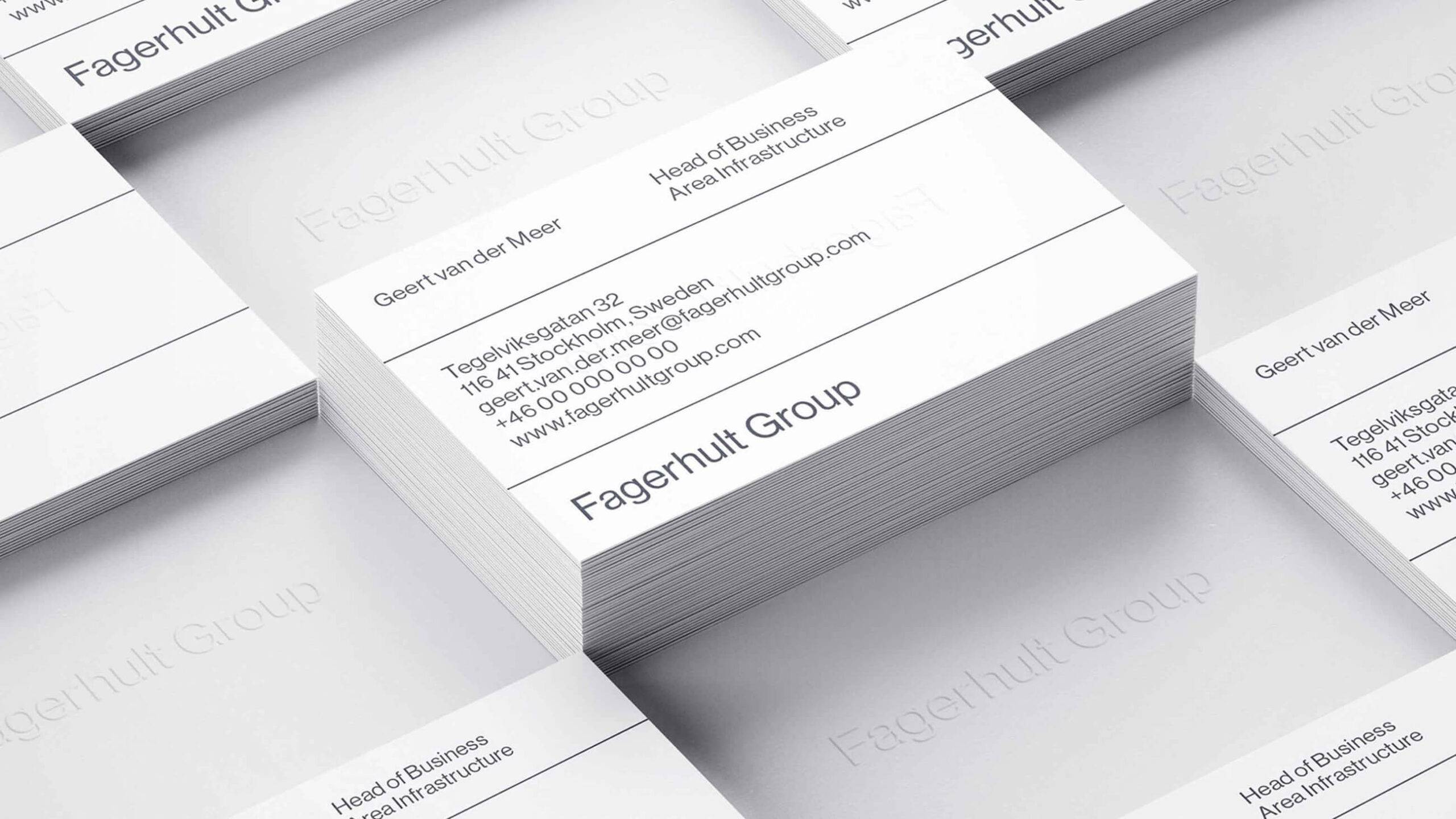
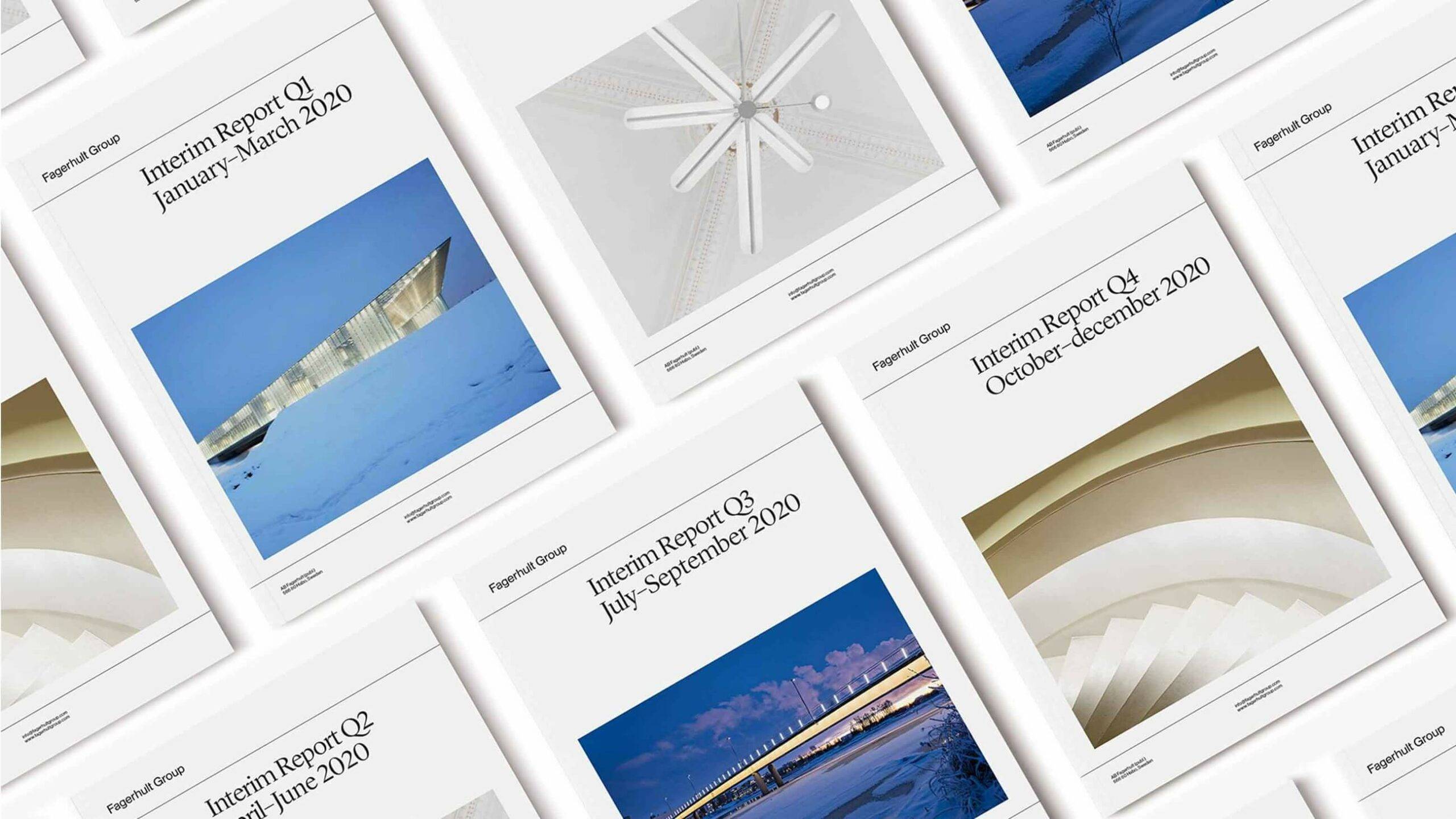
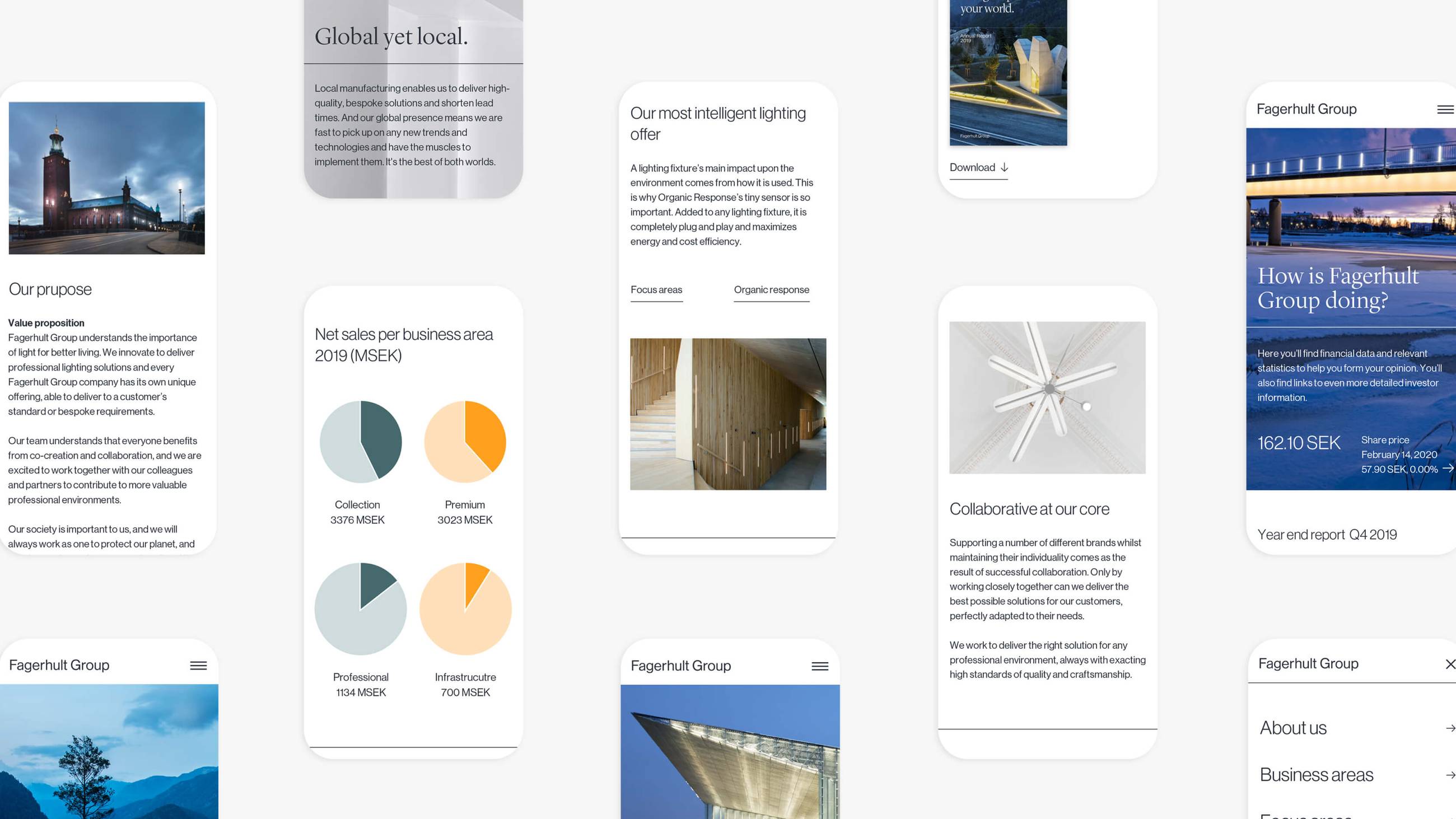
We revamped the logotype, developed a new color palette and brought in two new typefaces. We designed a gradient inspired by light and put together a framework for new imagery to showcase all the areas the group covers. Furthermore, we developed ‘the line’, a graphic element dividing content and providing a recognizable structure. Last but not least, we brought everything together in one unified website.
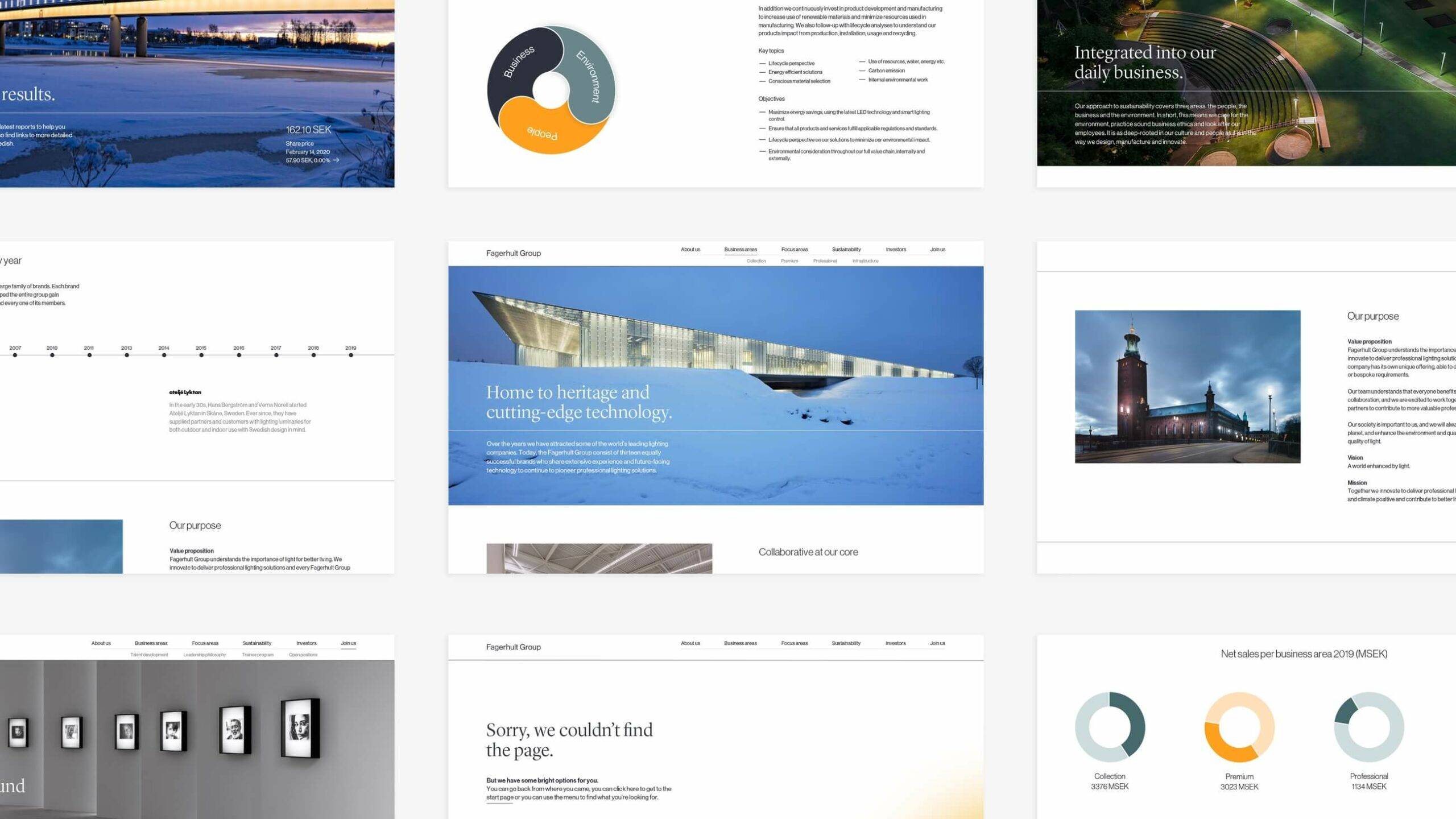
The future is looking bright
There’s no doubt that Fagerhult Group will keep enhancing the world with advanced, bespoke lighting solutions. And now, more people will tune in and listen to their story, the story of thirteen companies making the world a bit brighter.
