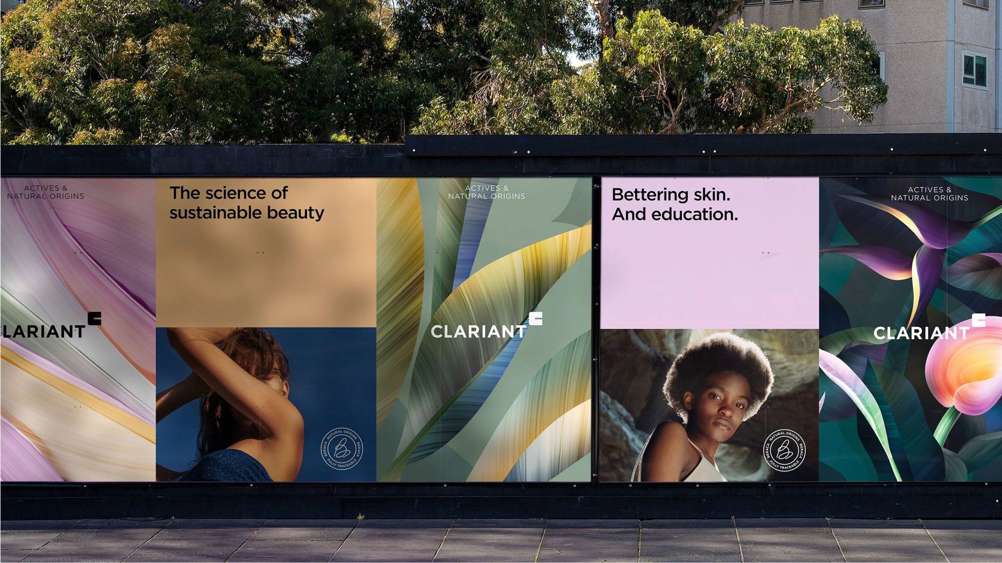
The science of
sustainable beauty
CLARIANT

Clariant is a Swiss multinational specialty chemicals company operating across 53 markets. Among other things, their innovative products are used by major brands in the beauty industry. Their latest business line for skin and hair care is Clariant Actives & Natural Origins. Based on advanced scientific technologies and natural ingredients, paired with an extensive sustainability commitment, Clariant was looking to launch their new business line and take the beauty industry to the next level.
What we did:
Strategy
Positioning Naming
Design
Visual identity Verbal identity Illustrations UI design Environment/ design Guidelines
Content
Copywriting Photography direction Campaign
Technology
Integration support

Different heritages. Same goal.
Actives & Natural Origins is the result of a merger between Clariant Active Ingredients and Beraca – a well-known Amazon-based manufacturer of natural ingredients that has received awards for its sustainability work in such areas as fair-trade processes and efforts in promoting the development of local communities. Our mission was to create an identity for the new business line, communicating an effective and more sustainable category of products as well as the integration of Beraca, all in line with the Clariant master brand.

Powered by Beraca
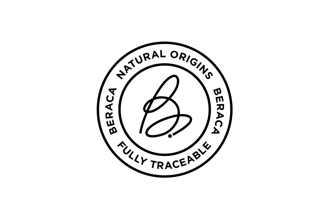
In order to strengthen their claim to be the most sustainable player in the beauty segment, a new positioning and promise for the business line was developed: the science of sustainable beauty, clearly expressing Clariant’s commitment to a more sustainable industry. One of the main strategic solutions to finding an appropriate and balanced branding hierarchy was the Beraca stamp – a symbol we created to be used on every product containing Beraca ingredients, with the purpose of emphasizing Beraca as a key driving force for Clariant. For the visual identity, we let the essential pillars of science, beauty, nature and sustainability come together, expressing warmth and progressiveness. We isolated tones of sand, orange, purple and grey from Clariant’s existing color palette. Illustrative artwork was added to communicate nature in a modern and unique way. And a new image concept, with a different treatment was introduced, capturing people in nature, portrayed just as beautifully as their natural surroundings.


A united future
Clariant Actives & Natural Origins was launched successfully – a clear and distinct business line, but very much a part of the Clariant family, all to make Clariant the number one choice for sustainable beauty and support them on their journey to taking the beauty industry to the next level.


