Everything for Södertälje
TELGE

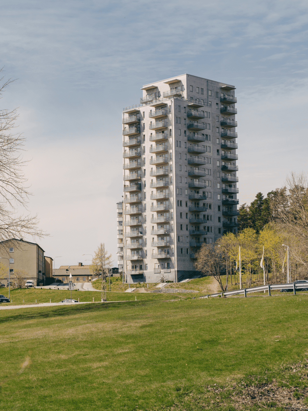
Telge operates in Södertälje and manages housing, real estate, heating, energy, trade and industry, communication infrastructure, and other things the city needs to function and thrive. Being owned by the municipality, but run as a for-profit organization, their business model is rare, but highly beneficial to Södertälje and its citizens. And it helps them on their mission to create a better and more sustainable society.
What we did:
Strategy
Brand positioning Brand platform
Design
Visual identity Verbal identity Iconography Illustrations Motion design UX/UI design Website Guidelines
Content
Copywriting Photography direction Implementation plan Design templates Office templates

Telge who?
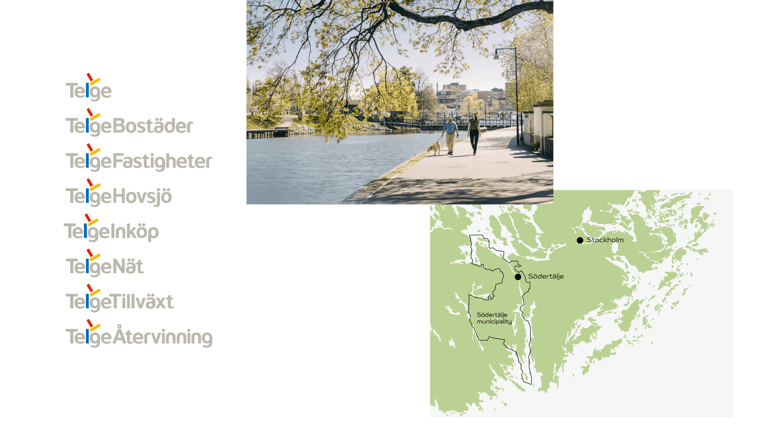
Telge have always made things operate smoothly yet gone fairly unnoticed. In other words, their businesses have been solid. But their brand far from strong. Our mission was to make the brand just as modern, professional and sustainable as Telge’s operations. A challenging factor was that their different business categories were split into several sub-brands. A structure that needed to be dealt with for the upcoming branding project.
Where worlds come together
First off, we recommended to bring together all the Telge sub-brands with a local target group, forming a single brand. This way we could use every part of Telge to shape a compelling story, told with one voice. Also, this would increase awareness of who Telge are, what they do, and their mission, to earn a well-defined spot in people’s minds.
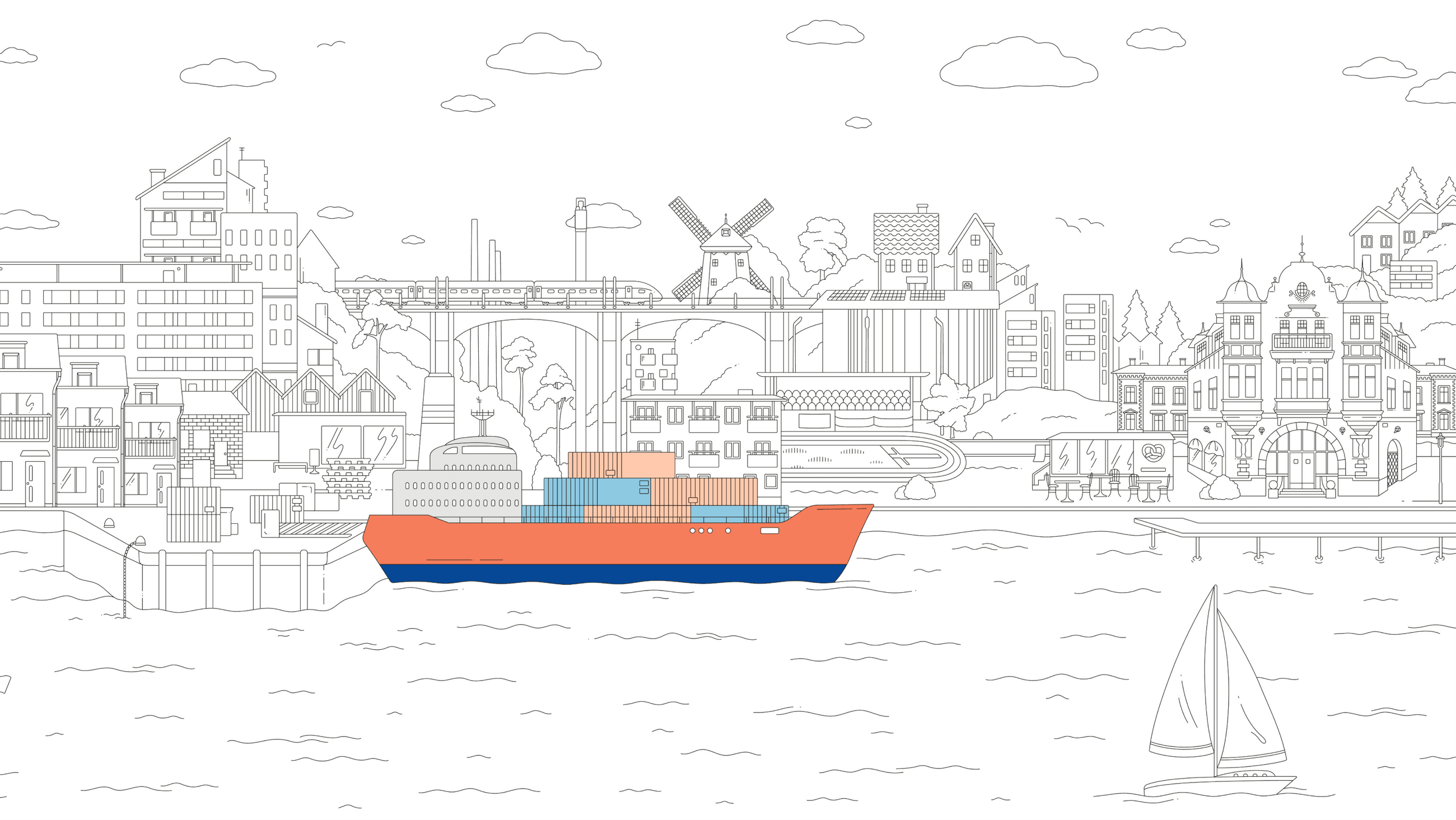
Everything for Södertälje
The main insight that shaped the new narrative, is just as simple as it is true – that Telge does everything for Södertälje. Literally speaking in terms of their broad operations for the city, but also in the sense of giving Södertälje their all. A message that fits well following the merging strategy of the former sub-brands, and the story of a company that provides so much for its city.
“Essen has been very professional in creating our new brand strategy with great understanding of exactly what we wanted to achieve. We are very happy with the creative work and what the project management team did for us. We would highly recommend them.”
JÖRGEN AUSTLER OLSSONCFO, Telge

Here to make a difference
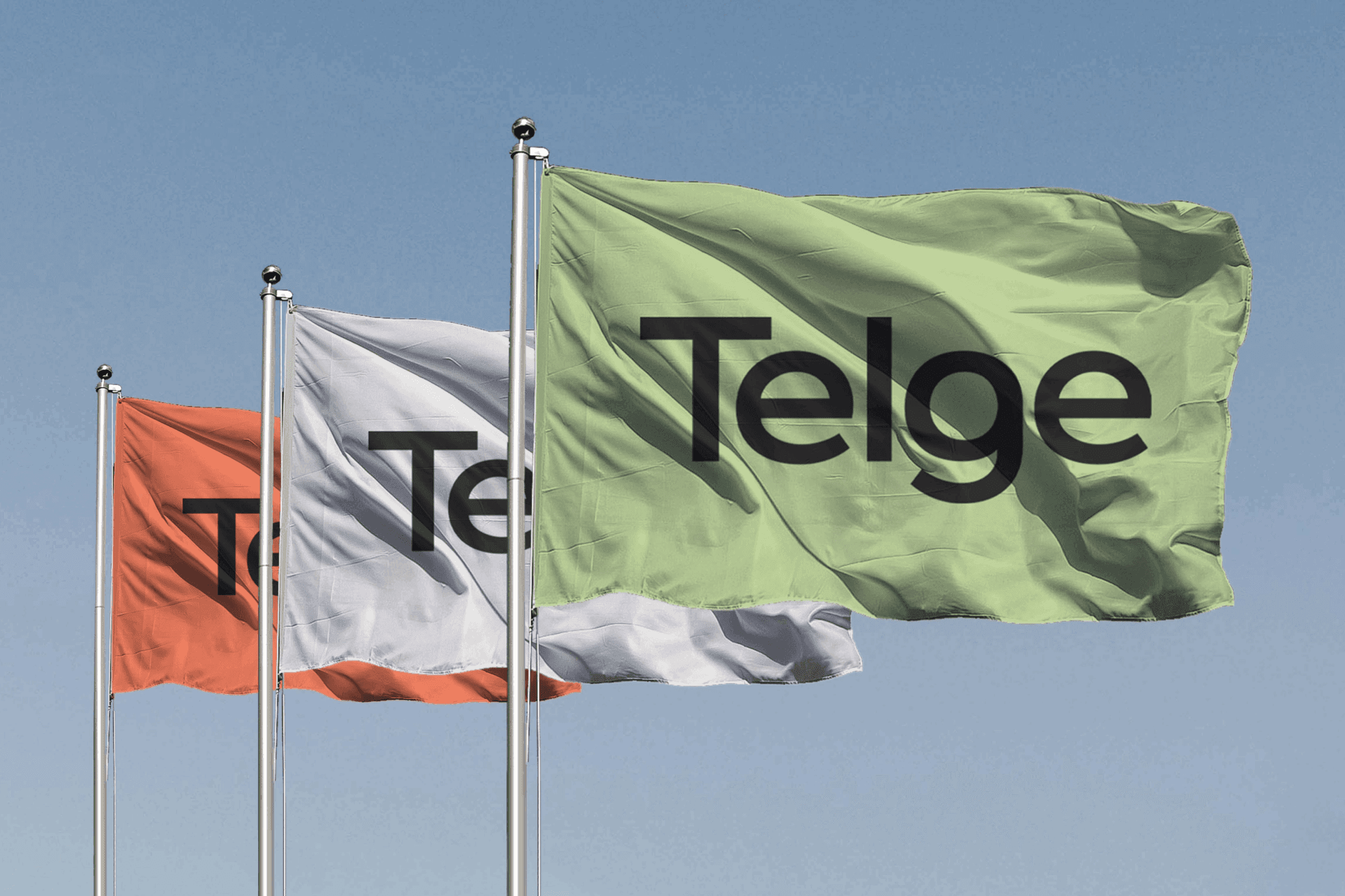
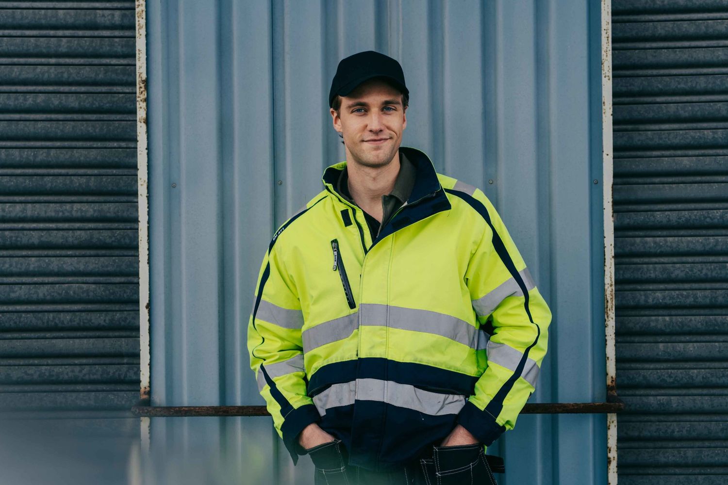
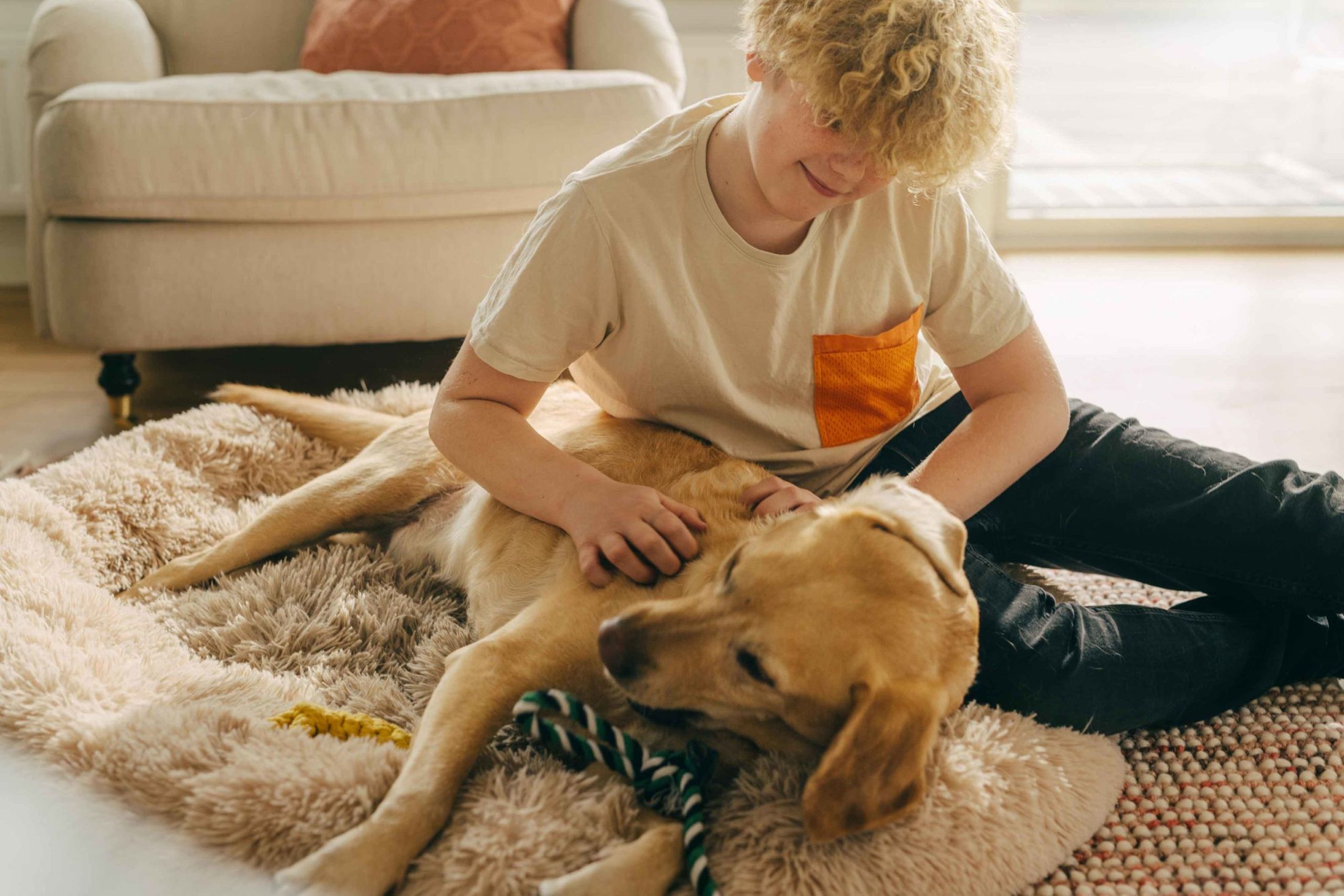
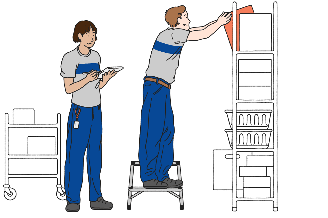
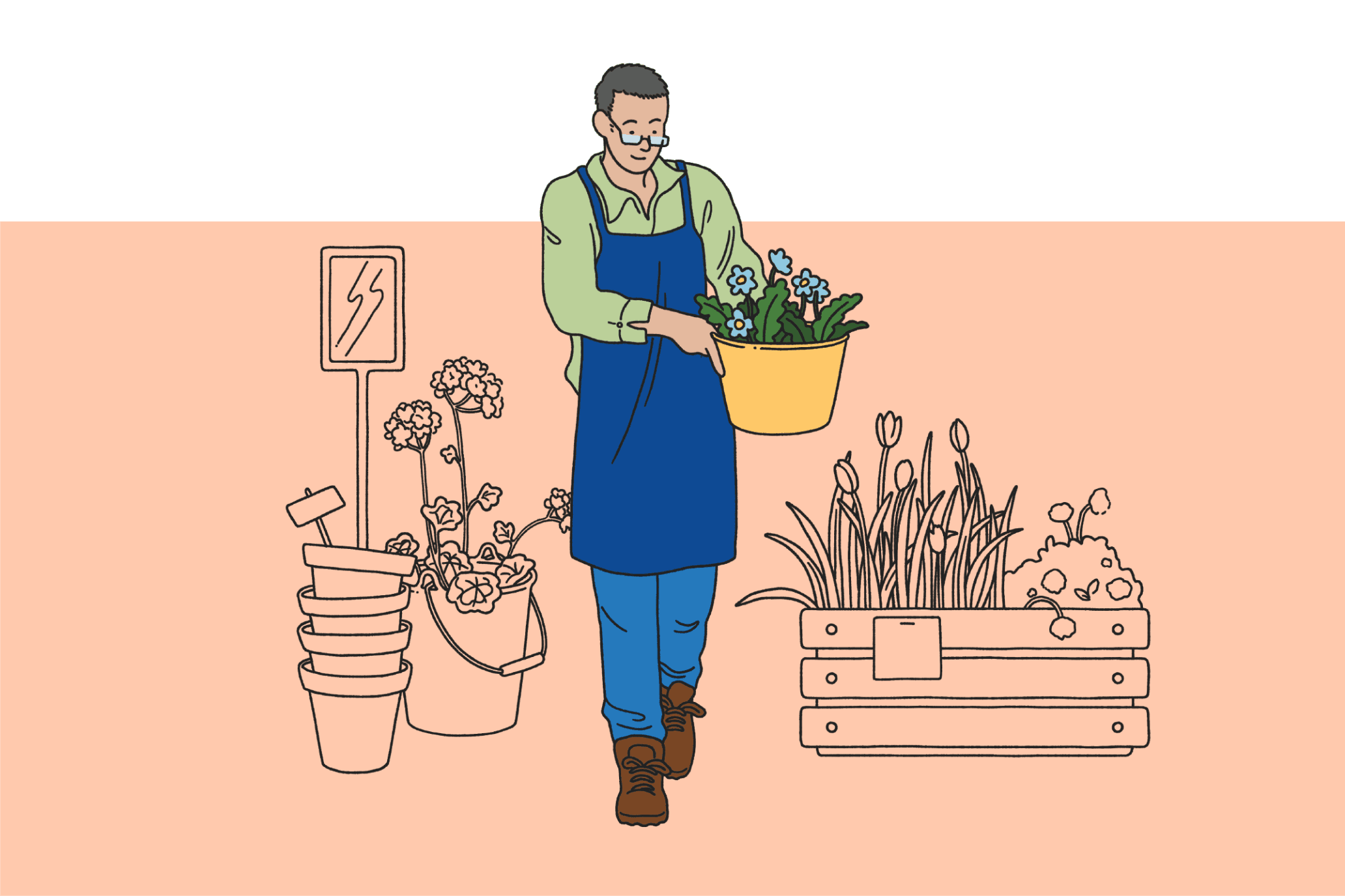
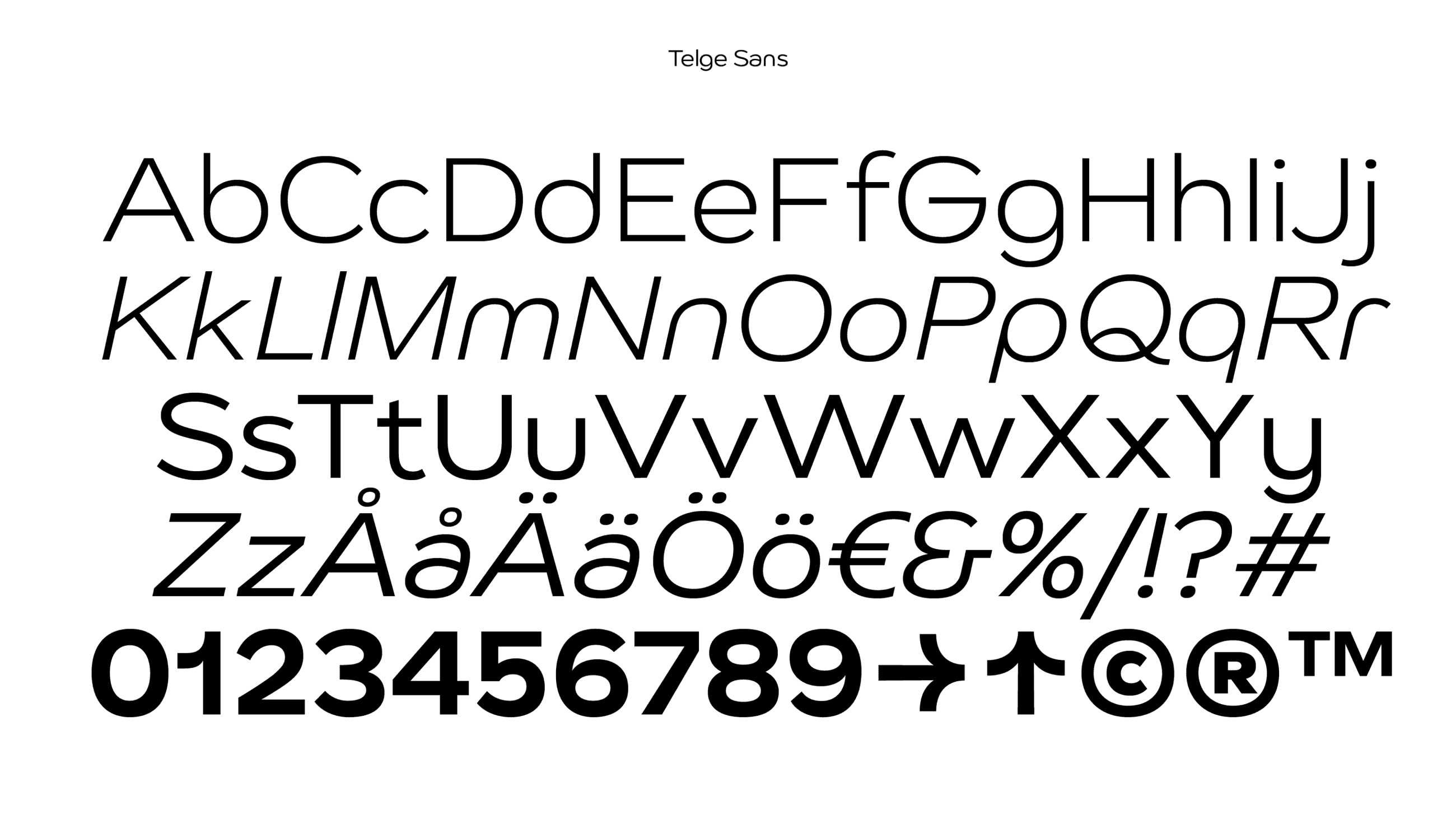
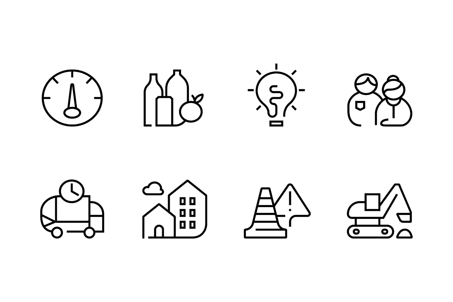
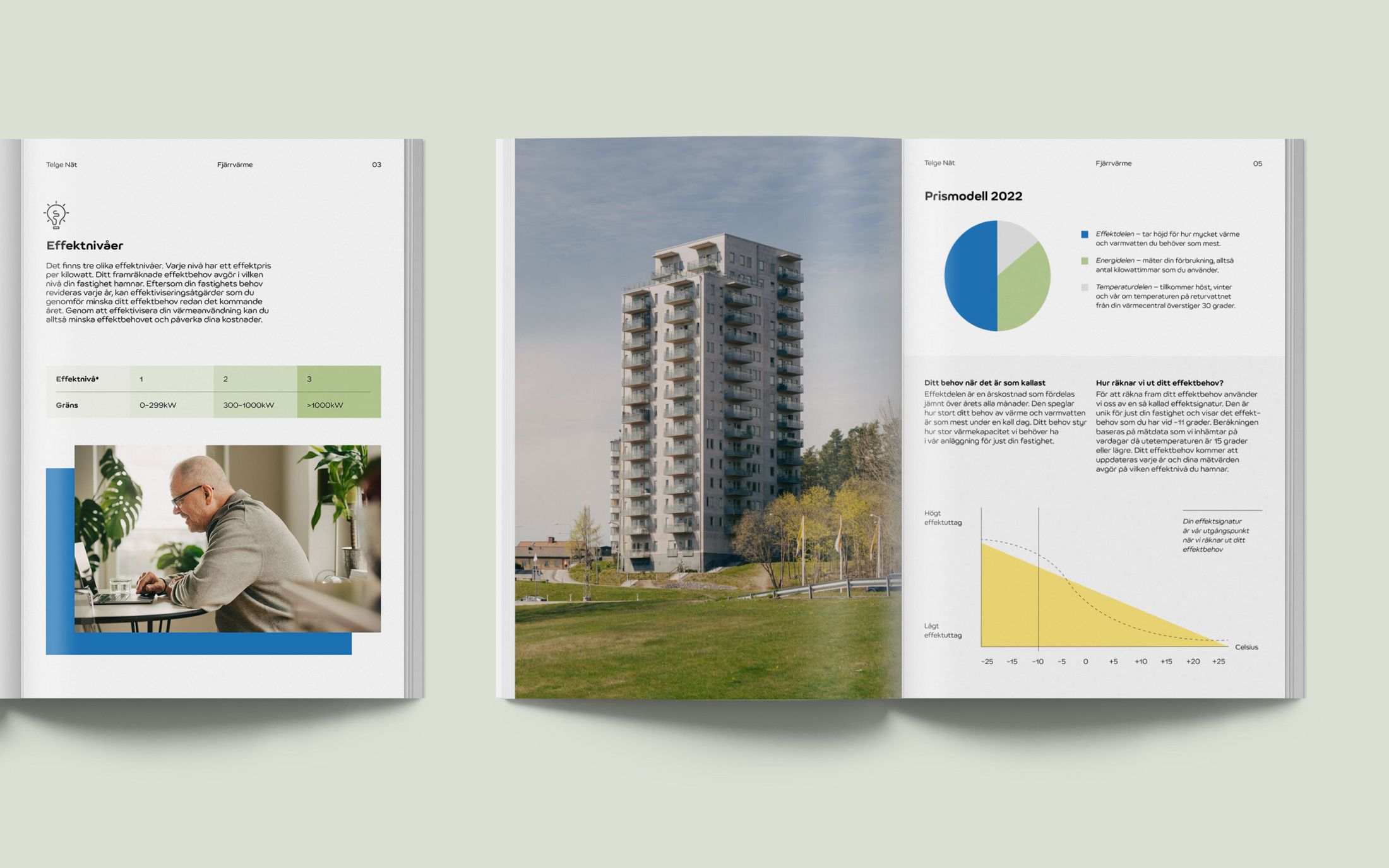
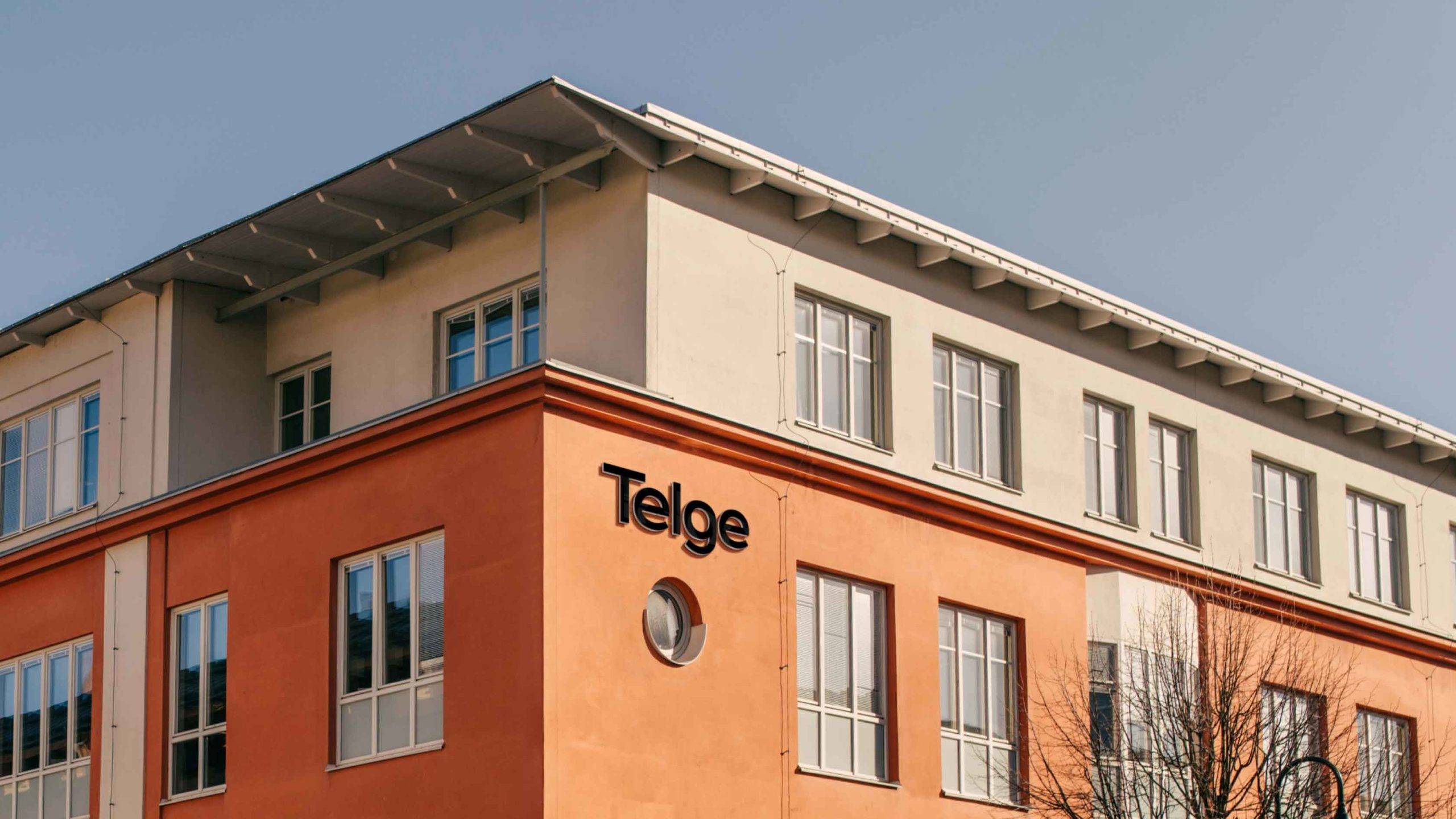
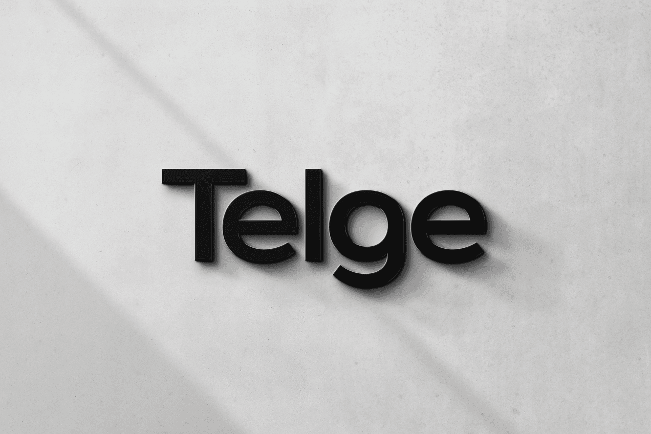
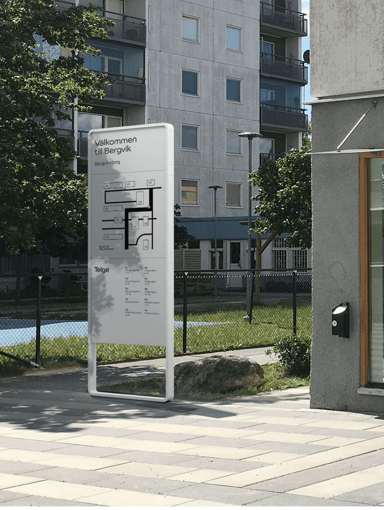
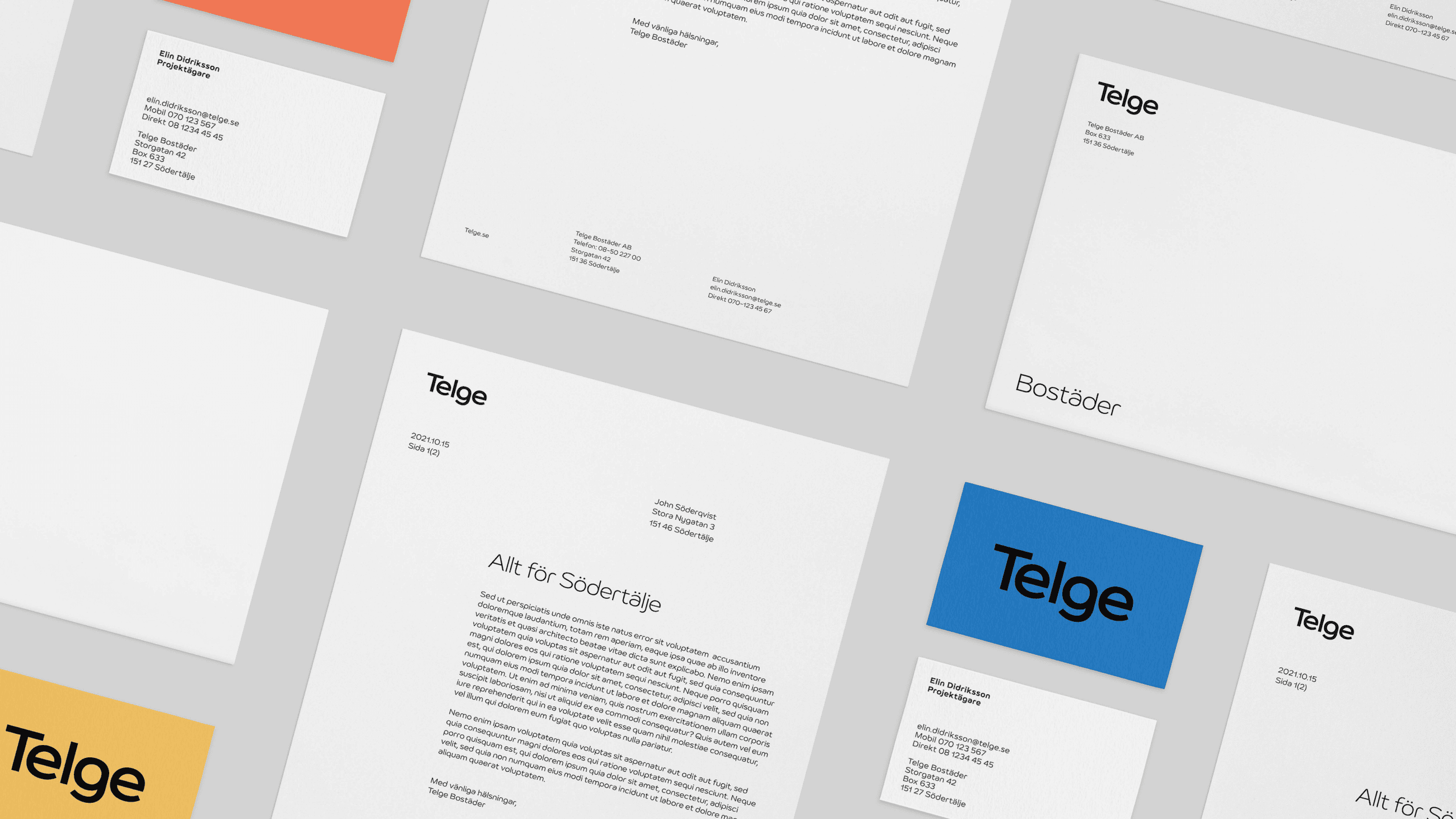
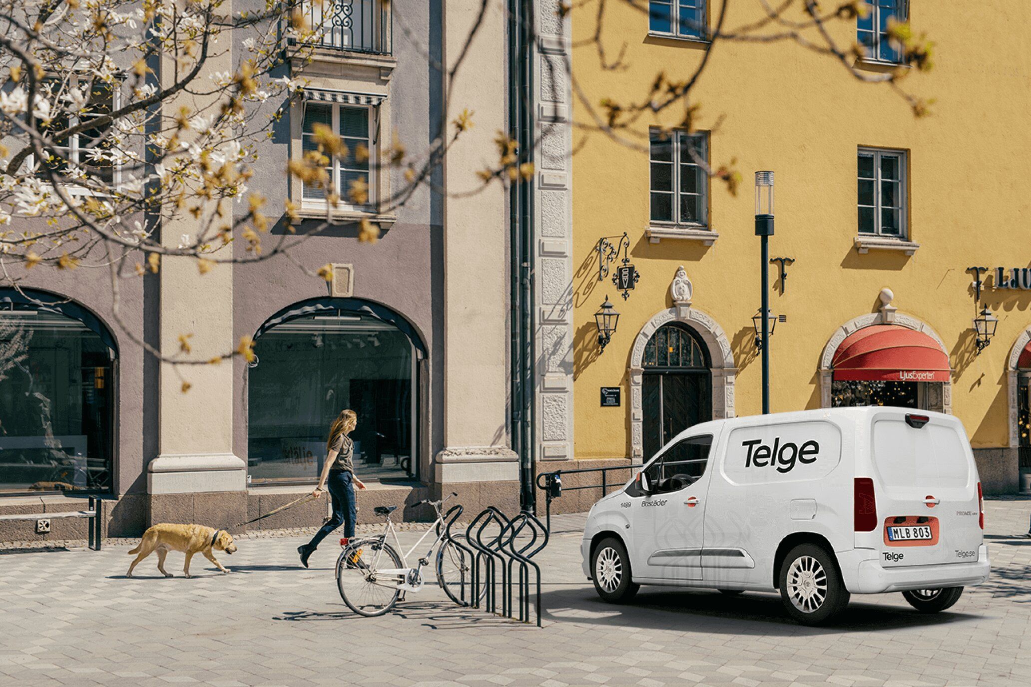
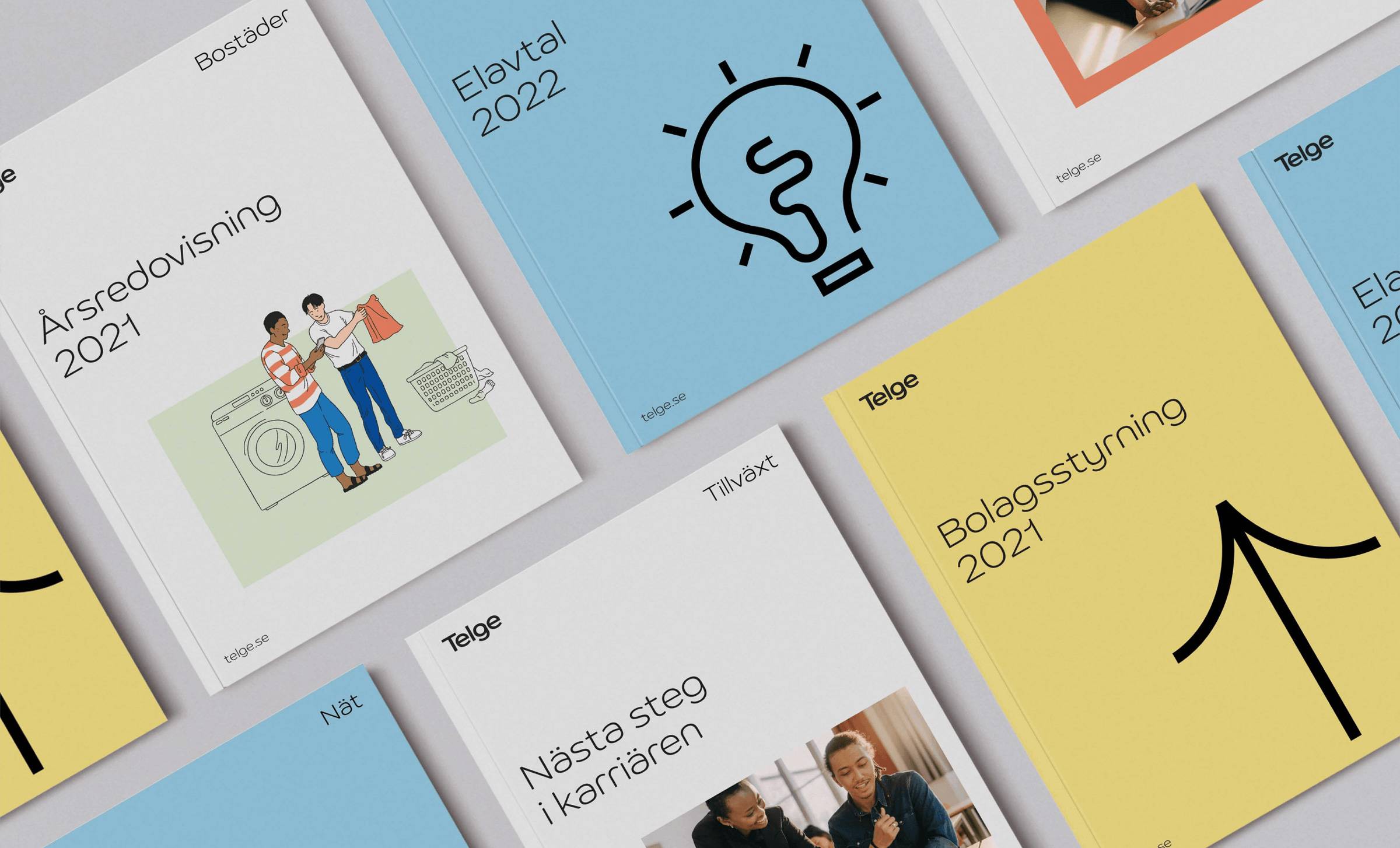
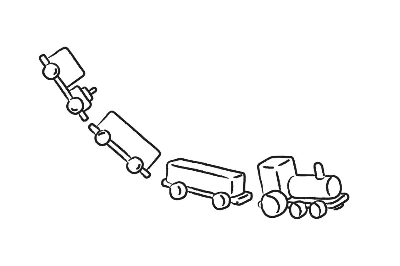
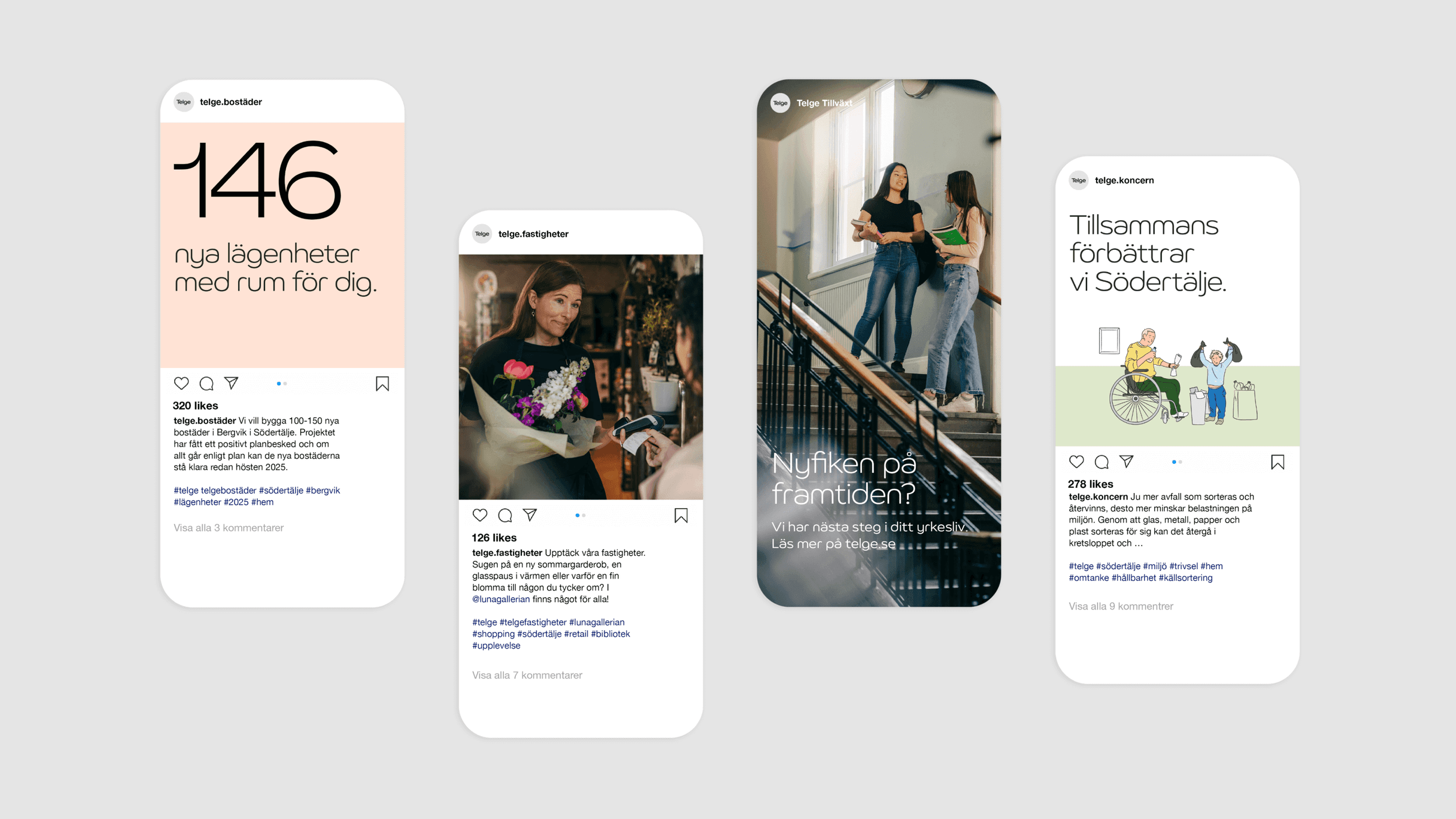
We did a complete rebrand, verbally and visually. We simplified the logo, creating a more modern look, while retaining character from the previous wordmark. A bespoke typeface was developed “Telge Sans” together with extensive iconography, both based on the round and open shapes of the logo. We based the new color palette on the previous one to maintain recognition, but refreshing it. Toned down, yet bright, it lends a sophisticated and warm expression to the program. The image and illustration manners put people first, adding warmth and personality to the brand. And for the image bank, every photo was shot on site to portray Telge in the context they belong. The new identity was implemented across all touchpoints – from website and social media to building facades and branded cars. Together, the changes expressed a modern, warm, progressive yet humanistic Telge. Last but not least, we helped Telge to rebrand “Hubbarna” – an initiative for young people in Södertälje to explore new interests, make friends and get a positive start in life. At the end of our branding journey, a new start was set for Telge. Now ready to show how they create a better and more sustainable Södertälje. Today, and for generations to come.
