Making a communications
expert understandable
PTS

The Swedish Post and Telecom Agency’s (PTS) assignment is to ensure that the country's communication is robust in the event of a crisis. There is also a softer dimension to their work, that all people in Sweden have access to good telephony, broadband and mail. A precondition for a well-functioning society and a happy population. In summary, PTS has a broad mission and the broadest possible target group – the entire Swedish population.
What we did:
Strategy
Brand positioning Communication strategy Qualitative and quantitative research studies
Design
Visual identity Verbal identity Iconography Illustrations Motion design UX/UI design Websites and apps Retail/environmental Guidelines/Brand portals
Content
Copywriting Scriptwriting Campaign Design templates Office templates
Technology
Front-end development Back-end development Prototyping
Law
Freedom to operate search Pre-file search Protection
Leading by example
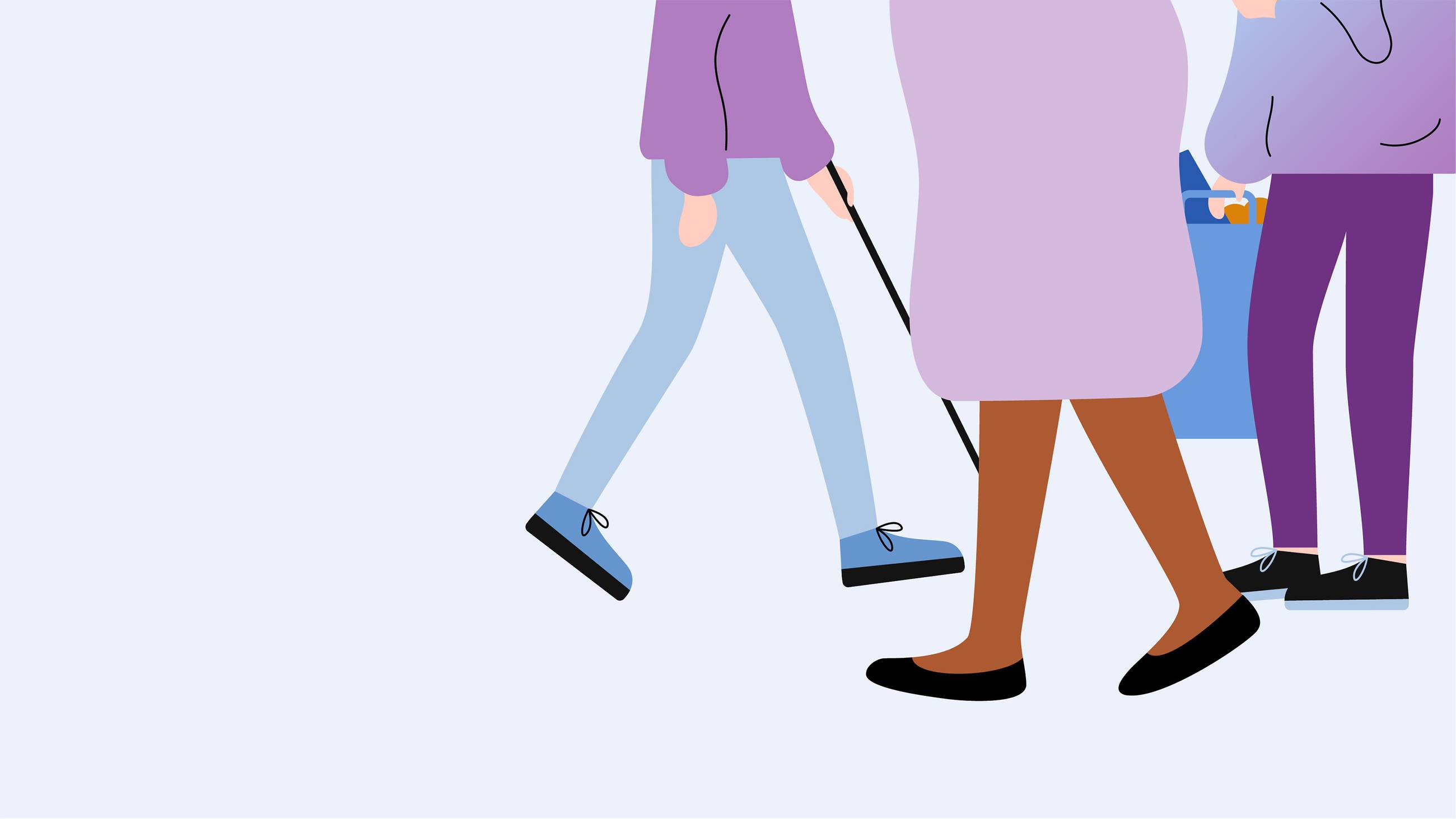
Our collaboration started with an analysis of the existing visual identity. Our conclusion was that the it was outdated, poorly adapted to digital channels, the font had poor readability and the color palette did not live up to current accessibility guidelines. This of course needed to be addressed, as inclusion and accessibility are top priorities for PTS. In fact, PTS were involved in developing the standards that exist for digital accessibility. Thus, they themselves needed to lead by example.



Creating a broader appeal
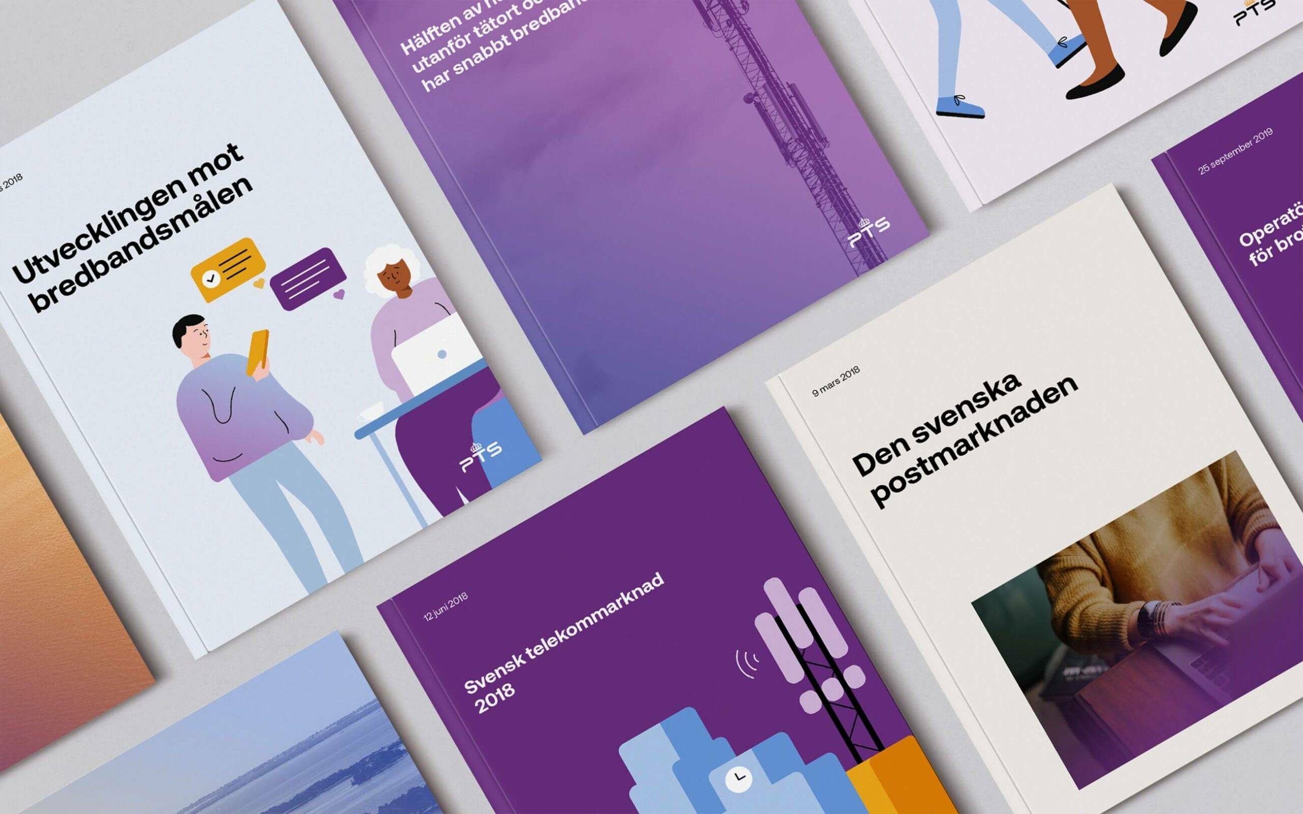
Next came an inventory, sorting components into assets and liabilities. From there we developed a new identity for PTS, with a more human and legible font, warmer colors, easy-to-handle imagery containing photographs, illustrations and animations, as well as information graphics. Great emphasis was placed on the visual identity being flexible enough to manage a whole range of expressions, from informative to more communicative.


Connecting the elderly
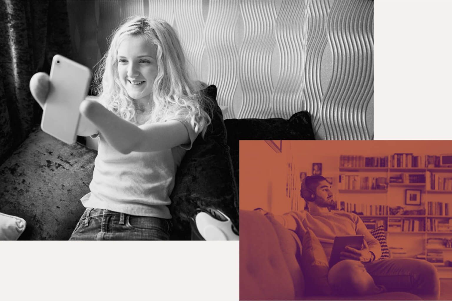
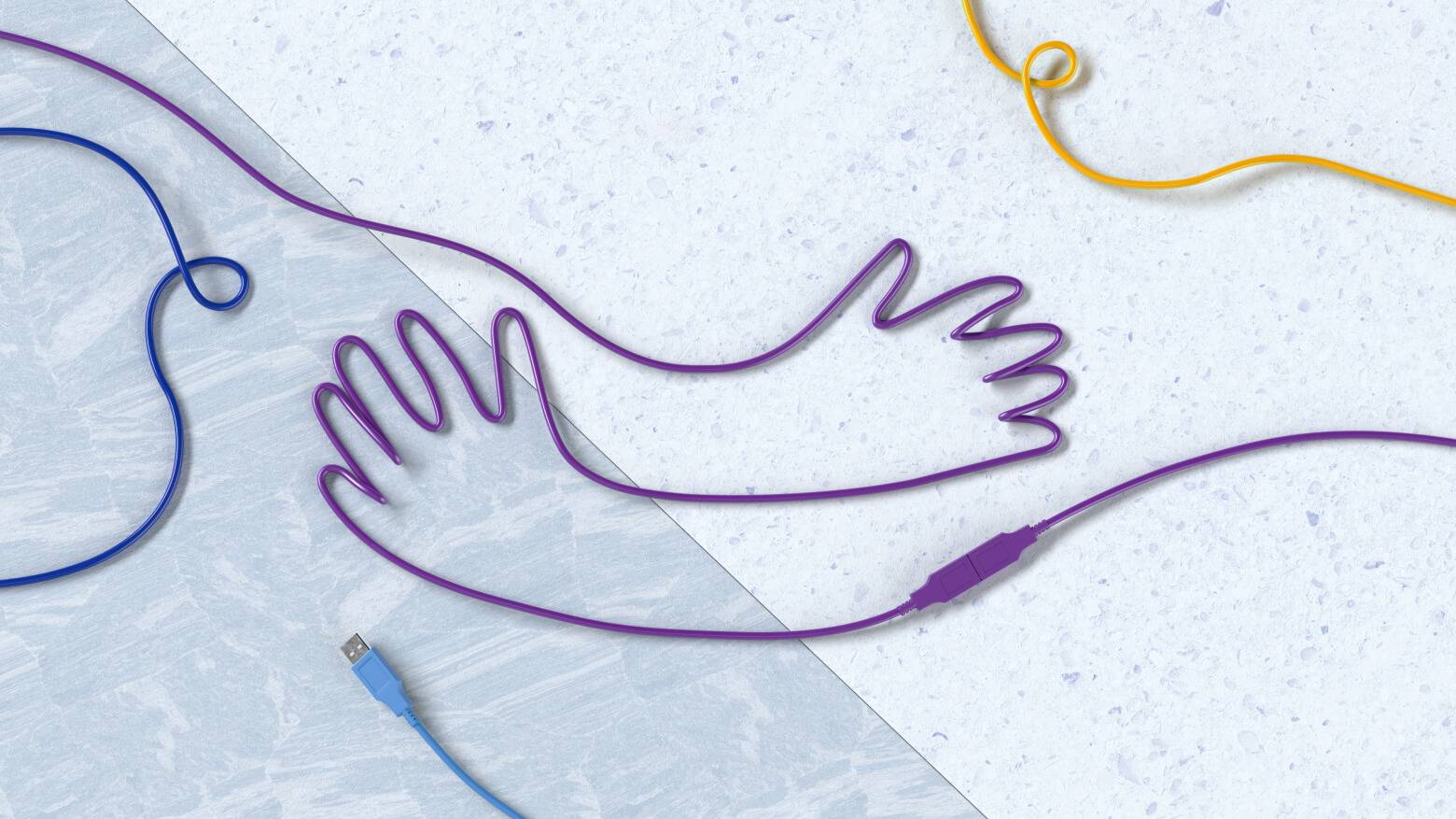
The toughest pressure test was the development of the Digital Help – a digital platform to help the elderly use digital tools to break their isolation due to the COVID-19 pandemic. Digital Help was launched according to plan in December 2020 and thus marked an end to our work with PTS's visual identity. But our collaboration with PTS lives on.

A new look for Innovationstävlingen
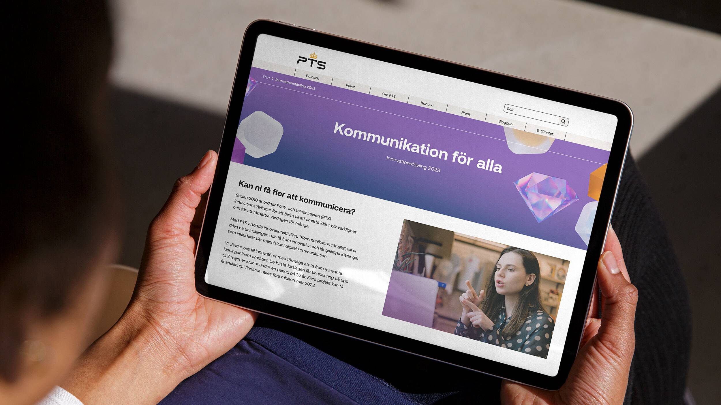
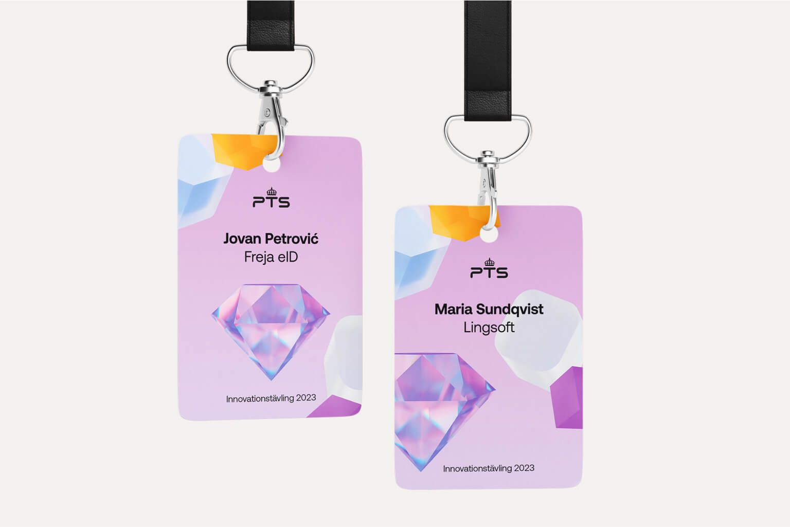
Since 2010, PTS arranges the annual competition “Innovationstävlingen” helping to realize new ideas in digital accessibility, thus improving everyday life for people regardless of functional needs. Instead of creating new separate identities for each year’s theme, we helped PTS to create one main look and feel to be used for all future events. The new identity was centred around various building blocks, representing the stages of ideation and product development, including a shiny diamond as the main graphic asset. All floating around in a playful warm setting.

Not your average website
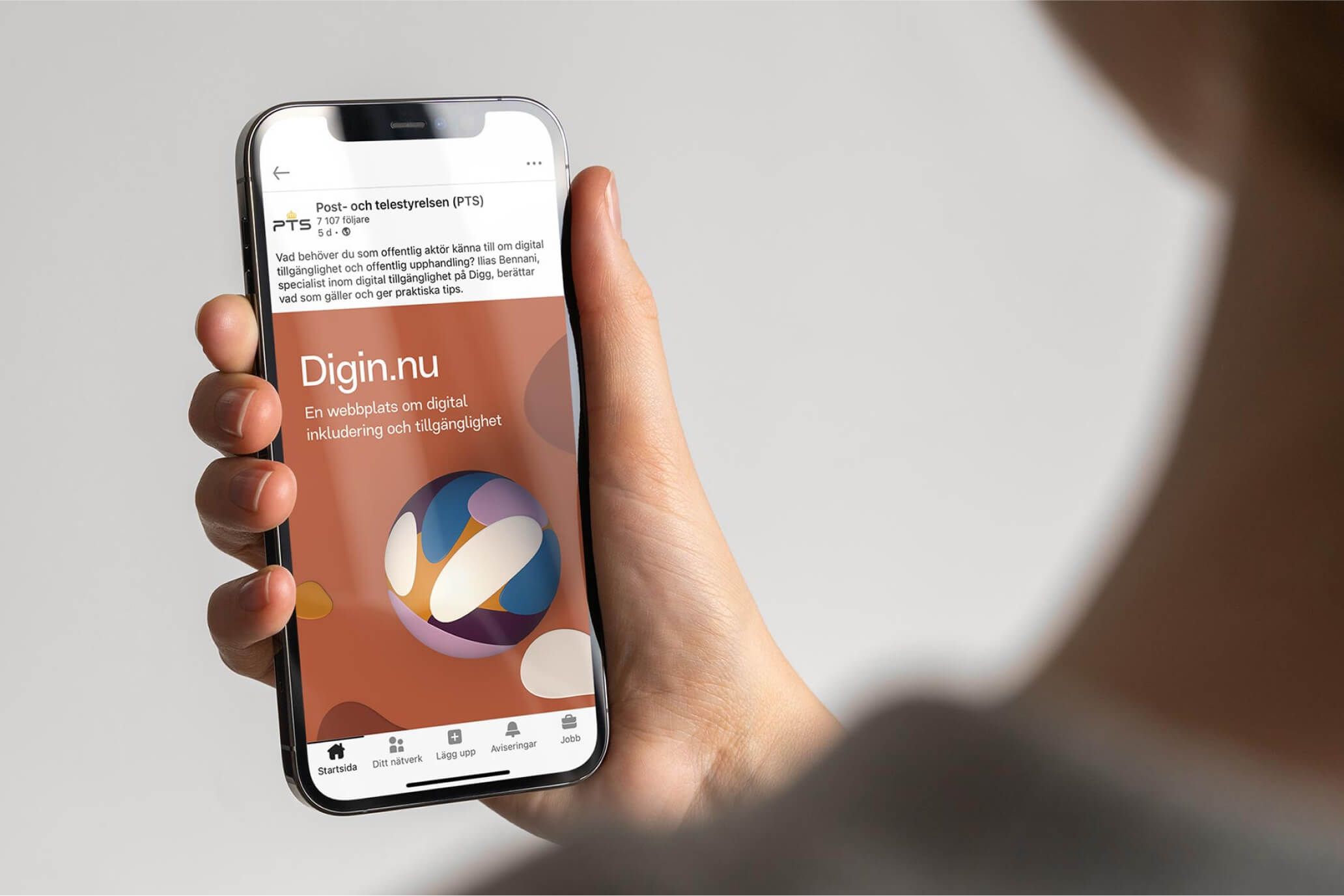
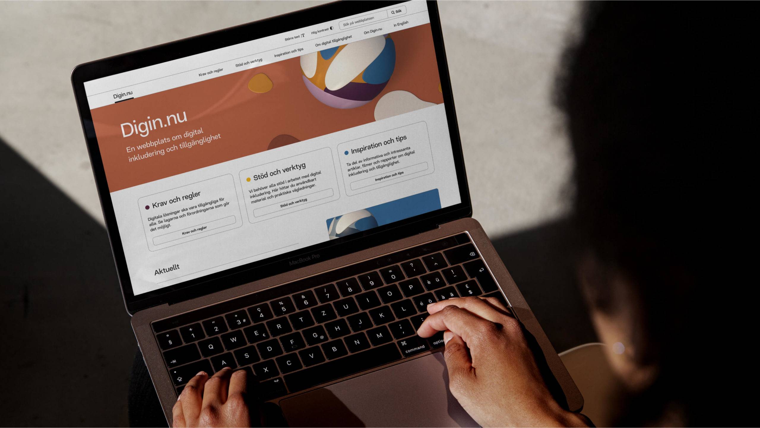
Also, we created Digin.nu, a website that educates private and public organisations about accessible communication, and how to create inclusive content adapted to people’s different functional needs. In addition, we wanted to make the site itself a model for accessible communication and give visitors a concrete example of how a digital channel can and should work. To further strengthen the idea behind the initiative, we developed a visual identity inspired by people and perspectives coming together. The website not only became an important tool to increase awareness of accessible communication but encouraged people to make digital exclusion history.
