Modern living at
the heart of history
HAAVENS
An abundance of beautiful rental apartments in the heart of the largest cities of the Netherlands, but not one communicative building block to tell the story. This was the starting point of a month-long journey with the Netherlands’ newest real estate company.
What we did:
Strategy
Brand architecture Brand platform Brand positioning Social Media Strategy Technical strategy Quantitative and qualitative research studies
Design
Visual identity Verbal Identity Iconography Illustrations Motion design UX/UI design Website Guidelines
Content
Copywriting Scriptwriting Photography direction and production Campaign Social media plan Implementation plan Design templates Office templates
Technology
Front-end development Back-end development Prototyping Integration support
A life well lived
We worked in close collaboration with the owners and the management team, carefully molding the new brand. To them, apartments were more than just a roof over your head, they were a springboard from where you take on life. This, along with the Netherlands’ famed ports, inspired the name: Haavens.
Creating Haavens
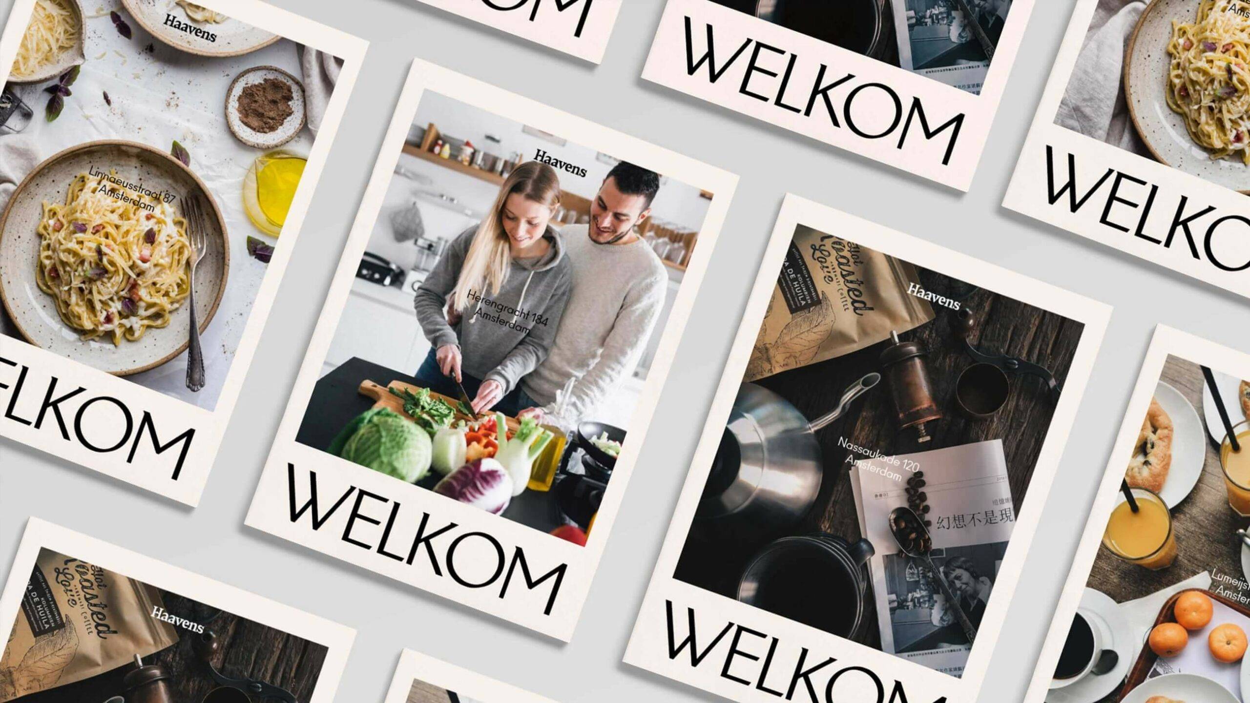
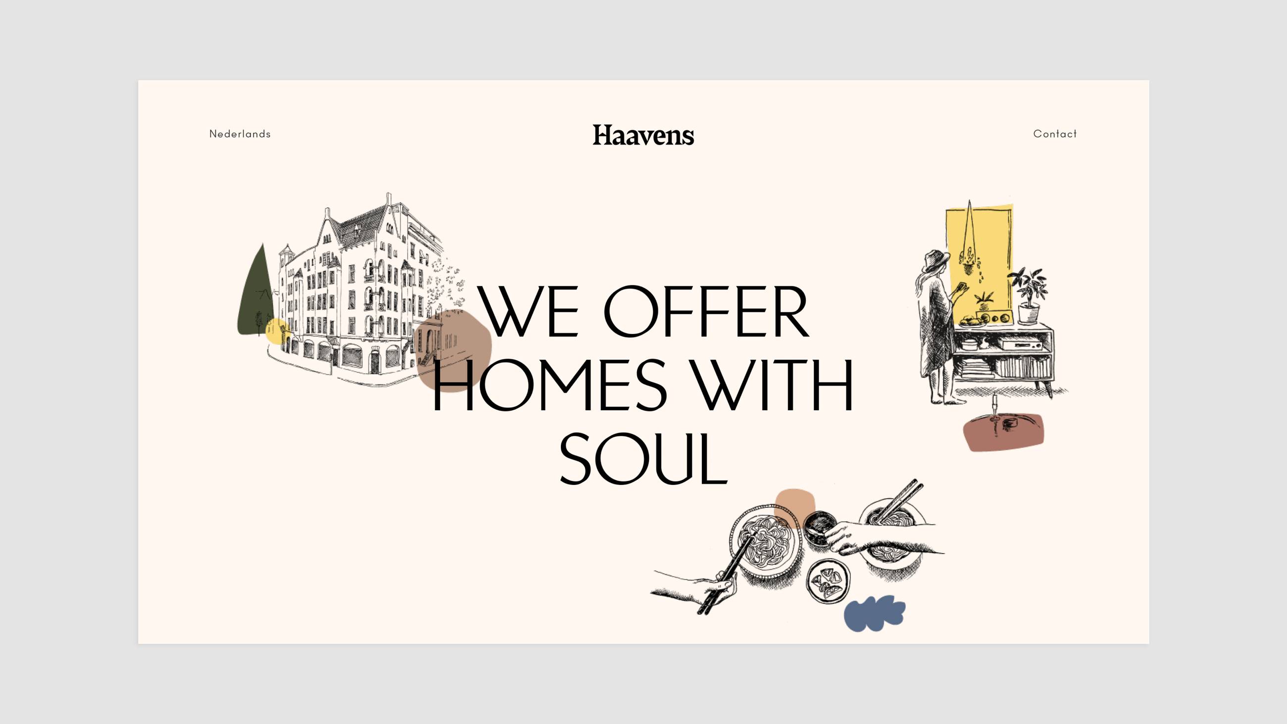
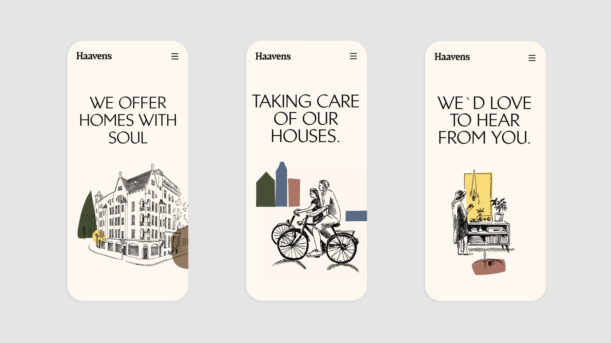
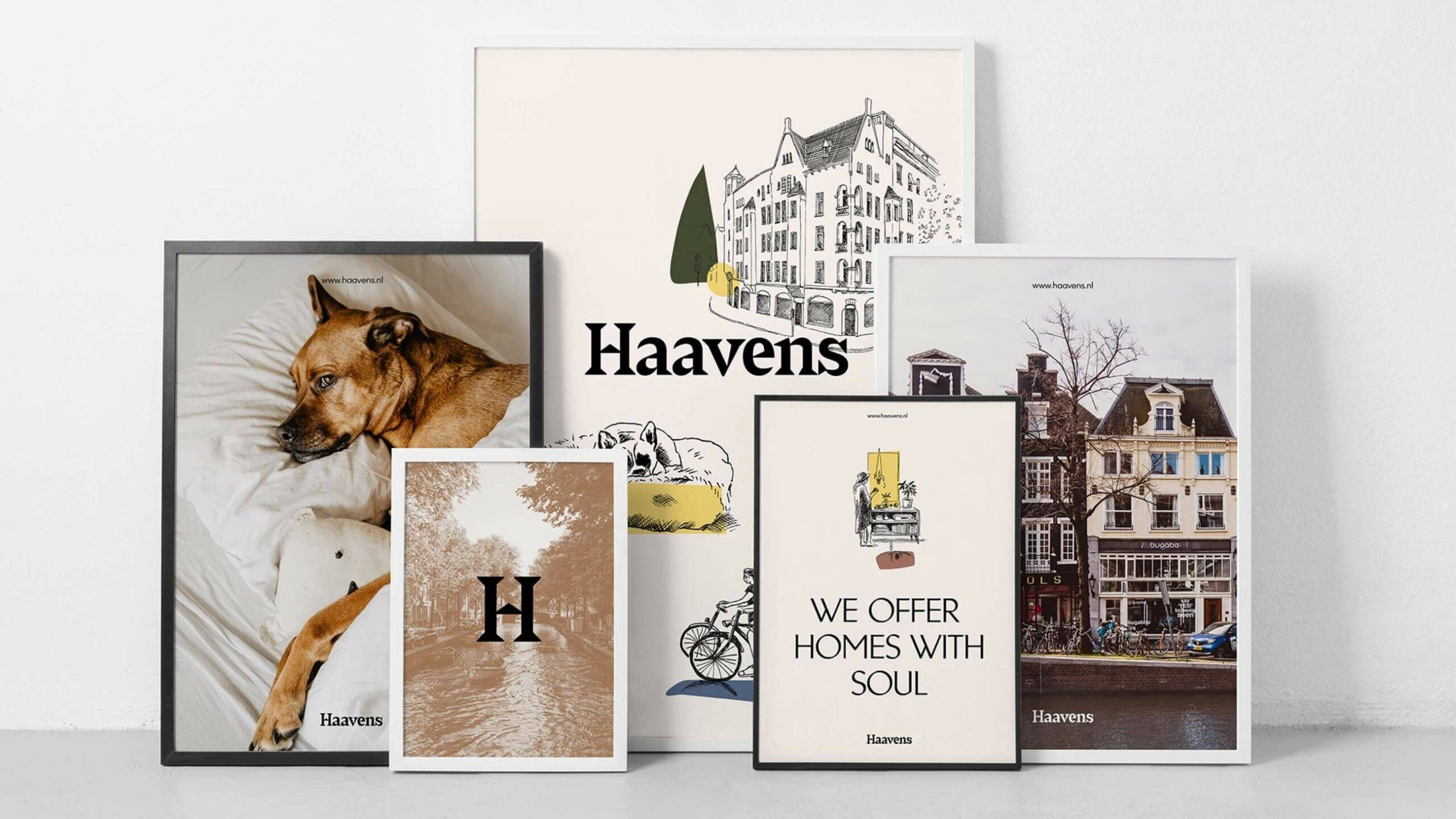
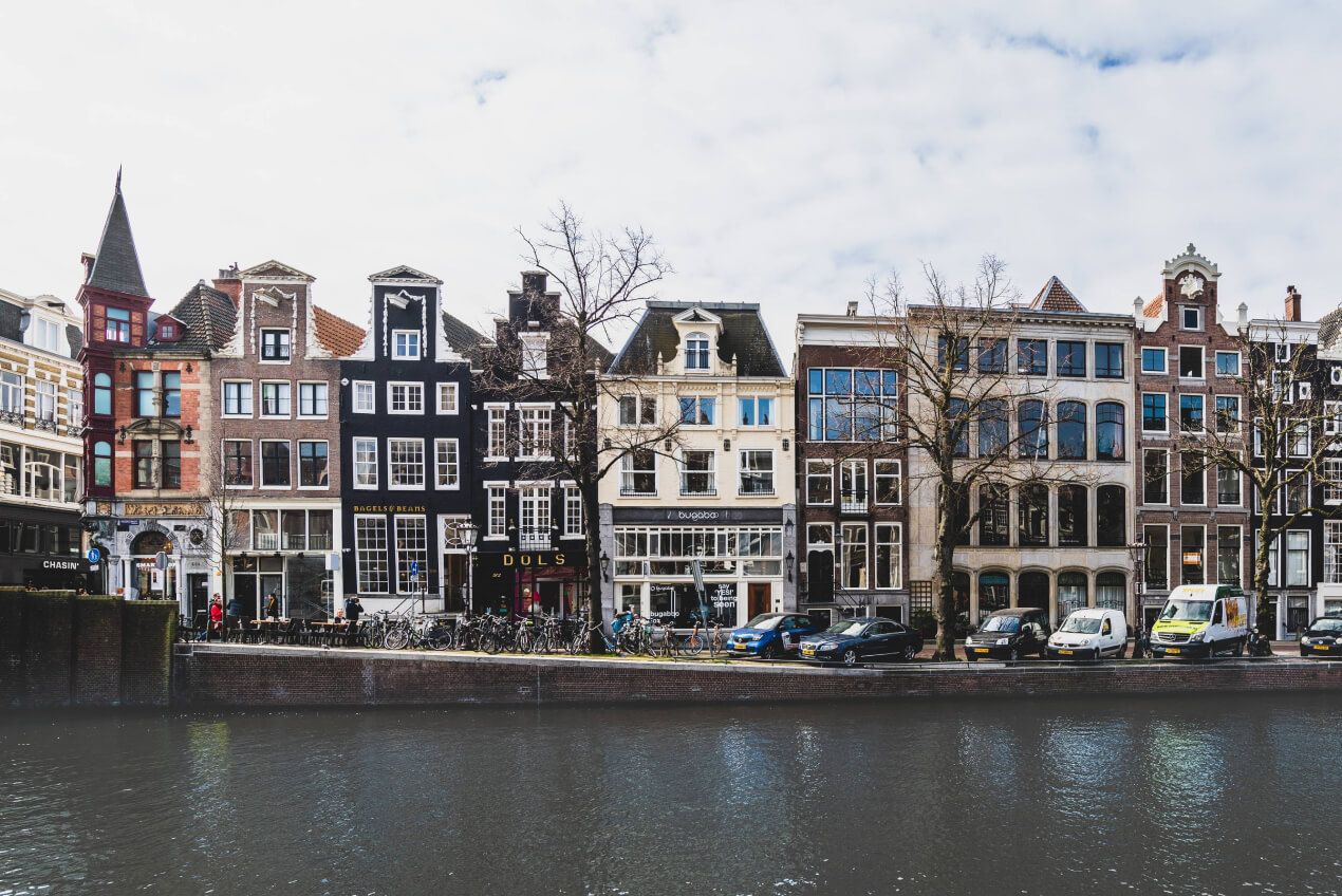
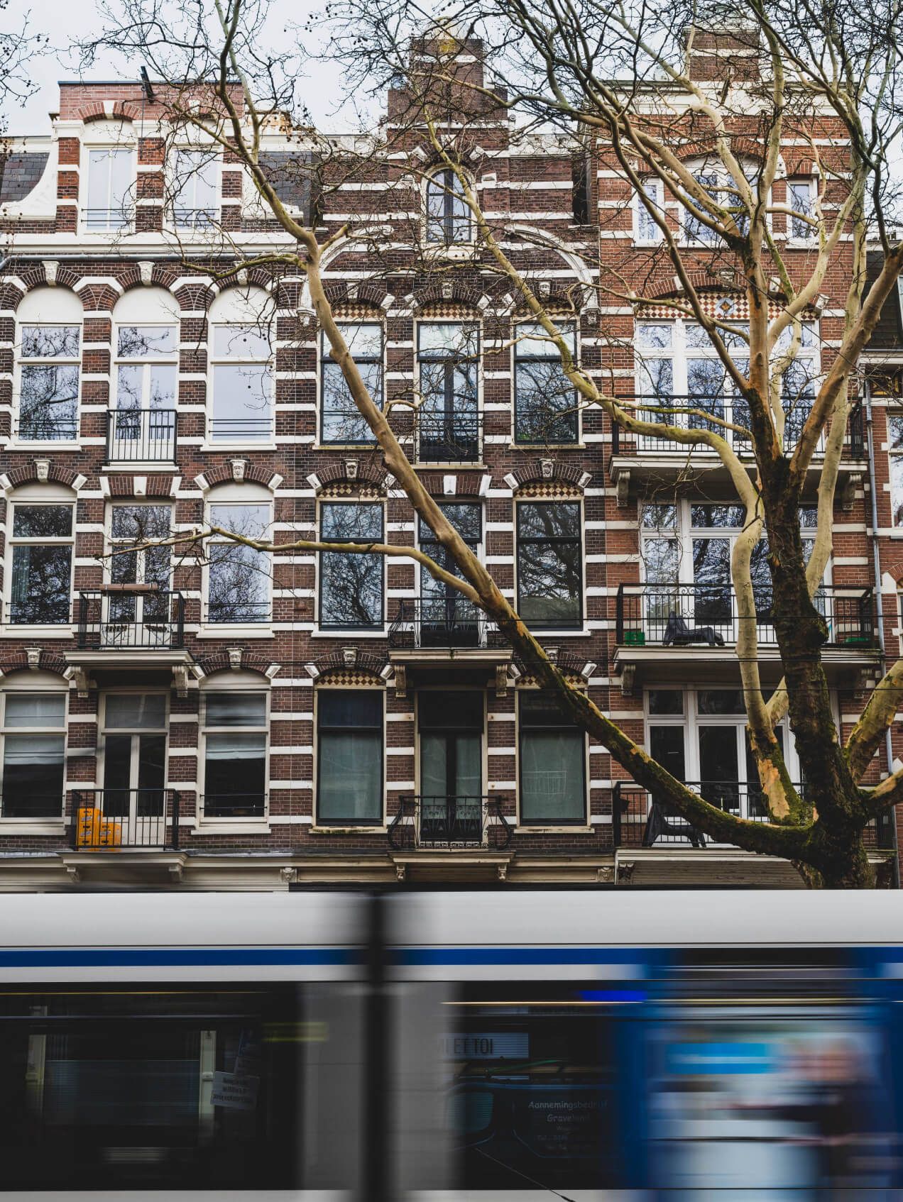
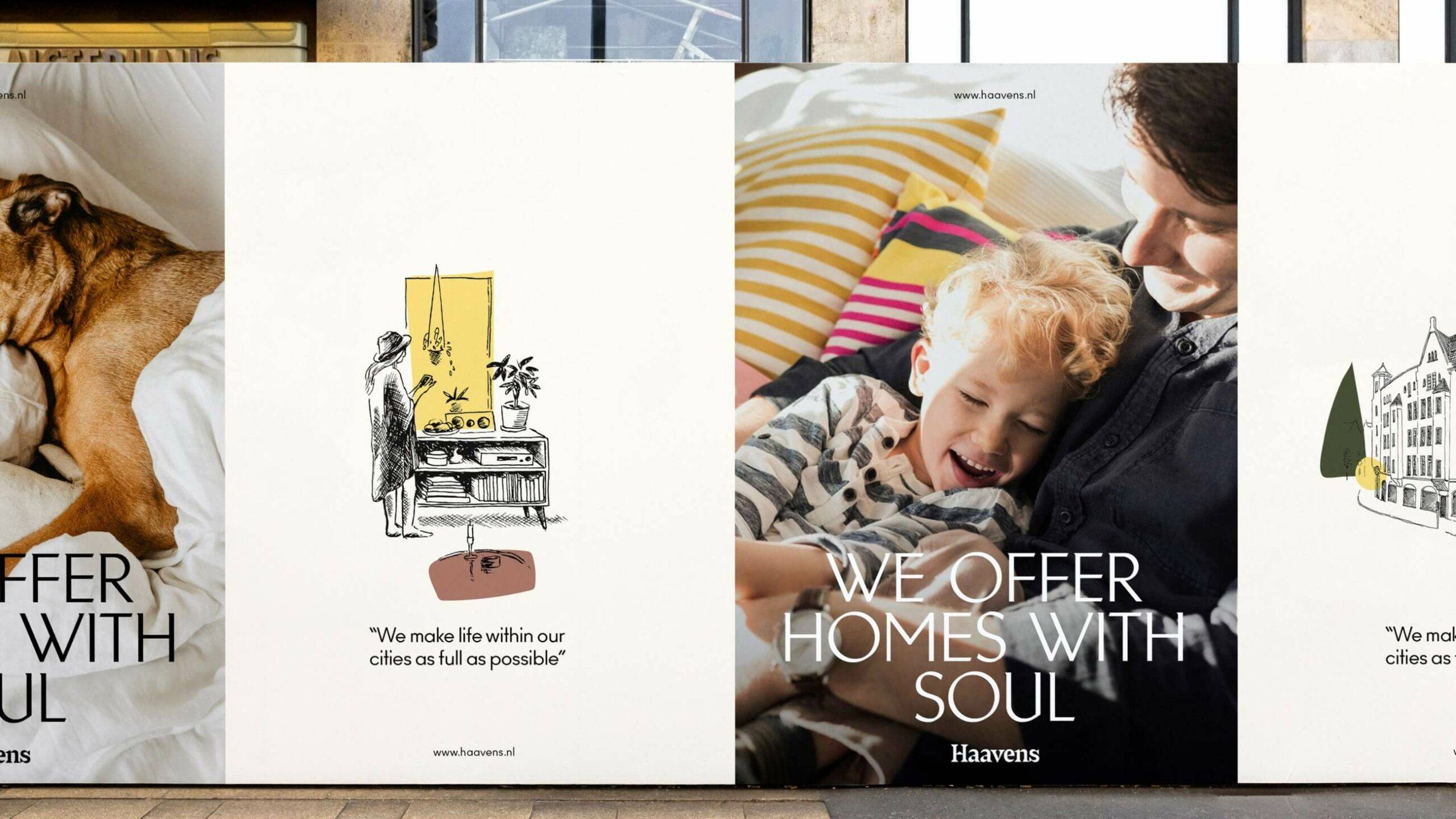
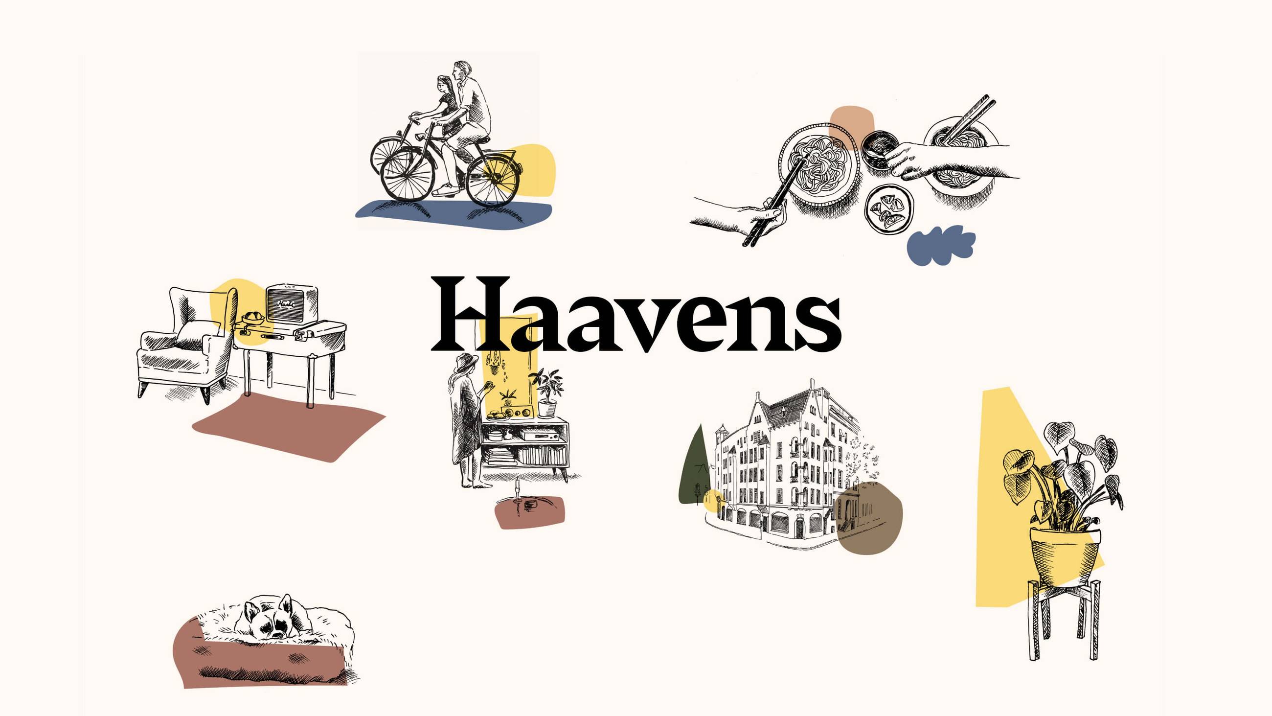
The visual identity was developed at the intersection of three equally important aspects: the human touch of homes, the professionalism of a service brand and the exclusivity of real estate investments. Illustrations inspired by classic pencil drawings, along with imagery of life at home, lent a human touch. Images capturing beautiful building exteriors provided a premium feel. And the verbal identity added to the welcoming warmth of the brand.
Made by the Netherlands
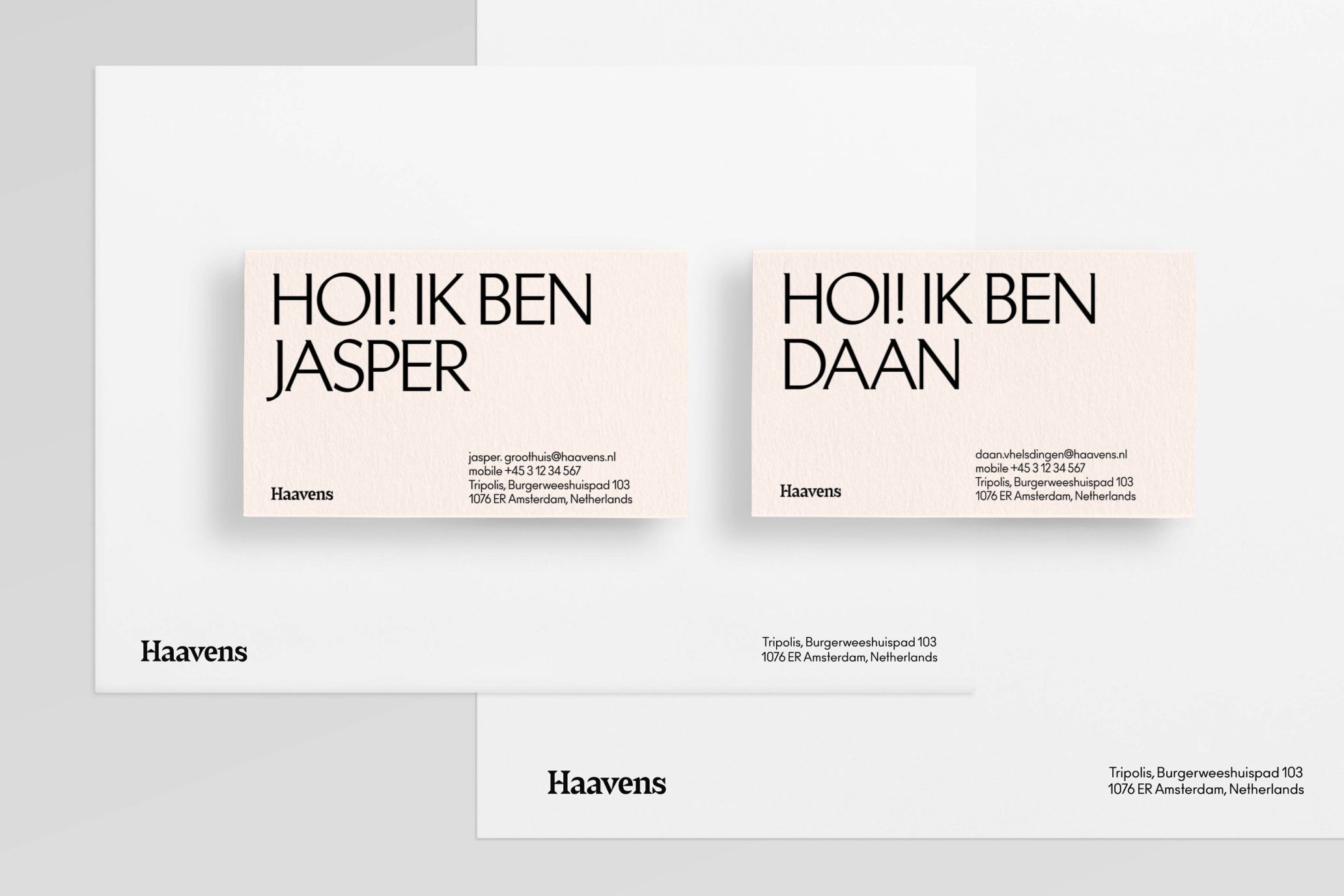
In just one month we created an entire brand with collaterals. A professional yet inclusive brand, historical yet modern, bold yet quirky. And a name clearly professing what living is all about.
