Make sense common
STEEP
The rise of the pandemic saw a surge in new workplace tools. Suddenly the need to collaborate and share the same vision was felt and felt bad. Tech company Steep has a completely new angle on workplace collaboration: honing in on data and unlocking a whole new world for employees.
What we did:
Strategy
Brand positioning Brand platform Technical strategy
Content
Copywriting Scriptwriting Photography direction Film direction & production Implementation plan Design templates
Design
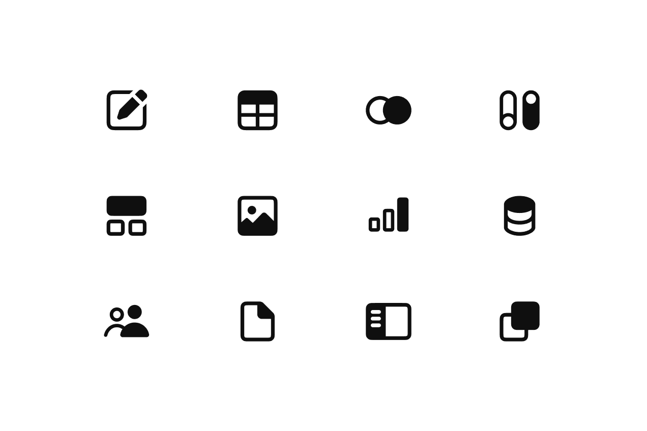
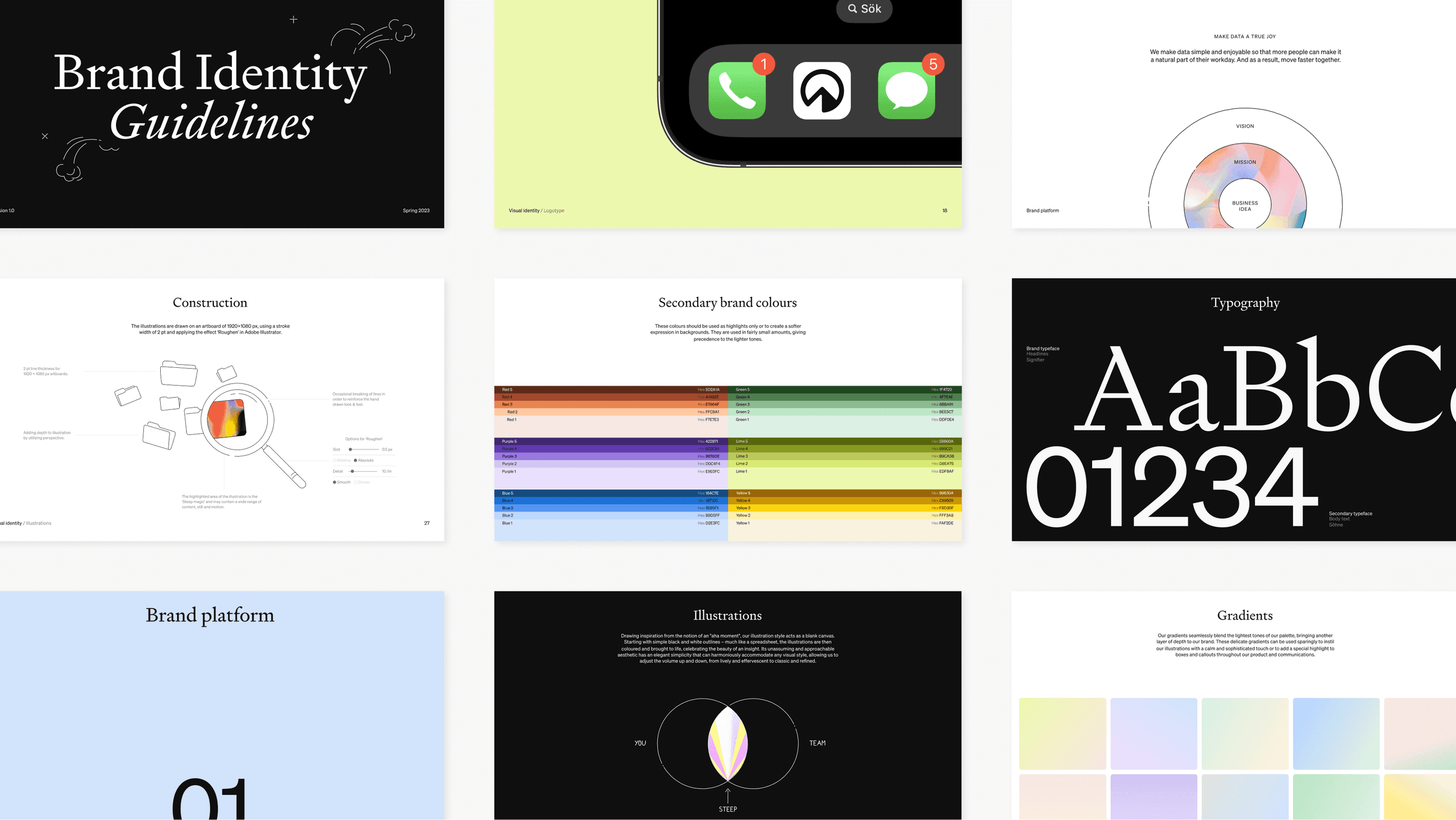
Visual identity Verbal identity Iconography Illustrations Motion design Guidelines
Make sense common
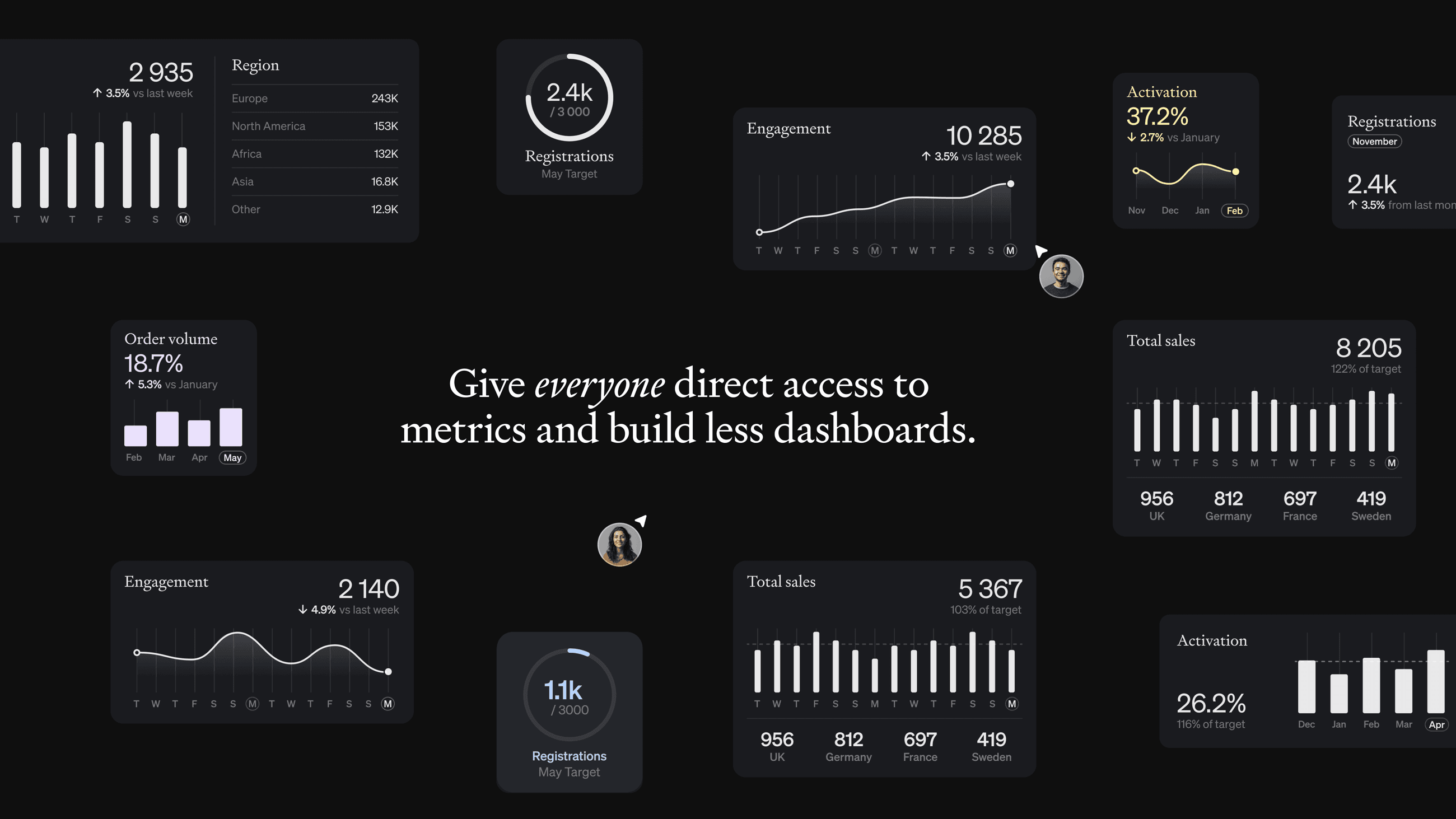
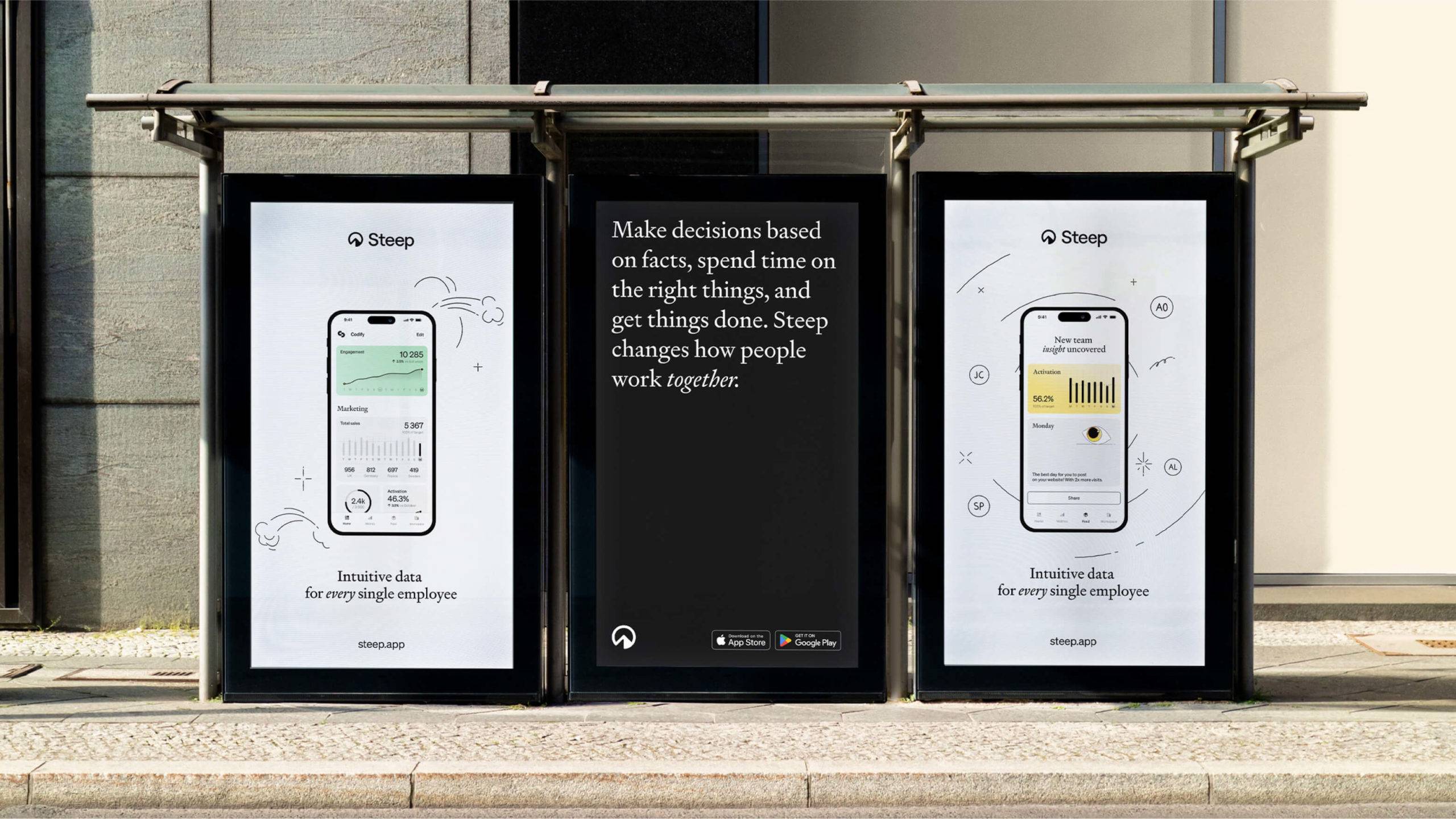
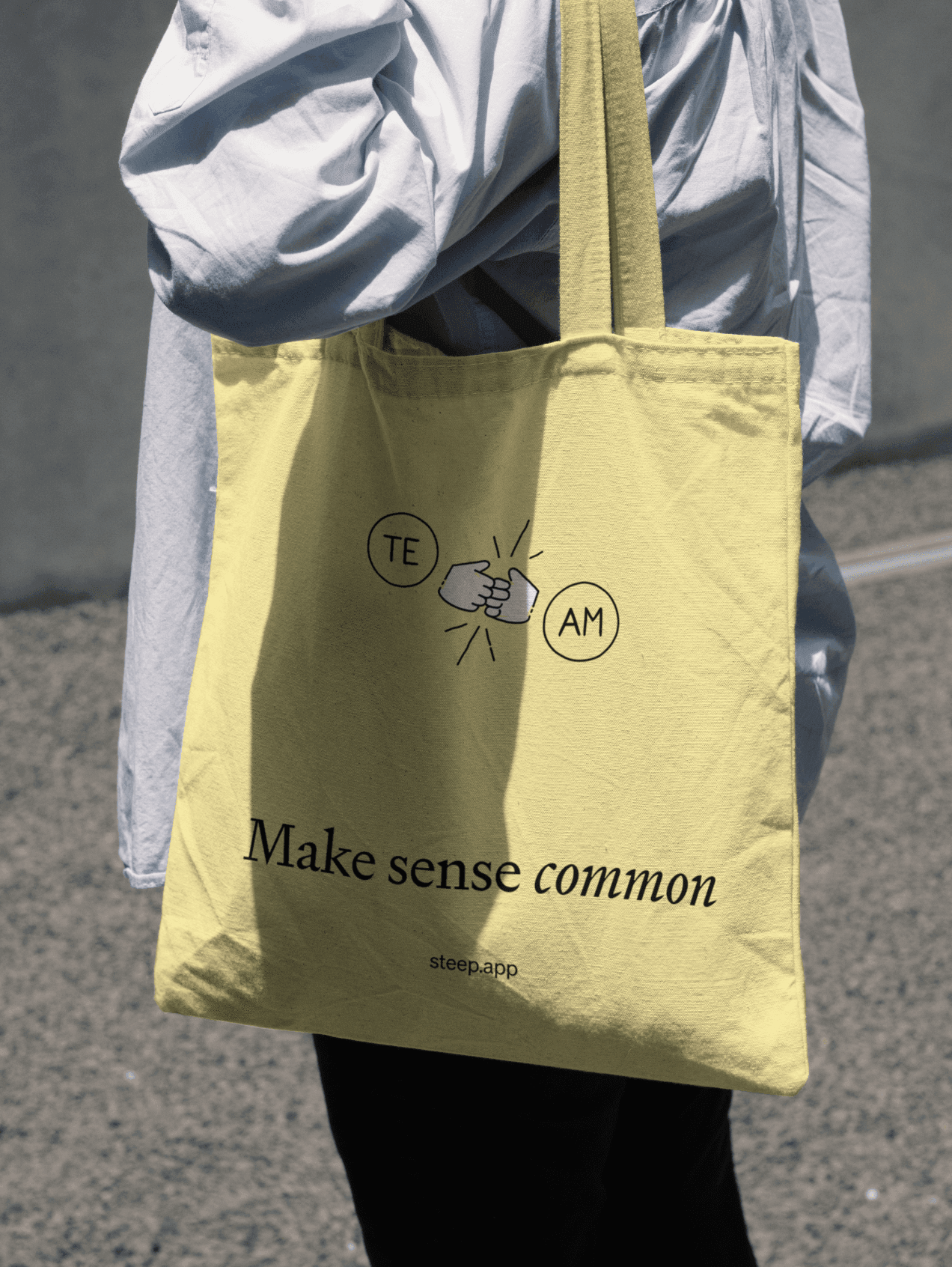
When Steep came to us, it was clear that they had the product to revolutionise how companies work with data. What if everyone, instead of a select few, they reasoned, had constant access to the numbers that affect them and their team? And what if it was made simple and digestible? Wouldn’t that help everybody pull in the same direction and reach their goals faster? From this intention to democratise data, we wrote the brand promise Make sense common, capturing both its simplification and the notion that data is for everyone.
Bringing “aha” moments to life
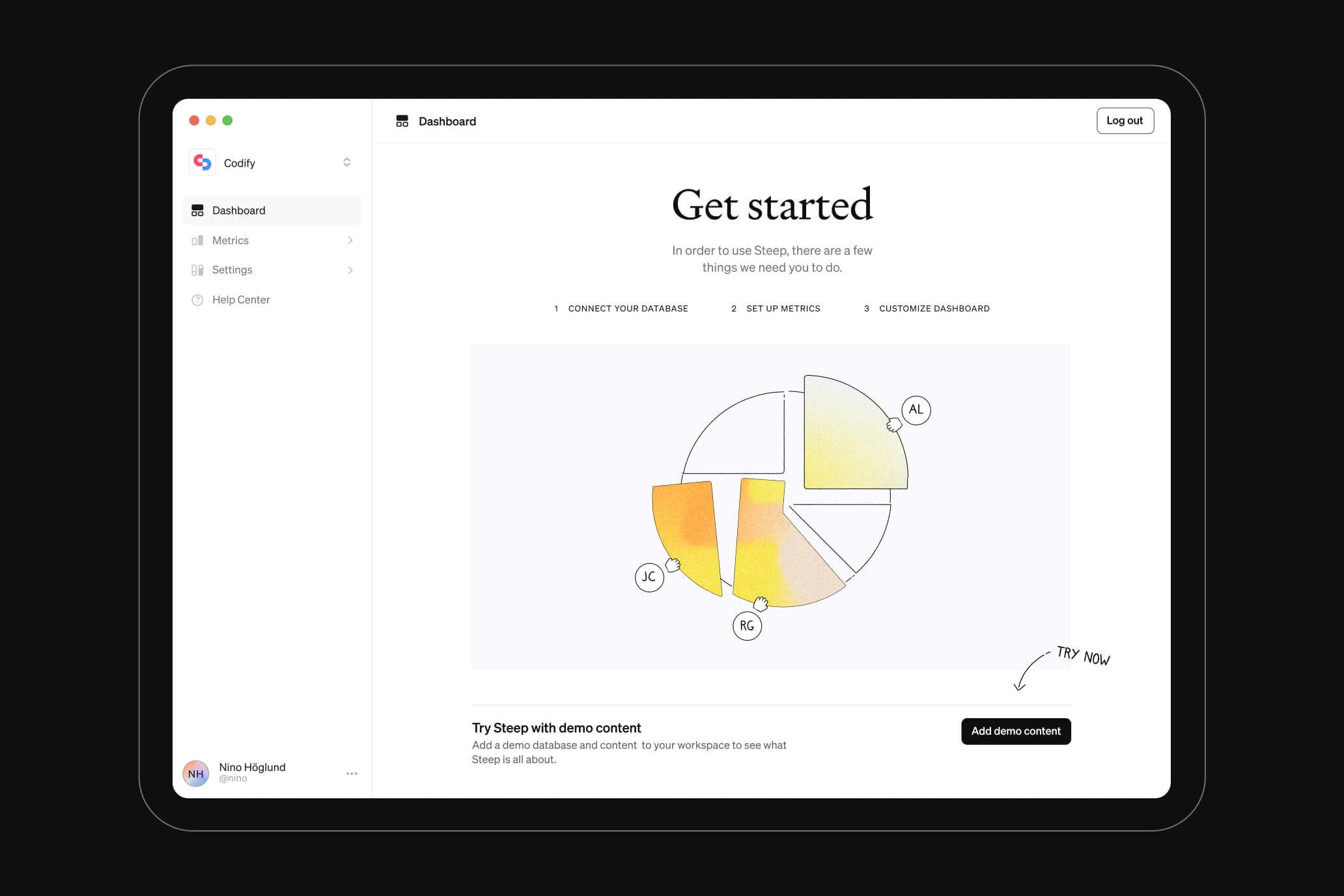
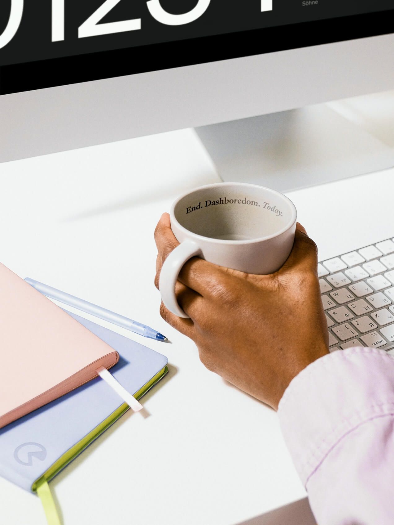
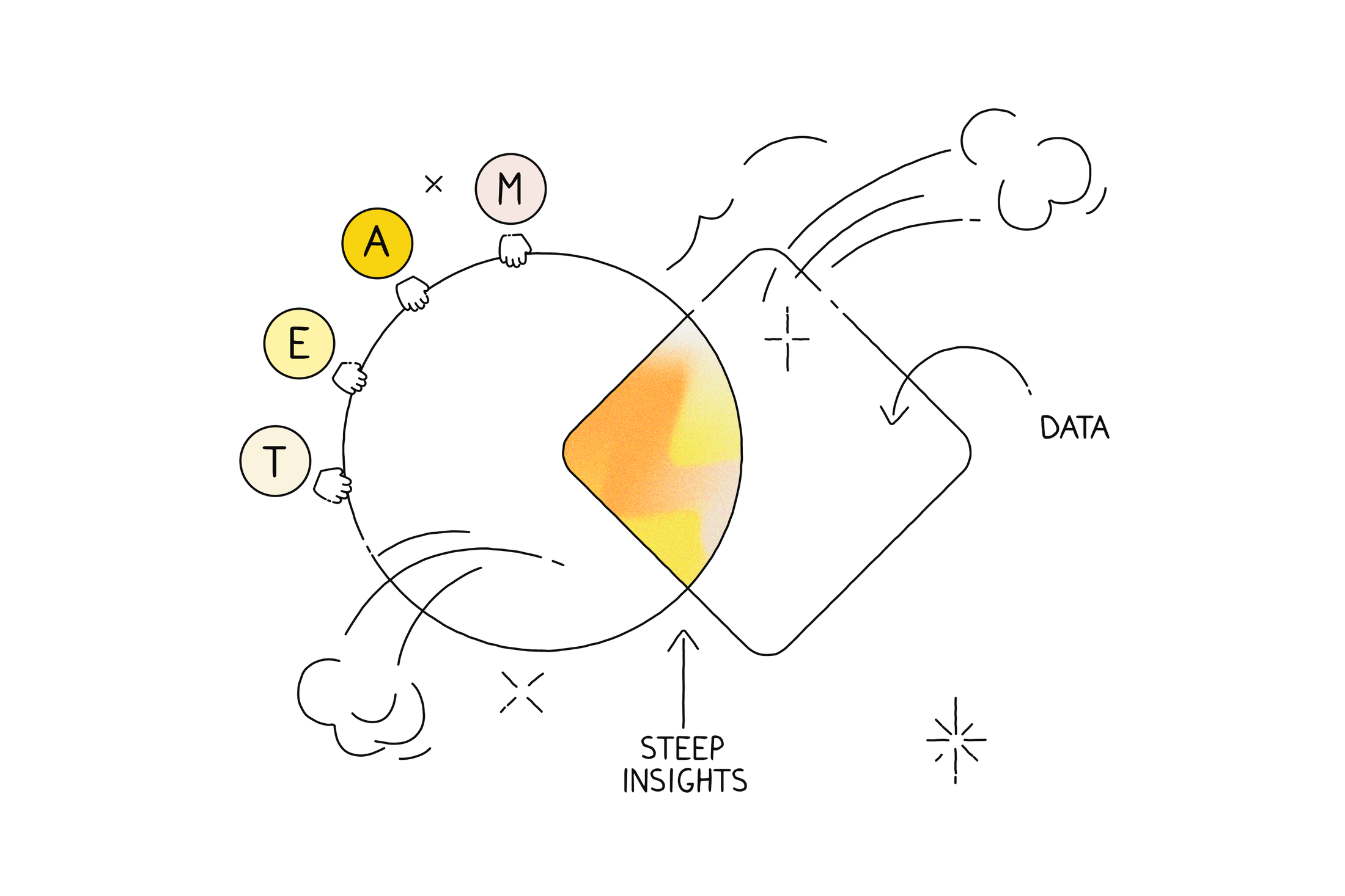
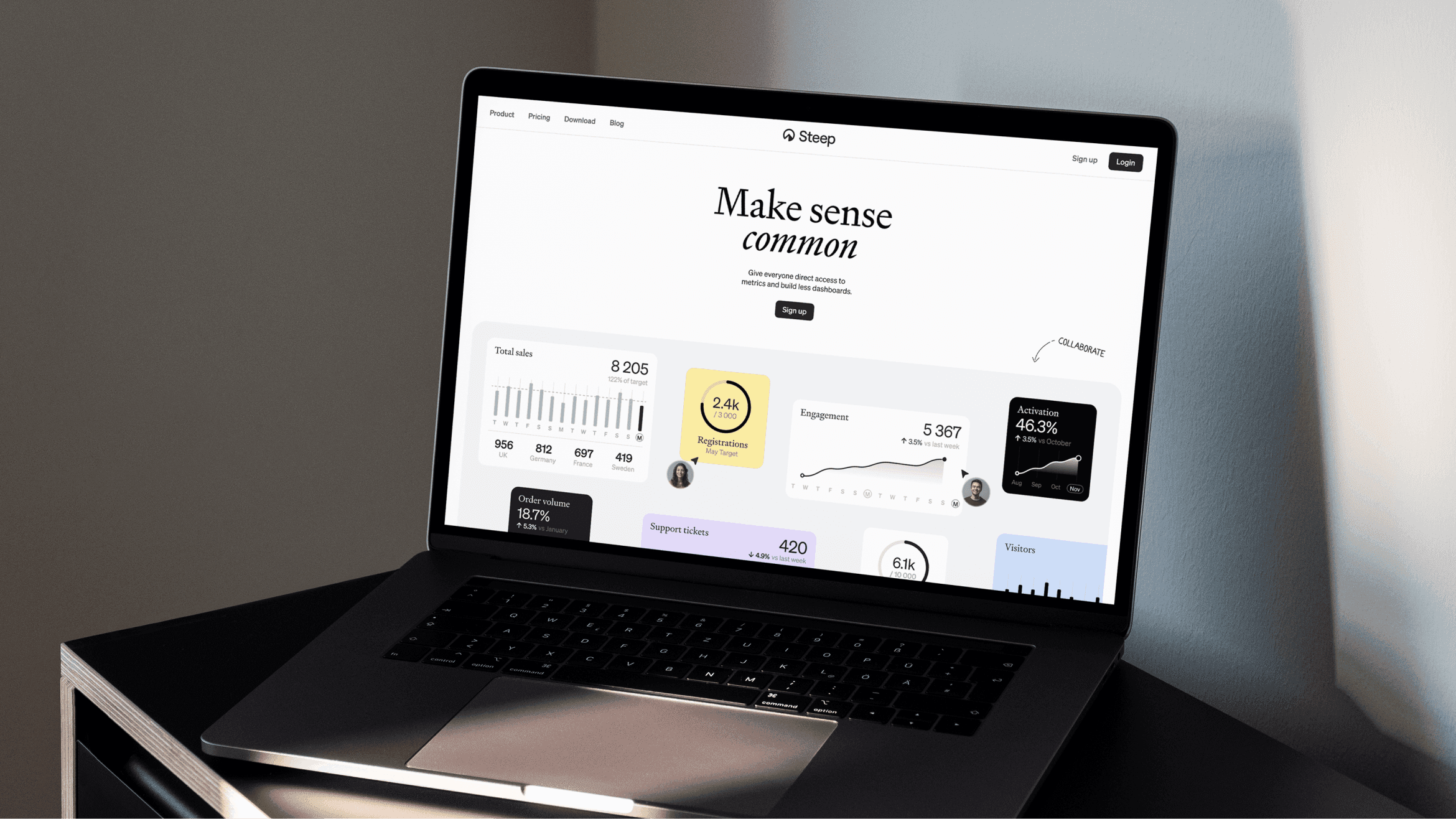
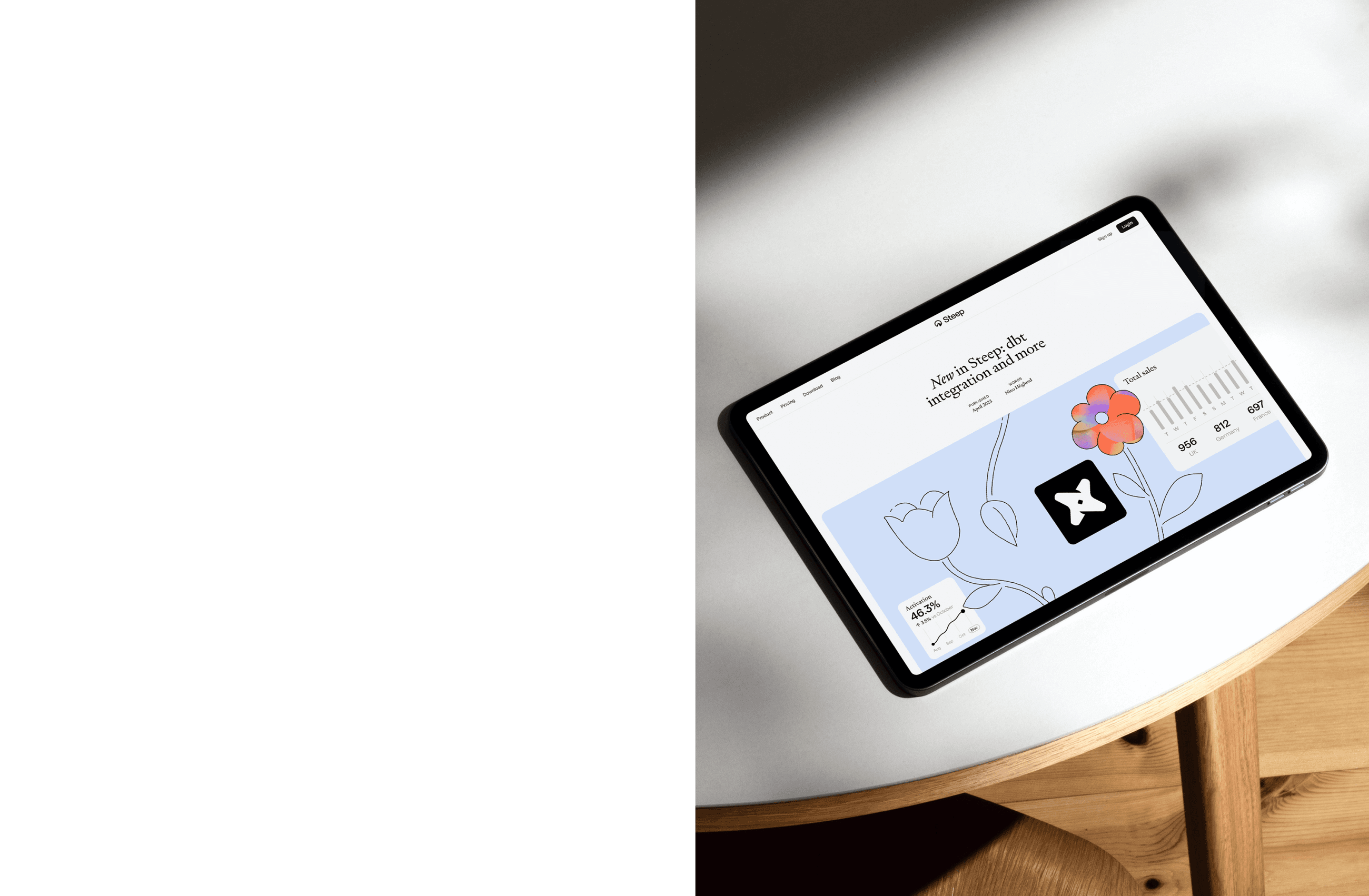
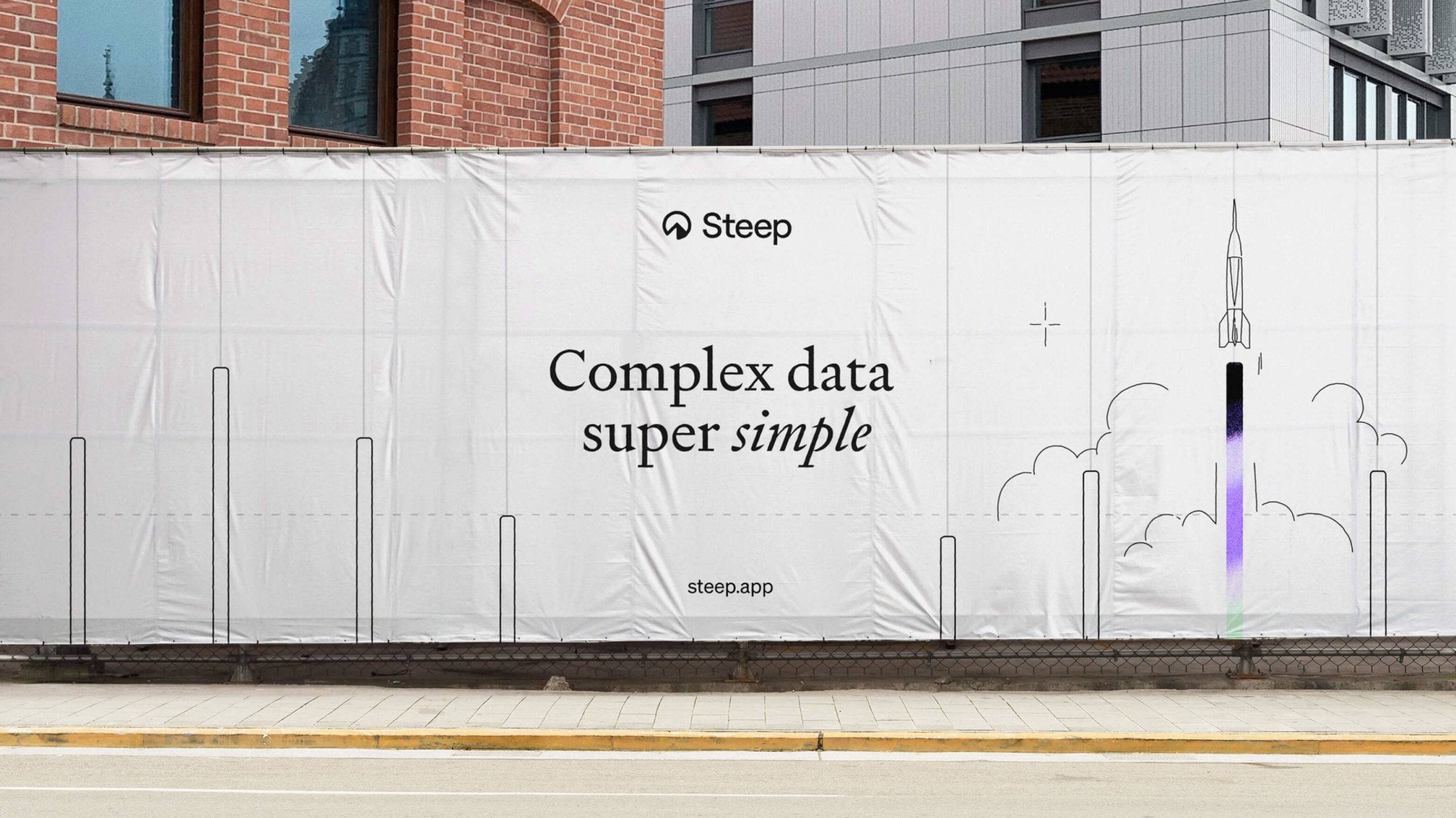
To attract other tech companies the brand needed a certain level of playfulness while maintaining trustworthiness. After all, asking people to hand over their data is a big ask. This resulted in a black-and-white identity with splashes of colour. For the illustration style, we drewinspiration from the notion of an “aha” moment. Simple outlines, much like a spreadsheet, were then coloured and brought to life, celebrating the beauty of insight. This aesthetic allowed Steep to adjust the volume, from lively and effervescent to classic and refined. Typefaces Signifier and Sohne brought sharpness and simplicity. All this was accompanied by a verbal identity that was informal and friendly. Being simple was crucial to a company thatsimplifies things.
Design with a capital D
The last thing we wanted was for the visual identity to make promises the product failed to deliver. So, we worked shoulder-to-shoulder with the head of product design at Steep, adjusting the visual identity and the product design in parallel. As a result, Steep’s visual world became cohesive, creating optimal conditions for a strong brand going forward. Wecan’t wait for Steep to join the ranks of other workplace tools that have seen their brands become household names.
