Modernising a medical research pioneer
KI
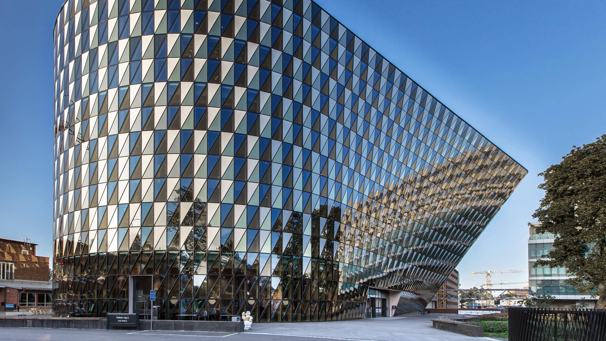
Karolinska Institutet is one of the world’s leading medical universities with a vision to advance knowledge about life and better health for all. The university accounts for the single largest share of all academic medical research conducted in Sweden and offers the country’s broadest range of education in medicine and health sciences.
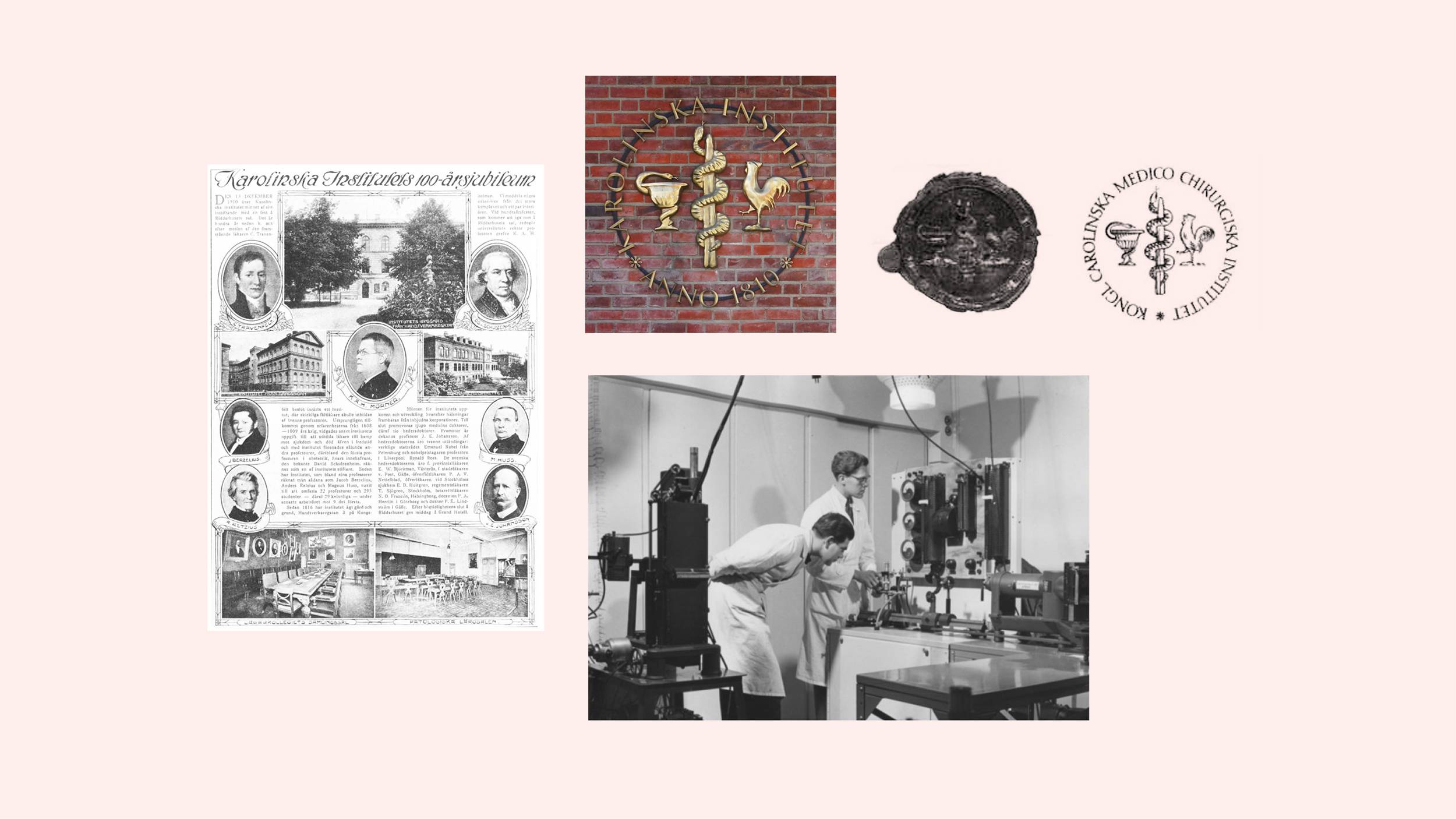
In need of a change
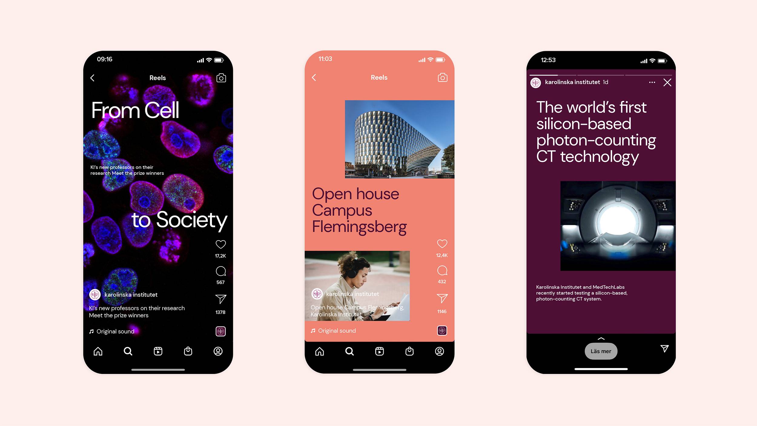
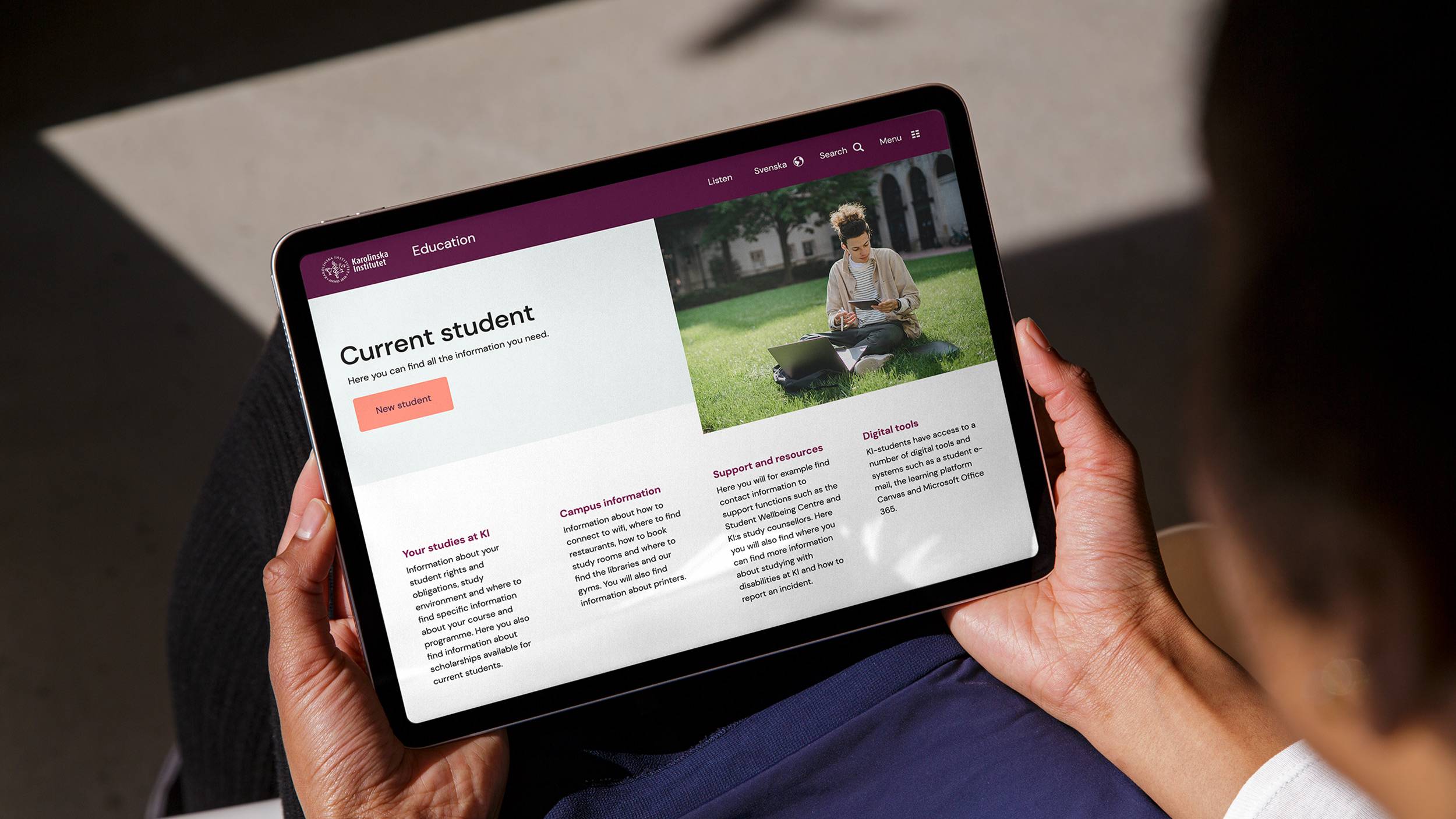
Since Karolinska Institutet's identity basically has remained unchanged since 2005, a major overhaul of the logo, colour palette, and typeface was needed to modernise its expression – adapting it to digital channels and making it functional from an accessibility perspective. At the same time, we needed to keep KI's existing look and feel for maximum recognition.
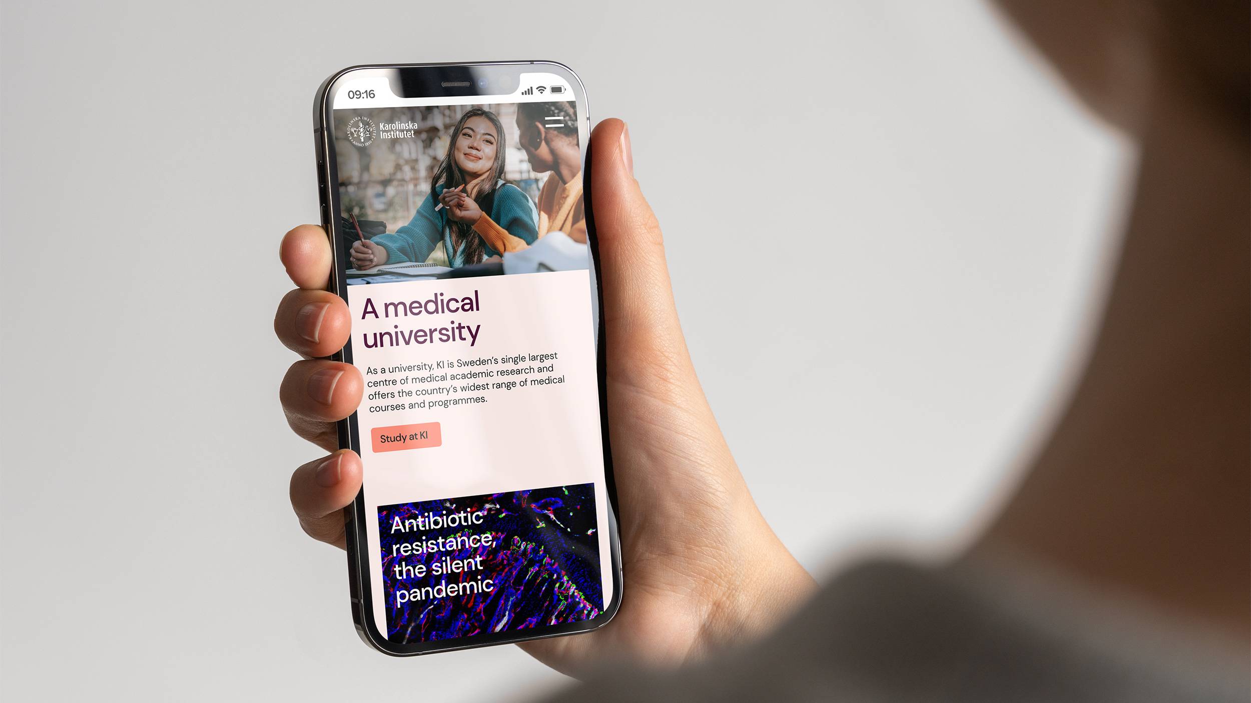
Historic assets. New settings.
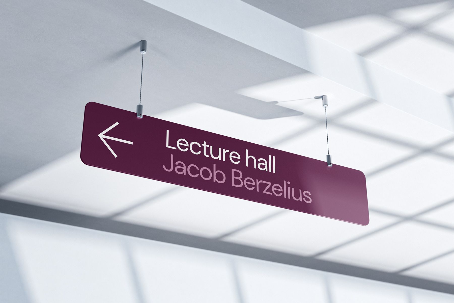
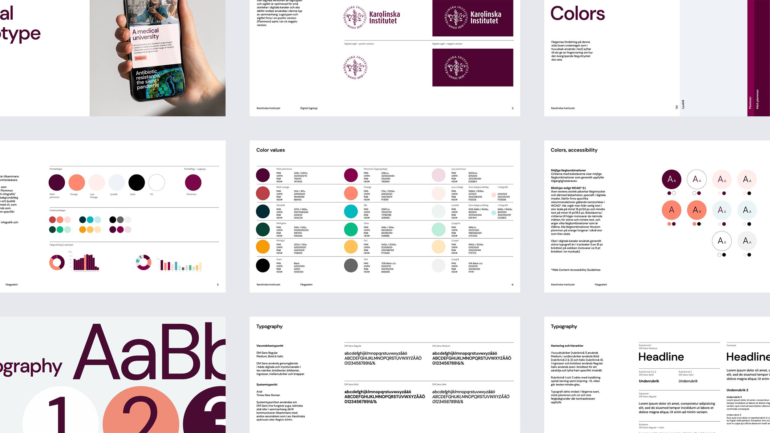
Based on KI's iconic seal-like logo, we developed a digital and simplified version, adapted for optimal readability in digital channels. We simplified the motif, fattened the font and lines, and created more air between the different elements. We also developed a new colour palette, based on KI's classic “plum” colour, but added complementary colours to create better dynamics, clearer contrasts, and a more modern expression. For the typography, our choice fell on DM Sans. A characterful sans serif to create distinction, and equally functional for both digital and analog channels. From body copy on the web to impactful headlines in print.
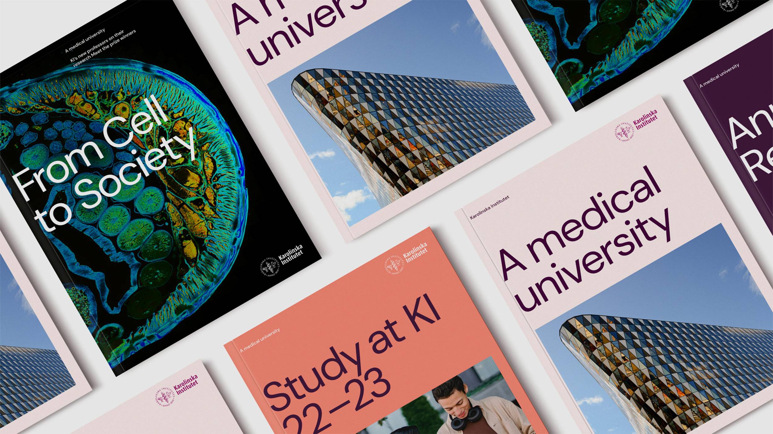


Modern look. Better outlook.
With respect for KI's past and the brand recognition intact, we helped KI go from old-fashioned and scattered, to modern, communicative, and trustworthy. All in all, an important shift for the brand behind one of the world's best universities.
